Other than perhaps a baseball cap, there is nothing more iconic in sports than a football helmet. This is especially true when it comes to college football. When you think of college football teams, maybe you think of their logos, but you probably imagine their helmets first. Of course, some are better than others. Here are the 50 best helmets in college football, a list that surely isn’t going to lead to any debate.
Brian Westerholt/USA TODAY Sports
The Chanticleers are relatively new to FBS, so they are eligible for this list. And they managed to sneak in. They have an angry bird with muscles on their helmet. The bird is also teal. It’s dumb and corny and feels incredibly ‘90s. All of that makes it fun, even if part of the enjoyment is perhaps ironic.
Bob DeChiara/USA TODAY Sports
This is an incredibly basic design: just one red stripe down the middle. However, the two colors are both good, and they are even better together. Also, kudos for getting the stripe’s thickness just right.
Duane Burleson/Getty Images
For a MAC team, Toledo has had a lot of designs, most of them based around a rocket. Some of them don’t look great, but the simpler ones work, especially since the dark blue and golden yellow color combo tends to work.
Raj Mehta/USA TODAY Sports
Western Michigan is one of many “mean horse” teams, but its horse looks better than others. Maybe that’s because of the color palette. Brown isn’t usually a great color for anything that doesn’t involve chocolate, but the Broncos make it work. In fact, the version that is primarily brown is a bit better than the golden flavor.
Jeremy Brevard/USA TODAY Sports
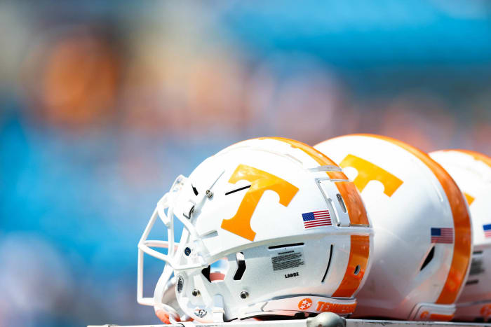
Yeah, Tennessee’s helmet is simple. However, the fact that it doesn't even have an outline around the big “T” makes it the right kind of simple. The orange “T” is iconic in college football, and that’s good enough to manage to make this list.
Kim Klement/USA TODAY Sports
Sometimes FAU has an owl on its helmet, and it looks all right, even if the logo is stretched out to be too much of an oval. The particularly fun helmet, though, is the one that features the state of Florida with the word “Atlantic” written in it. Very few helmets feature a state, so the Owls get points for that.
Brett Davis/USA TODAY Sports
Everybody loves Carolina Blue, and with good reason. It’s basically carrying this helmet. The interlocked “N” and “C” is a little busy, but it works well enough for the Tar Heels to get by.
Frederick Breedon/Getty Images
The Commodores have a clean design if there ever was one. They have a five-pointed star, as distinct and sharp a shape as you will find, with a “V” inside. The “V” is also up there in terms of the clean-looking letters. It’s simple without being too simple.
Mark Cunningham/Getty Images
While its helmet isn’t as great as the name “Bowling Green,” the look is still good. The orange and brown call to mind Cleveland’s NFL team, for better or worse, but the colors work. Its falcon looks pretty cool, and the interlocked “BG” is an all right flourish.
Isaiah J. Downing/USA TODAY Sports
The Air Force has worn helmets that look like Bullet Bill from the Mario games that were absolutely awful. That’s a shame, because its normal helmet is plenty good. It’s just a blue lightning bolt on a white field, but it still looks nice in its simplicity.
Boise State University/Getty Images
Nothing Boise State does is muted. Just look at its blue turf. All the “big, mean horse” designs are a little tacky, but the basic design is cool. The blue is distinct, and the orange and white of the bronco logo blend in well. It feels almost subtle. Almost.
James Snook/USA TODAY Sports
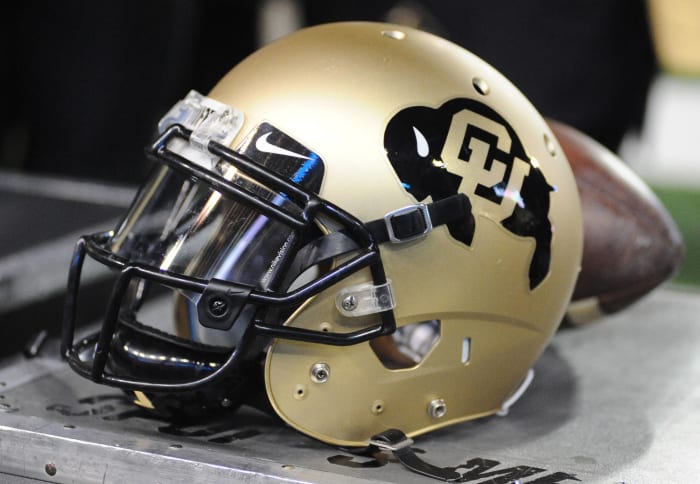
These helmets would be better if they didn’t have the “CU” over the buffalo in the logo. It makes it look like part of the animal is missing! However, the buffalo does look cool, and the little dab of a white horn is a nice detail.
Otto Greule Jr/Getty Images
We were relieved when Pat Hill stopped coaching the Bulldogs because it meant the end of those dumb bone stickers. Now we get to enjoy the goofy, mean bulldog on a football uniform in peace. Also, Fresno State forever gets points for having a big, green “V” on the back of its helmets for whatever reason.
Jim Dedmon/USA TODAY Sports
Charlotte’s colors are kind of boring, but it is getting points for its logo. The lettering of the “49ers” is solid, but this is really about the pickaxe-wielding arm surrounding it. That’s an original concept, and originality counts (when it doesn’t suck).
Robert Stanton/USA TODAY Sports
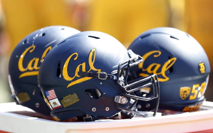
It’s a simple design: two colors and three letters. The helmets just read “Cal” in cursive, with a cool little flourish. The shortening of California to “Cal” shouldn’t qualify as a fun touch, and yet somehow it does.
Stephen Lew/USA TODAY Sports
Louisiana’s helmet says “Ragin’ Cajuns” on it. That makes sense, because that’s what the team is called. How could you not love a helmet that has the words “Ragin’ Cajuns” on it? Case closed.
Kirby Lee/USA TODAY Sports
There’s actually not a lot of black on this list, but Iowa makes the black work. Somehow, its black seems particularly black, and it meshes well with the yellow of the helmet. It also manages to make its hawk look slightly menacing, but it keeps the design simple. That’s a tough needle to thread.
Jack Plunkett/WireImage
The old-school helmet of an angry wave shaking its fist is incredibly kitsch, but honestly it looks bad. However, the version with a “T” getting swept up in a green wave is cool. Name another helmet that has a wave on it. Exactly.
Jonathan Devich/Getty Images
Hawaii has a funky “H” on its helmet, but everything about Hawaii is unique. Anything that seems to evoke the local flavor is a worthwhile touch. The two different greens shouldn’t be a good idea together, but they are. All of the attempts to bring back the rainbow haven’t worked on the helmets, unfortunately.
Bob DeChiara/USA TODAY Sports
Orange and blue, baby! It’s so simple: just a big block “S.” Whether the main color is orange or blue, it still looks nice. The version without the stripe is better.
Greg Thompson/Icon Sportswire via Getty Images
The skeleton pirate is so cheesy but in an endearing way. What’s not cheesy, though, is the purple and goldenrod-ish color combo. The yellow facemask version is particularly dope-looking.
Raymond Carlin III/USA TODAY Sports
Look, Kansas football sucks, but it’s not because of its helmets. The version that just says “KU” is lame and perhaps more befitting of the Jayhawks’ lack of talent. However, the cartoon bird is always amusing. We’ll never complain about seeing him.
Brian Spurlock/USA TODAY Sports
This list mostly avoids basic, one-color designs. However, Notre Dame still makes the cut. The team has the nickname “Golden Domers” because of the distinct golden quality of its helmets (but also because of the golden dome on the main building on campus). The gold just seems brighter and more distinct than any other gold. These helmets are too famous to keep off this list.
Jimmy Simmons/Icon Sportswire/Corbis via Getty Images
Fine, he’s a recent, futurist helmet update that actually works. The tiger in a circle was too crowded and small. The big, yellow tiger is simply designed, which is why it works better than some of the other overly large logos. Only the yellow version, though. Not the silver tiger.
Michael Wade/Icon Sportswire via Getty Images
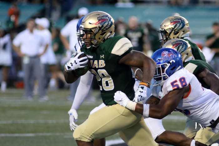
Guys, there’s a dragon on UAB’s helmet. How could you be against a helmet with a FIREBREATHING DRAGON on it? It’s not a bad dragon design, either. It could have looked dumb as hell, but it actually looks fine and dandy. Also, it’s a dragon. Did we mention that?
Rob Foldy/Getty Images
The helmet with an actual gator on it is all right. The orange helmet with the blue “Gators” lettering is better. However, the best of the bunch is, oddly, the white helmet with the big blue “F.” That “F” looks on point.
Jamie Rhodes/USA TODAY Sports
The chrome red design is too much. Those “look how modern and hip we are!” designs barely ever work. We aren’t War Boys on the Fury Road. Give us the simple white helmets with the angry, incredibly cartoony cardinal. That’s the design that wins the day.
Bobby McDuffie/Icon Sportswire/Corbis via Getty Images
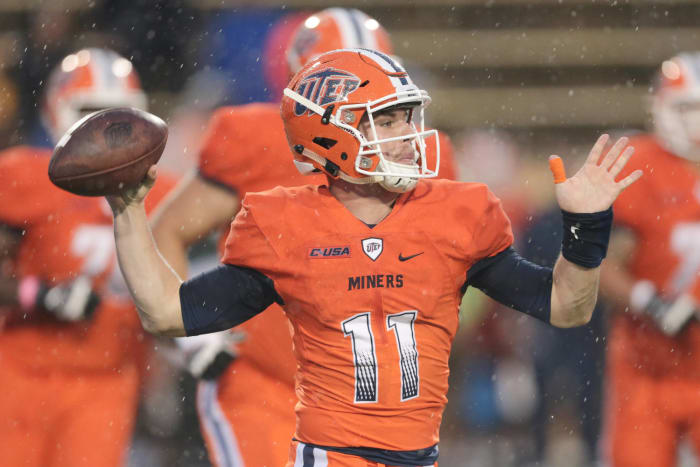
The Miners may be one of the worst teams in the FBS, but they rank much better when it comes to helmet design. Not only do they rock a sharp orange-and-blue combo, but also the “T” of “UTEP” is a pickaxe, which is awesome. UTEP does one thing right, at least.
Troy Babbitt/USA TODAY Sports
You could argue that the Wyoming helmet is subtweeting all the helmets featuring angry horses. The Cowboys, fittingly, have a cowboy on their helmet riding a bucking bronco. Having it in silhouette form is probably the only reason it doesn’t look silly. Instead, it looks pretty awesome.
Ronald Martinez/Getty Images
The death penalty never managed to kill the Mustangs’ fashion. Their galloping house outline is lovely, and the blue striping around the red horse looks great on the cream-white helmets. All other versions need not apply.
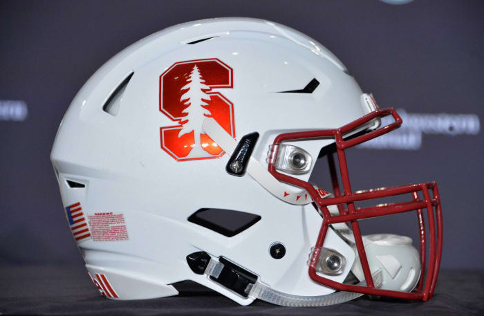
Kirby Lee/USA TODAY Sports
There’s a tree in the logo! A well-drawn tree at that. Somehow, it works superimposed over their big block “S." Long live the tree.
Troy Babbitt-USA TODAY Sports
Look, if your team is called the rams, you better have ram horns on your helmet. Colorado State gets that. The helmets have a nice, simple horn design, plus an uncommon color pattern. Shout out to dark green and gold.
Adam Lacy/Icon Sportswire via Getty Images
Football teams, and sports teams in general, are so concerned about appearing tough. Oregon State is called the Beavers, and it has a beaver in its logo. That’s awesome, and so are the Halloween colors.
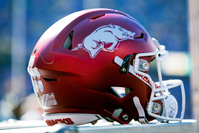
Stephen Lew/USA TODAY Sports
Arkansas has a unique team name in Razorbacks. As such, the fact there is a giant, angry hog on their helmets is also unique. Sometimes uniqueness is a lot of fun. So, yes, Arkansas is here solely because of the razorback on its helmet.
Charles LeClaire/USA TODAY Sports
The lettering on the Pitt helmet feels almost clunky. It looks hastily written. That’s charming, though. It feels like the Panthers are wearing a bunch of homemade helmets or something.
Jeff Hanisch/USA TODAY Sports
Sometimes it feels like the tiger in LSU’s logo is too busy. Other times it feels charmingly quaint. Either way, the yellow version with the purple lettering and stripes looks great.
Greg Bartram/USA TODAY Sports
The buckeye stickers actually aren’t great; they feel a little cheesy and create asymmetry among players. But they are iconic. Plus, you won’t find a sharper stripe on a helmet out there. This is only for the silvery gray version, though. Get out of here with that black alternate we’ve seen in the past.
Shanna Lockwood/USA TODAY Sports
The Hurricanes have a simple design. There’s a “U,” fitting for “The U.” Half is orange; half is green. The logo is instantly recognizable, even to non-football fans.
Jamie Sabau/Getty Images
You may not watch Tulsa play often, and with good cause, but do yourself a favor and check out its helmets sometime. It’s a beautiful design through and through. The font choice is superb, and the shade of gold looks sharp. The stripes are a nice touch as well.
Mark J. Rebilas/USA TODAY Sports
Shout out to that tiger print, which is so simple but nevertheless provocative. Another shout out to those purple and white stripes down the center, which work great with the primary orange color. However, any design that makes purple the main color is a desecration of the traditional design.
Kirby Lee/USA TODAY Sports
Los Angeles has a real battle for the best helmet in the city. The colors of UCLA’s helmet are nice, and they complement the jerseys well. The helmets also gets points for the little flourish at the end of the “a” that underlines the whole “Ucla.” The Bruins do lose points for making the “cla” lowercase, though.
James Snook/USA TODAY Sports
The Trojan is maybe a little busy, even if the design is still only two-tone. That being said, the color combo is a real pleasure. Plus, from a distance, the logo looks a bit better, and that’s how most of us see it.
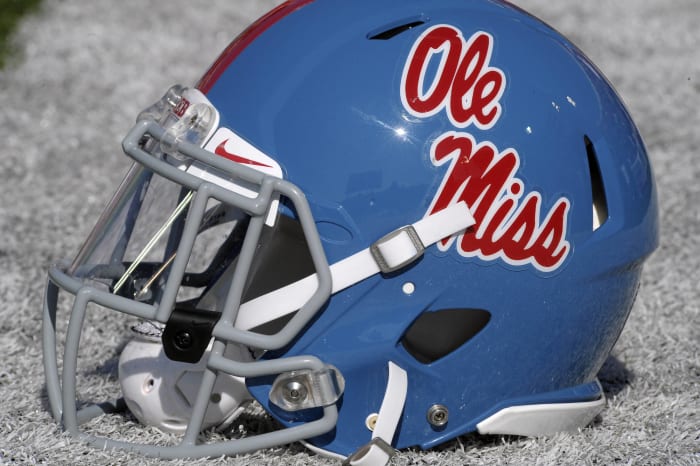
Justin Ford/USA TODAY Sports
You’re going to get the cursive “Ole Miss” no matter which helmet you see. However, the dark blue one is merely decent. That powder blue-ish helmet, though? That’s a real beauty.
Geoff Burke/USA TODAY Sports
There is arguably no better color combo out there than blue and orange, so Virginia is out ahead of the pack just for that. It’s hard to make a single letter look good and stand out, but the Cavaliers manage to do it with their “V.” The swords underneath are a nice touch.
Mike Carter/USA TODAY Sports
The Spartans would have the best helmet in most states, but unfortunately they share their state with the Wolverines. Michigan State’s design is great. They green and white go so well together, and the Spartan helmet logo, which is to say the helmet on the helmet, looks cool.
Matt Kartozian/USA TODAY Sports
The pitchfork design is all right, but this ranking is for the classic helmet design. We’re talking a yellow helmet with Sparky, the devilish mascot, getting up to his own pitchfork-related mischief. It’s cartoon, but delightfully so. That’s way more fun than a big ol’ pitchfork not being wielded by anybody.
Jim Dedmon/USA TODAY Sports
The black, red and white versions of South Carolina's helmet all look good. The “gamecock” is a little busy looking — you can’t make it out well if you aren’t up close — but South Carolina gets points for the uniqueness of its logo. The block “C” is also a nice touch.
Michael C. Johnson/USA TODAY Sports
Texas is finally back in the Top 25 coming off a Sugar Bowl win over Georgia after a few down years, but through it all the Longhorns always looked good helmet-wise.The burnt orange longhorn is a beautiful silhouette — they actually have a logo on their helmets — and the design remains clean.
Troy Babbitt/USA TODAY Sports
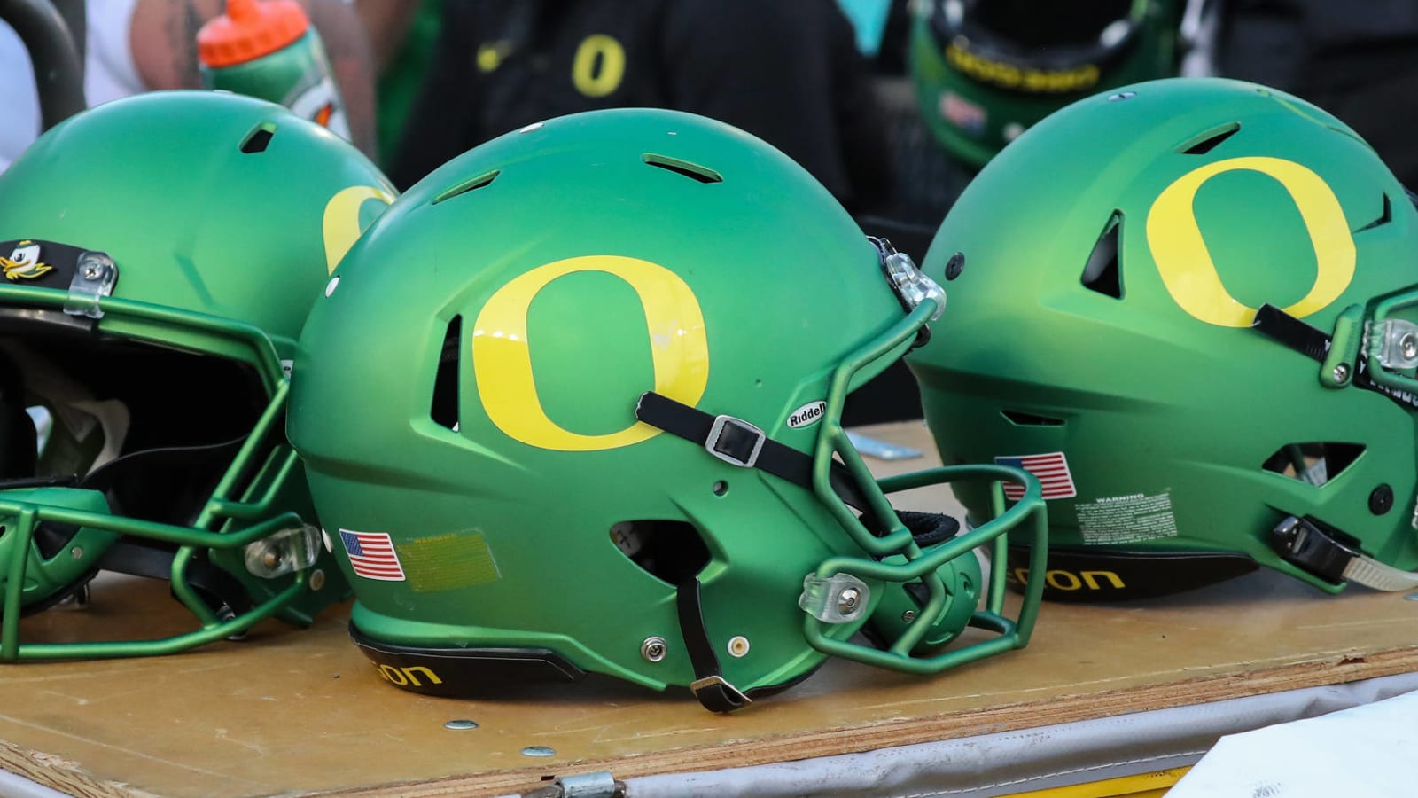
There have been a million different Oregon helmets, it seems. Some of them are great, but admittedly some of them are tacky as all get out. However, the bright green variant with the simple yellow “O” is so good the Ducks really don’t need any other options. Stick with what works.
Tommy Gilligan/USA TODAY Sports
There is arguably no more instantly identifiable helmet than Michigan’s. It’s classic, but it’s not just simply monochrome or just a single stripe down the middle. The maize-and-blue winged design looks amazing, and it’s perpetually in style.


 +
+