Sports and fashion often intersect, and nowhere is that more evident than with uniforms. Fans love to rock their favorite jerseys, while players of course want to look good when they take the field. Sometimes, unis really nail it, but other times, not so much.
Here is a look at the best and worst that the sports world has to offer when it comes to uniforms. Who looks good, who looks bad and who looks ugly across the NBA, NHL, NFL and MLB?
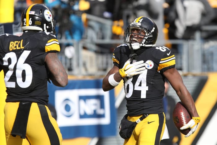
Geoff Burke-USA Today Sports
The Steelers are one of the NFL's proud franchises, and they have plenty to be proud of when it comes to their classic uniforms. These uniforms have had little changes to them since the 1970s, but they're still classic and one of the best in football.
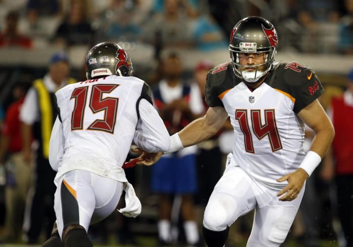
Reinhold Matay-USA Today Sports
The Bucs underwent a massive downgrade with their recent uniform change. Instead of having a uniform that could be considered a modern classic, they now have one that's too modern and too clunky. This uniform is a mess, and they could do with another change to fix its issues.
3 of 52
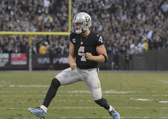
Best NFL uniforms: Oakland Raiders
Kirby Lee-USA Today Sports
In the mid-1960s, the Oakland Raiders decided upon their current uniform design. They haven't changed it since then, and they haven't needed to. They wear extremely simple uniforms, but the color scheme and logo still manage to give the Raiders a classic and intimidating look on the field.
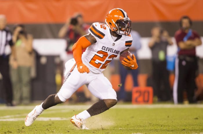
Scott Galvin-USA Today Sports
Unless they decided to wear all brown, the Cleveland Browns used to have good uniforms. Then they decided to update their uniforms, and now it's a weird hodgepodge of old ideas (blank helmet) with new ideas (team name on the pants). It's a strange look for a franchise that seems lost at times.
Brace Hemmelgarn-USA Today Sports
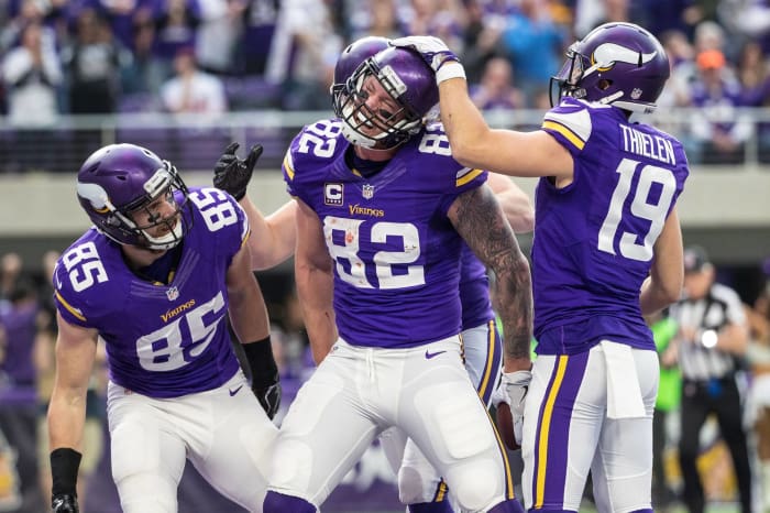
In a reverse of what Tampa Bay did, the Vikings went from having one of the worst uniforms in the NFL to having arguably the best uniform set in the league. The shade of purple is fantastic, and the uniforms perfectly blend modern ideas with classic taste.
Aaron Doster-USA Today Sports
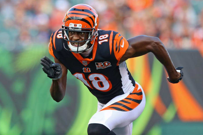
This is another team that would benefit from going back to the uniforms it had before the current look. The Bengals have a great-looking helmet, but that's the only thing on this uniform that looks good.
Eric Hartline-USA Today Sports
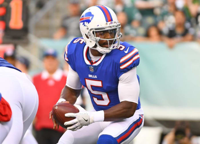
Once again, this was a team that underwent a massive upgrade with its latest change. The Bills may not be the most successful team on the field, but their beautiful uniforms make them a winner in our eyes.
Jasen Vinlove-USA Today Sports
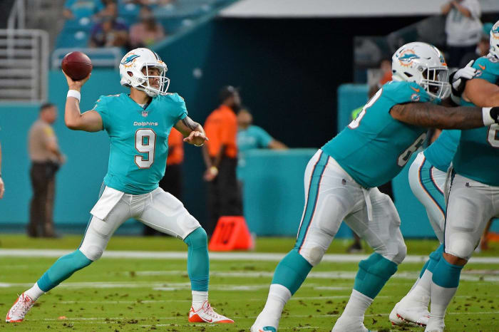
You have to try hard in order to make a look with teal seem boring or uninteresting, but that's what the Miami Dolphins achieved with these uniforms. The logo isn't exciting, and the uniforms just seem bland.
Dan Powers-USA Today Sports
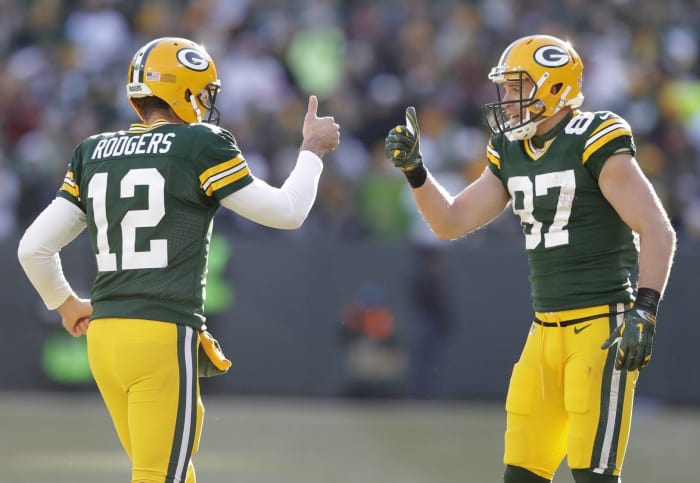
The Packers have looked nearly the same since the 1960s, and that's for good reason. There's no reason to change when you've stumbled upon a great look. They've made minor changes over the years in order to keep up with the times, but this is a look that has endured the test of time.
Reinhold Matay-USA Today Sports
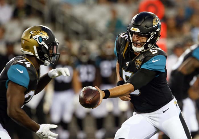
This is the worst uniform in the NFL. The helmet is bad. The jersey is bad. The pants are bad. Everything gets worse when the Jaguars wear their gold Color Rush uniforms. There's barely anything redeemable about this look, and they could benefit from going all the way back to the drawing board with their uniform set.
Matt Marton-USA Today Sports
The Bears may be in a bit of a hibernation at the moment, but their uniforms are still solid and one of the classic looks in the NFL right now.
Mark J. Rebilas-USA Today Sports
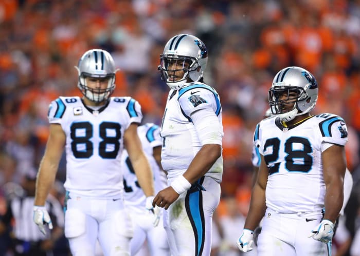
While Carolina's expansion partners have devolved into ugliness, the Panthers came up with a solid uniform in their very first season and have only needed to make small changes over the years. As such, they have a solid look that is definitely easy on the eyes.
© Kevin Jairaj-USA Today
The Texans are another example of an expansion team that got uniforms right out of the gate and haven't needed to change. If they stick with this look, it could be up there with the classic uniforms of the NFL in due time.
Kim Klement-USA Today Sports
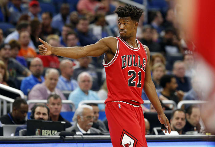
A lot has changed in the NBA over the years, but one thing that hasn't changed and shouldn't change is how the Chicago Bulls' uniforms look. They came up with a classic, timeless design, and as such, they're one of the best-looking teams in the NBA.
Thomas Shea-USA Today Sports
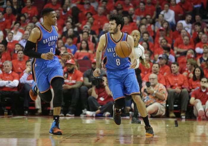
The Thunder has the worst logo in the NBA, and the uniforms aren't too much better. OKC's uniforms for road games are particularly egregious, as the script looks like something that should be worn in high school instead of the NBA.
David Butler II-USA Today Sports
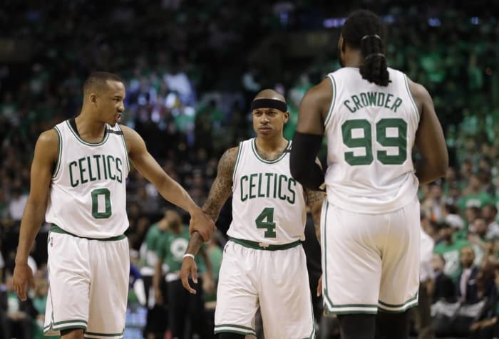
The look is simple, but sometimes simple is all you need. Boston's shade of green is excellent, and the organization has made enough small tweaks to keep up with the changing times. The Celtics have a classic look, and it's one that will continue to be good for as long as they keep the common sense to stick with it.
Nelson Chenault-USA Today Sports
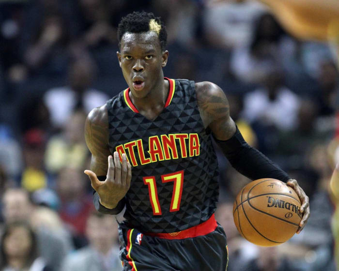
You have to give the Hawks credit for trying to be bold, and their idea is nice in theory. Unfortunately, it's lacking in execution, and the result is a look that falls flat on the court.
Gary A. Vasquez-USA Today Sports
Although these uniforms aren't as good as what they looked like during the Showtime Era, the Lakers' classic gold uniforms are still good enough to be considered one of the best in the NBA. They catch your eye as soon as you look at them, and it's a great look for the blue blood franchise of the league.
Jerome Miron-USA Today Sports
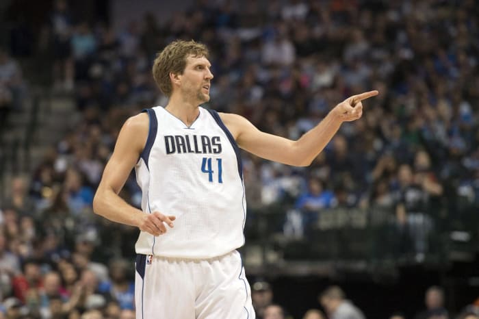
This was a cutting-edge look in the mid-2000s. Now, the Mavericks have a look that is dated and in need of some sort of tweak.
Jason Getz-USA Today Sports
The Nets may not have the pedigree or history of teams like the Bulls, Lakers and Celtics, but they have a uniform set that can measure up with those classic franchises. Their uniforms are an example of how you can mix modern ideas with a simple design and make it work in fantastic fashion.
Brian Babineau/Getty Images
Nike has taken over the NBA in time for the 2017-18 season, and while most teams have made small changes, others made big alteration. The Pacers were one of them. Unfortunately, the Pacers seemingly couldn't decided between a throwback look or a modern look, so we got this mishmash of look.
Bill Streicher-USA Today Sports
"The Process" is very popular in Philadelphia, and the process that the 76ers took to come to this uniform design should be emulated across the rest of the NBA. The Sixers may not be the best team in the league yet, but they're definitely the best-looking team in basketball.
Kyle Terada-USA Today Sports
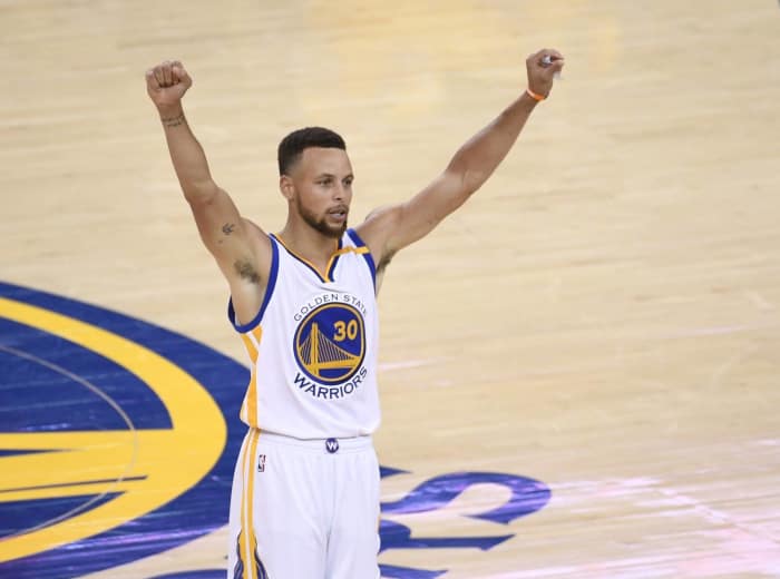
This may be a bit of a controversial opinion, but it has to be said. The Warriors may be the NBA's model franchise at the moment, but their uniforms leave much to be desired. It's a poor update of their classic throwback "The City" uniforms, but they may not change them due to the fact that they've had incredible success while wearing them.
Troy Wayrynen-USA Today Sports
A lot of things may change in the NBA, but one thing that won't change is the basic gist of Portland's uniforms. The Blazers have come up with a unique look for their franchise, and it's a good trademark for them to have.
Brad Penner-USA Today Sports
The Pistons recovered from briefly losing their minds during the mid- to late 1990s teal phase. They brought back the old colors and modernized the classic uniforms to give themselves a very solid look.
Kelley L Cox-USA Today Sports
This is a no-frills look for a no-frills franchise, but there are enough interesting quirks about this uniform (specifically, using the Spur logo as a "u" in the script) to make this one of the best looks in the league.
Nick Turchiaro-USA Today Sports
This is a beautiful update of the uniforms the Blue Jays wore during their time as back-to-back World Series winners in the early 1990s. In fact, you could say that these are actually better than what they wore back then, which is extremely high praise.
Neville E. Guard-USA Today Sports
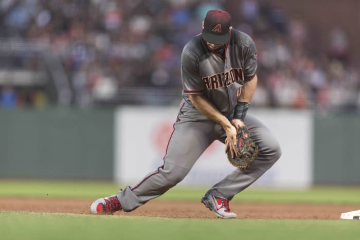
There have been rumors that Arizona's dark gray road uniforms may signal a trend for other teams to wear the same shade of gray for their away uniforms. If that rumor turns out to be true, that would be sad because Arizona's uniform set is not one that should be emulated in any way by any other team.
Charles LeClaire-USA Today Sports
This is a classic uniform that manages to avoid being bland. Why is that? Just look at the two Cardinals perched on a baseball bat. There are no other frills on this uniform, and it doesn't need them when you have such a unique and eye-catching centerpiece on your look.
Steve Mitchell-USA Today Sports
The Marlins have a brilliant shade of orange in their color scheme. Unfortunately, they rarely wear their orange jerseys and have actually shelved their orange caps. As such, they've devolved to a boring, mostly black look. It could be so much more.
Patrick Gorski-USA Today Sports
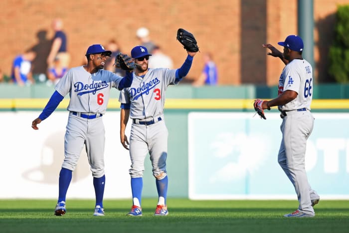
The Dodgers are currently tearing through baseball like a buzz saw, and they're doing so wearing amazing uniforms. That's always been the case for Los Angeles. The team has basically worn the same uniforms since its days in Brooklyn and don't really need to mess with perfection.
Jake Roth-USA Today Sports
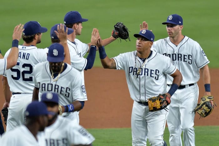
There's nothing particularly good or bad about the Padres' uniforms. They're just "there." This is the most boring uniform set in baseball today, which is a shame because they could easily switch to brown and yellow (like they do for Friday home games) and be one of the most interesting teams in baseball.
Mark J. Rebilas-USA Today Sports
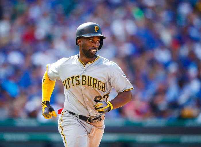
Everything about Pittsburgh's uniform just screams "classic." From the hat to the lettering to the numbering and the classic Pittsburgh black-and-gold color scheme, everything about the Pirates' look is just solid from top to bottom, and it's definitely one of the best looks in baseball.
Ron Chenoy-USA Today Sports
The Rockies are another team that can't let go of the grip of black in order to really let their identity shine. They could do a better job of utilizing purple in their scheme, but instead they stick with black that it gives them a mostly bland and unexciting look.
Brad Penner-USA Today Sports
Whether you love them or hate them, there's one thing that every baseball fan can agree on: The Yankees look good in pinstripes. Their uniforms have remained untouched for decades now, and for good reason. It's very hard to improve upon perfection.
36 of 52
Worst MLB uniforms: Special event uniforms
David Richard-USA Today Sports
For Father's Day, Mother's Day, Memorial Day and the Fourth of July, MLB decided that it would be a good idea to have every team dress up in themed uniforms. Although the uniforms raise money for good causes, that's the only good thing that can be said. Otherwise, the designs are mostly eyesores and a distraction from what is normally a good-looking league overall.
Dennis Wierzbicki-USA Today Sports
If the Yankees are the best-looking team in pinstripes, then the Cubs are second best. They also sport a lovely shade of blue as evidenced by how their caps seem to pop whenever they're hit by sunlight.
Joe Nicholson-USA Today Sports
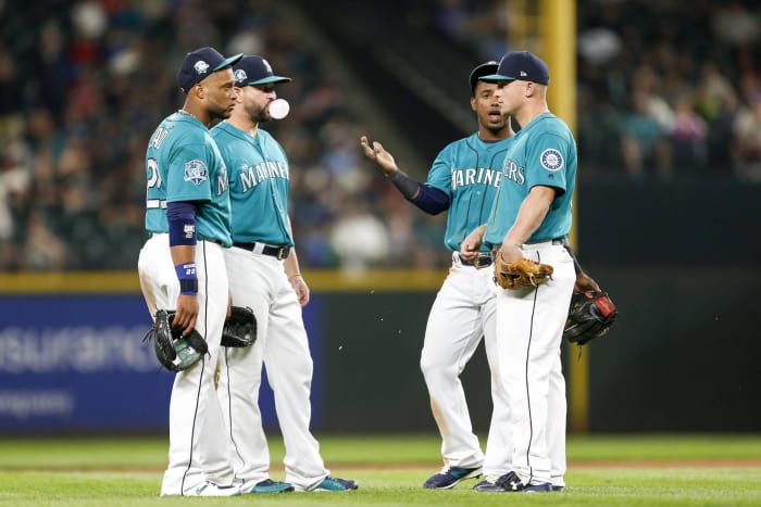
One of the teams that started off the teal craze in sports during the 1990s has stuck with it through 2017. Fortunately for the Mariners, their implementation of teal has yet to be dated, and they're still one of the best-looking teams in baseball.
Noah K. Murray-USA Today Sports
The Mets are an example of what happens when you don't use black as a crutch like the Marlins and Rockies do. They went back to their blue, orange and white color scheme, and now they have a uniform set that is very easy on the eyes.
Christopher Hanewinckel-USA Today Sports
Not only is this uniform one of the best in the NHL, but it's one of the best in all of sports. The Blackhawks have been one of the better-looking teams in all of sports, and it's good that they have a product on the ice that lives up to the quality of their excellent uniform.
Charles LeClaire-USA Today Sports
The Capitals were known for having some funky uniforms back in the 1970s, and now they're known for once again having funky uniforms in the present day as they tried to update those old uniforms. The result is a mess of piping and an awful crest logo that already looks dated even though it hasn't even been around for too long.
Eric Bolte-USA Today Sports
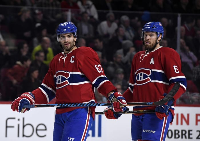
This is one of the most instantly recognizable and classic looks in all of sports. You know you've got a classic on your hands when there is a children's book centered around the classic jersey. The Canadiens have a outstanding look, and it's almost a guarantee that it will never change.
Russell LaBounty-USA Today Sports
Other than the trace of the Ohio flag in the crest logo, there's nothing in this uniform that's really special or eye-catching. It suffers from being a bit of a boring look. It's not classic enough to fall in that category, nor does it have anything especially bad going on. It's just a boring look.
Eric Hartline-USA Today Sports
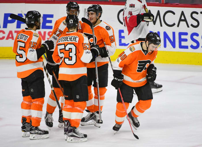
The Flyers went back to the look they had during their glory days of the 1970s, and it was an amazing idea. They have one of the most unique looks in the NHL thanks to their color scheme, and the contrasting nameplates on their jerseys instantly set them apart from the rest of the NHL. The result is a look that's classic and unique at the same time.
Sergei Belski-USA Today Sports
This uniform is a mess of piping, which is a shame because the Flames could easily go back to their uniform design from the 1980s and be one of the best-looking teams in the NHL. Instead, they stubbornly stick with this awful uniform, and they're one of the ugliest teams in the league as a result.
Charles LeClaire-USA Today Sports
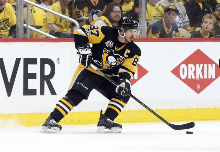
Congratulations to Pittsburgh — you are officially the best-looking city in all of sports. The Steelers have great uniforms, the Pirates have excellent uniforms and the Penguins may have the best uniforms out of all of them. There is not a single bad thing that you can say about the Penguins' uniforms, which means they have the best uniform sets in the entire NHL.
Tom Szczerbowski-USA Today Sports
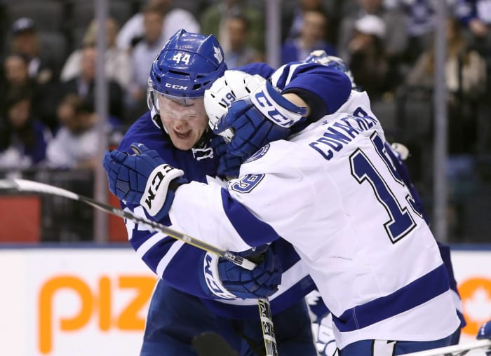
At first glance, does this image look like an intra-squad scrimmage or an actual NHL game between two different teams? If your answer was the latter, then which team is Toronto and which team is Tampa Bay? Toronto is in blue and Tampa is in white, but the fact that you had to think about it is a sign that the Lightning made a mistake when it went with a look that turned them into a carbon copy of the Maple Leafs.
Raj Mehta-USA Today Sports
The Red Wings have excellent uniforms, and they've only worn alternate uniforms on a handful of special occasions ever since they came upon their current uniform set. They may be simple, but they're elegant and definitely one of the best sets in the NHL.
Dan Hamilton-USA Today Sports
This is another example of random piping on a hockey uniform gone wrong. This uniform could be good, but instead the vertical striping just takes away from the overall look and is a detriment to Ottawa's visual identity.
Jeff Curry-USA Today Sports
The Blues made the wise decision to dump their wacky piping from the mid-2010s and have had one of the best looks in the NHL ever since.
Brad Penner-USA Today Sports
All of the Original Six teams in the NHL have solid uniforms, and the Rangers are no different. Their royal blue is great and matches well with the shade of red on the pants. As a result, the Rangers are a very good-looking hockey team when it comes to their uniforms.
Jerome Miron-USA Today Sports
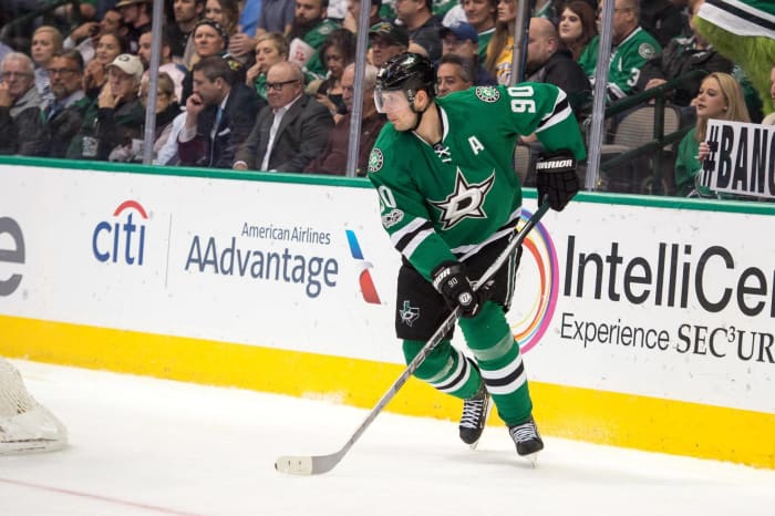
The Stars recently adopted a brilliant shade of green as their main color, and that's arguably the best part of their visual identity. They came up with solid uniforms to complement the color as well, and the Stars now have a look that may be the best that they've had since their days in Minnesota.


 +
+