There probably isn't a sports league with more loyalty to old uniforms while also seeking modernity than the NFL. There's a little something for everyone.
However, it does make it difficult to rank each uniform. Even in NFL fashion, there's a lot of subjectivity.
Fair warning: I'm a sucker for the old, classic looks, but I did my best to give some of the newer, modern-looking uniforms their fair standing too. It's also worth noting that while all uniform combinations were considered, my grading scale was mostly based off each team's primary home uniform.
Without further ado, here are all 32 NFL uniforms ranked from worst to best:
Kim Klement-USA TODAY Sports
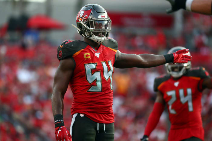
The Buccaneers have completely rebranded their uniforms multiple times, and they still haven't gotten it right. Part of it is the color scheme, as mixing pewter with red and orange just doesn't produce great results. Don't be surprised if Tampa Bay rebrands its uniforms again within the next decade.
Orlando Ramirez-USA TODAY Sports
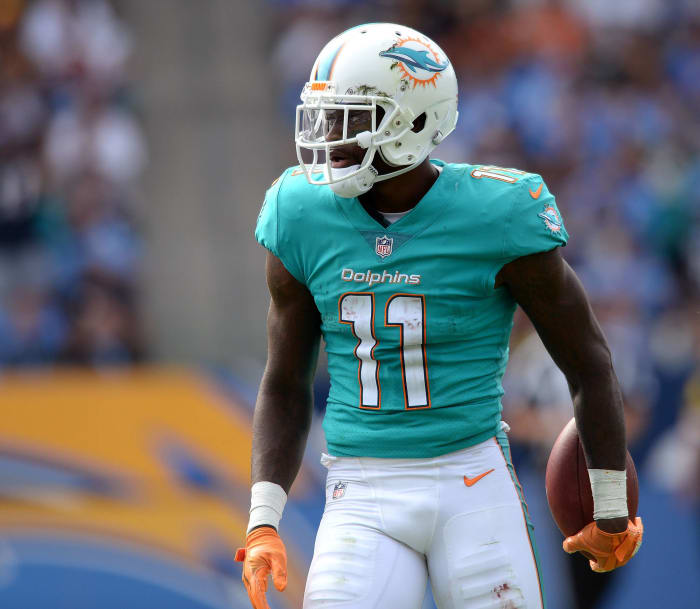
There's a reason the Dolphins have been wearing their retro uniforms more and more often. For one, they are sweet, but secondly their 2019 look isn't. Teal and light blue usually produce a great look, but taking away the stripes on the sleeves makes the jersey too plain, and the "newer" dolphin logo doesn't strike nostalgic feelings like the older logo does.
Jerome Miron-USA TODAY Sports
As I said in the intro, I'm a traditionalist when it comes to jerseys and uniforms. Having said that, the Giants have the worst of the more traditional-looking uniform. Their sleeves have no stripes or logo, giving the whole jersey a dull look. The off-gray pants are arguably even worse.
Christopher Hanewinckel-USA TODAY Sports
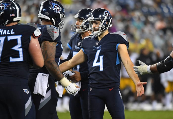
The picture on the side is of the Titans' color rush uniforms. The team's primary uniforms are the same jersey with white pants, which does look a little better, but the jersey has weirdly placed blue, gray and silver stripes. Similar to the Giants, why introduce the gray at all? There are too many colors.
Kevin Jairaj-USA TODAY Sports
If the Jaguars returned their teal jerseys to the primary uniform (unless they somehow messed it up like Miami), then Jacksonville would be much higher on this list. Instead, the Jaguars try to combine black and blue together, which few teams can pull off. Without any stripes, the pants are also too plain. But at least they got rid of the black-and-gold helmets.
Jeremy Brevard-USA TODAY Sports
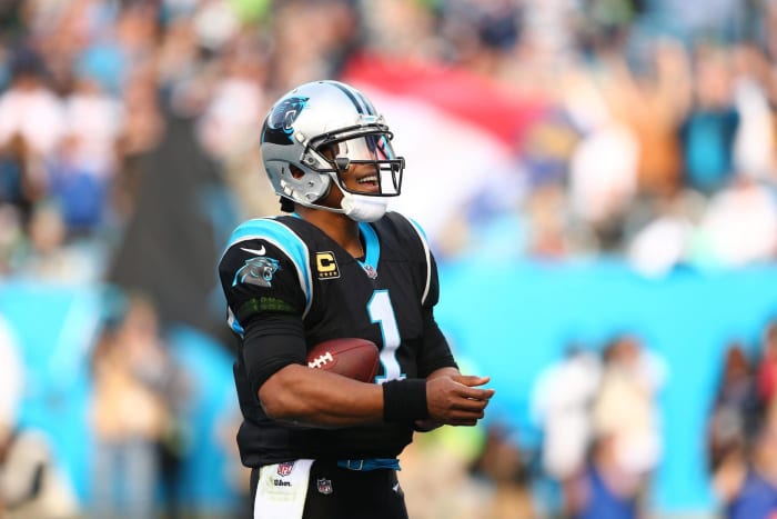
Here's another example of black and blue failing to go together. Sports fans associate cool jerseys with the color black, so it's natural for organizations to try and capitalize on that. But it doesn't work for teams that don't actually have the color black in their schemes. Carolina has a home alternate uniform that's panther blue (worn in Week 2). That's the jersey the Panthers should wear all the time.
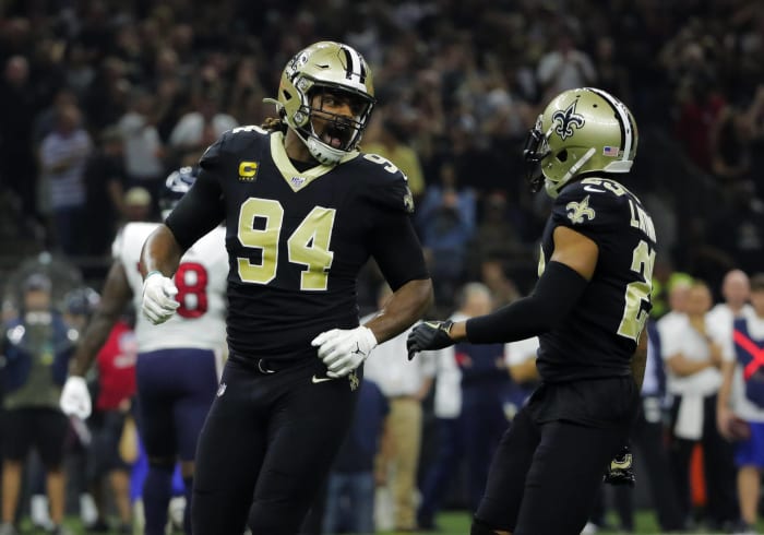
Derick E. Hingle-USA TODAY Sports
If the Saints wore gold pants all the time, this would be a nice look. Instead, they've switched to often wearing black pants with no stripes. There's actually no stripes whatsoever on the uniform. At least black is in their color scheme, but the uniform is too dark.
David Butler II-USA TODAY Sports
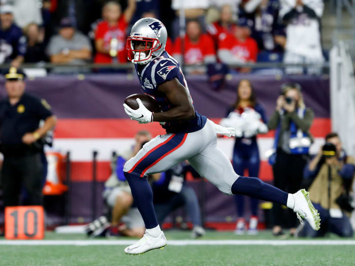
This is the only time you'll see the Patriots ranked this low in anything. Again, the color scheme is a problem, as the Patriots are supposed to be representing early Americans and yet that dark of a blue is not one of the country's colors. Furthermore, the logo has become so synonymous with winning, that we don't give the Patriots enough criticism for how poorly designed it really is.
Mark J. Rebilas-USA TODAY Sports
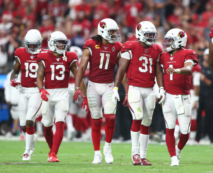
There isn't necessarily anything bad about these uniforms, but nothing sticks out as great either. The white helmet works for the Dolphins, but it's not quite as effective in the desert. Like some of the other previous jerseys, the Cardinals jersey has weirdly placed stripes, but at least they stick to red and white.
Brett Davis-USA TODAY Sports
Similar to the Dolphins, the Falcons seem to be wearing their superior retro all black uniforms more often. But the team's current primary home jerseys aren't bad. There are some unusual placed stripes, but it at least works for the home uniform.
Ken Blaze-USA TODAY Sports
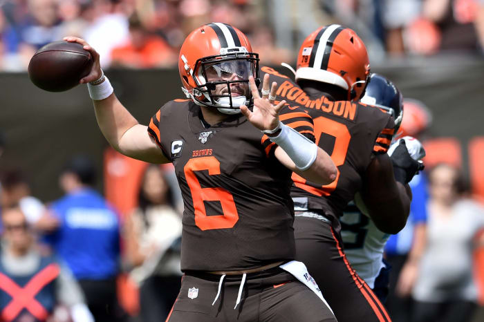
The uniforms pictured on the right actually aren't bad. It would look better with orange or white pants, but I don't have an issue with brown uniforms (particularly since that's the name of the team). The Browns lost points for their alternate uniforms, though, which are right up there with Tampa Bay as some of the ugliest in the league.
Troy Taormina-USA TODAY Sports
These are pretty sharp for a non-classical look. The Texans have the sleeve stripes above the numbers, which is unusual, but it works well. The red and navy blue go well together, along with the white pants supported with one main stripe.
Isaiah J. Downing-USA TODAY Sports
As far as the modern-looking jerseys go, the Broncos have one of the better ones in the league. The switch to the primary orange jersey was a bit jarring at first, but Peyton Manning and Von Miller made them look good, and it brings back memories of the "Orange Crush" defense. The stripe down the side curves inward, giving the pants a unique feature as well.
Tim Fuller-USA TODAY Sports
The Lions color rush silver uniforms are some of the ugliest in the league, but their home uniforms are about average. The rebranded Lion from a few years ago gave the logo new life, and the uniform introduces a modern look while remaining relatively loyal to the franchise's history.
Eric Hartline-USA TODAY Sports
Here's another case where I would prefer a team return to its retro jerseys and/or color. The newer-looking eagle wings are fine, but the Kelly green jerseys are just awesome. The darker green works as well, as long as the Eagles keep black out of the uniform (other than a couple of stripes).
Steve Mitchell-USA TODAY Sports
Like the Eagles, the Ravens have introduced too much black into their uniform at times — even supporting a black jersey, black pants look — but the primary Ravens uniform is solid. The Ravens have somehow incorporated three different logos (on the helmet, sleeves and hips), and yet the uniform doesn't look "too busy."
16. Washington Redskins
Brad Mills-USA TODAY Sports
Washington loses some points for terrible retro uniforms, but the team's primary home and away uniforms are good. The burgundy and gold mix well together, and the uniform features the right among of stripes on the pants and helmets.
Vincent Carchietta-USA TODAY Sports
The Jets have the newest uniforms in the league, and while they may drop slightly on this list after the novelty wears off, they look sharp. It's modern-looking without it breaking away too much from the franchise's history. However, I was not a fan of the all-black alternative look the Jets went with recently on "Monday Night Football." Again, teams without black in their color scheme can't pull off the black-out.
Ben Ludeman-USA TODAY Sports
These uniforms are a few years old, but similar to that of the Jets, the Vikings possess a modern look without breaking away from the team's history. The two stripes on the sleeves and down the pants are subtle yet avoid it from looking plain, and the introduction of the color yellow is a nice touch.
Jeremy Brevard-USA TODAY Sports
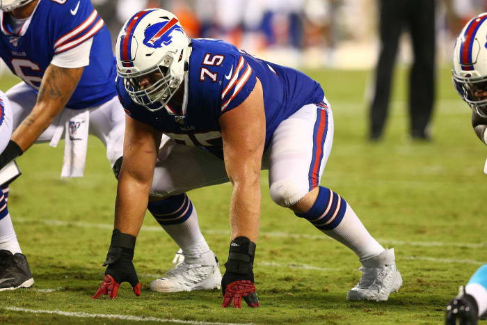
I'm still a bigger fan of the Bills uniforms from the Jim Kelly era, especially when it comes to the helmet, but these uniforms are so much better than the ones from the Drew Bledsoe days. Blue and red obviously go well together, and the Bills uniform has beautiful stripe coordination. The helmet would be better if red, but the logo and stripes are big, taking away some of the blank space.
David Kohl-USA TODAY Sports
The Bengals could probably be viewed as trendsetters for the more modern-looking uniforms of the last 20 years. I can certainly do without the ugly shoulder bar on their away jersey, but the home uniforms are sharp. There isn't another uniform in the league that better epitomizes a team's nickname, especially with the helmet.
Jim Brown-USA TODAY Sports
One could accuse the Colts of looking too plain, but the uniform is classic, especially the logo. The Texans may have copied their stripes above the numbers on the sleeves from their division rival. But Indianapolis hasn't changed these uniforms in years, and they don't need to.
Steven Bisig-USA TODAY Sports
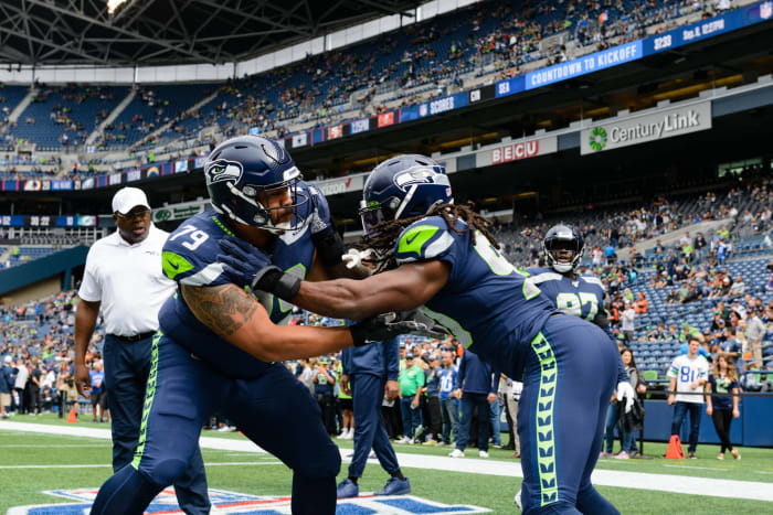
The Seahawks take all of what the Cardinals, Falcons and Titans want to achieve with their uniforms and place those elements together very well. It helps that the dark blue jersey and pants mixed with the neon green just looks and feels like Seattle.
9. Oakland Raiders
Kyle Terada-USA TODAY Sports
The Raiders could easily be in the top five on this list, but similar to the Colts, I dropped them slightly because the uniform is rather plain. That doesn't mean it needs to be updated, though, because the Raiders have made silver and black famous during their 60 years of existence.
Quinn Harris-USA TODAY Sports
Here's another uniform that's changed very little over the years. The Bears have occasionally tried to work more orange into their color scheme, but it looks better with just subtle notions of orange in the stripes. No need to ever overhaul this look.
Jeremy Brevard-USA TODAY Sports
This Rams uniform to the right could easily be in the top five. They fall just short of that here because their away uniform, which they wore in Week 2, is below average. This is supposed to be a "transitional phase" for the Rams uniforms, though, as they move into their new Los Angeles home. If the road uniform is redesigned for next year after their new stadium opens, the Rams uniform could be among the best in the league.
Geoff Burke-USA TODAY Sports
A lot of Americans hate the Dallas star, but it's certainly a classic look and maybe the most famous logo in the NFL. The Cowboys usually wear white uniforms with silver pants, but occasionally, like in Week 2, the opposing home team will wear white just to force the Cowboys to break out their navy jerseys. That's all right because those are pretty sharp too.
5. San Francisco 49ers
Stan Szeto-USA TODAY Sports
The 49ers color usage is excellent, as it allows the uniform to feature a gold theme that obviously connects with the nickname. The red jersey with white and red stripes on the sleeves and pants really works nicely together as well. Another classic look that doesn't need updating.
Philip G. Pavely-USA TODAY Sports
The Steelers have featured some downright terrible alternate uniforms over the last decade, but they finally got their alternative uniform somewhat right with the all-black color rush. At least they got it right to the point where Pittsburgh can stay in the top five on this list. The Steelers primary uniforms are some of the best in the league, as they feature all the usual tropes from the classic look.
Jake Roth-USA TODAY Sports
If the Chargers used their "powder blue" color on all of their uniforms, they would be No. 1 on this list. With the home jersey version displayed on the right, they slot in the top three. Rather than stripes, the Chargers have lightning bolts on their sleeves, giving their "powder blue" look a unique feature. The bolt is also on the side of the pants along the stripes. The yellow gloves are a nice addition to the look too.
Reinhold Matay-USA TODAY Sports
I warned readers I was a sucker for classic looks. The Chiefs sometimes wear all red, which definitely isn't the best of looks, but their primary uniforms are some of the best in football. The Chiefs' bright red really pops, especially next to the subtle yellow included on the sleeves and pants stripes. The white pants nicely contrast with the red jersey and helmet too.
Joshua Clark/USA TODAY NETWORK-Wisconsin via USA TODAY Sports
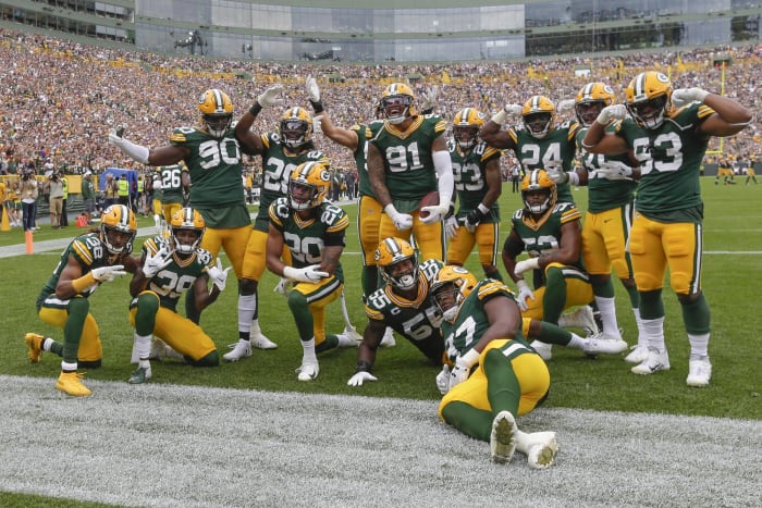
It's hard to find a better uniform than what the Packers wear. The green and yellow fit well together, especially with the green jersey sandwiched between the yellow helmet and pants. This works even better when the players wear green socks. The helmet, jersey and pants feature the consistent, classic stripes look too. There will never be a reason to change this uniform, and the Packers should never wear any ugly retro uniform ever again.


 +
+
