-

-


Follow Us
-

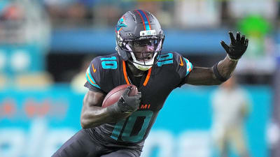
The Tennessee Titans are entering a new era this week. On Thursday, March 12, they'll unveil a brand overhaul to a packed house of season ticket holders at The Pinnacle in downtown Nashville. This event will showcase their new logo and uniform designs, which A to Z Nashville reported on February 14th.
We already know what the new logo looks like. We know there will be new uniforms. We know that the brand is leaning into "Titans Blue" which includes moving away from navy helmets. All of these details can be found in our original report.
But what we didn't know for sure was what the helmet looked like; until now. Here's what to expect from the Titans' new helmets, as well as a new detail about the jerseys that gets to the heart of what the Titans want this rebrand to mean for fans.
Titans new helmet and facemask color combination
Sources tell A to Z Sports that the Titans' new helmet will be white with a white face mask, embracing a color combination never before seen in franchise history.

The Houston Oilers sported grey facemasks from 1960-1980 before switching to red. Then the Titans wore navy facemasks on their white helmets and grey on their navy helmets.
A white shell was a popular guess once we knew the jerseys would be primarily light "Titans Blue" with red and white accents, featuring less navy. But a white facemask on a white shell is a new look entirely.
New "Tennessee" wordmark emblematic of a conscious unifying effort
Another new detail that sources have confirmed to A to Z Sports is that the wordmark on the breastplate of the jersey will be "Tennessee". This has been "Titans" since the team rebranded from the Tennessee Oilers in 1997.
It's a small touch that's a part of a larger effort. Sources say the organization put very serious intention into blending the history of the Oilers and the Titans. The rebrand will embrace the entire state of Tennessee for which they are named, while also paying tribute to the Music City.
When the Titans moved to Nashville and changed everything including their team name, the focus of the organization was to firmly establish their brand identity. They were the Titans of mythology, named for the city of Nashville's historical nickname "the Athens of the South". Today, the organization seems to be using this rebrand opportunity to put as much effort into wrapping their arms around the whole state that they represent. They're emphasizing being the Tennessee Titans, not just the Titans.
You can feel this in their new logo, which more directly reflects the circular tri-star symbol that defines the state flag. Changing the wordmark on the jersey is just one of a handful of ways in which the team is trying to be as intentional as possible when it comes to representing all Tennesseans, hopefully endearing themselves to more fans than ever.
Inaccurate mockups run wild across social media
Whenever teams design new uniforms, social media runs wild with fan theories and concept art. As the release date nears, internet detectives are on the lookout for leaks of any kind. With modern technology, anybody with an internet connection can make their vision come to life in the form of a fake leak.
Clearly Titans fans are thirsty for this new era of Tennessee football, and the excitement around this rebrand is reaching a fever pitch. Our sources seem confident that Titans fans will be pleased by what the organization is revealing this week.
More must-reads:
- Travon Walker's contract extension could be long-term steal for Jaguars
- Insider shares notable update on Shedeur Sanders' status with Browns
- The 'Rushing-TD leaders by NFL team' quiz
Breaking News
Trending News


Customize Your Newsletter
 +
+
Get the latest news and rumors, customized to your favorite sports and teams. Emailed daily. Always free!

PRIVACY POLICY COOKIE POLICY CONTACT US
ABOUT YARDBARKER TERMS OF SERVICE
By using this site, you agree to our Terms of Service and Privacy Policy.
This site is for entertainment purposes only.
There is no gambling offered on this site.
Gambling Problem? Call 1-800-Gambler.