After some questionable decisions in the late 1990s and into the 2000s, the NFL is on a uniform upswing. But many pivotal fashion changes have occurred throughout the league's history. So which ones worked and which didn't? Here is a primer on the history of uniform changes.
1 of 31
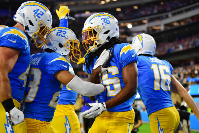
Los Angeles Chargers, 2020
Gary A. Vasquez-USA TODAY Sports
Another team that undid a 1990s or 2000s mistake, the Chargers may have done the best job correcting theirs. Ditching a bland look that comprised most of Philip Rivers' career, the Bolts dropped this gem on the football world shortly after the Rivers-to-Justin Herbert transition. Leaning all the way into the powder blue kits they used to tease the masses with, the Chargers — from the gold facemask to the old-school helmets to the lightning-bolt stripes — display a perfect blend of their color scheme. The Bolts do not break out the sublime blue-on-gold look quite enough, but when they do, no team outshines them in the modern NFL.
2 of 31
Cleveland Browns, 2020
Jeff Lange via Imagn Content Services, LLC
When the Browns rebooted in 1999, the orange pants remained in storage. After five years of dreadful uniforms comprised the late 2010s, the organization smartly did whatever it could to curry favor with a fanbase scorned for football quality and uniform design. That meant the Brian Sipe-era brown-on-orange presentation's reemergence. The Browns going back to their roots via the brown-on-white home kit or the storied all-white road attire brought a vital correction. But when the orange pants from the tunnel, Cleveland resides among the uniform elite. It took a wayward journey to get here. Not coincidentally, the Browns snapped a 17-season playoff drought in 2020..
3 of 31
Los Angeles Rams, 2017
Troy Wayrynen-USA TODAY Sports
Including the Rams seems polarizing, but this is not an indictment on the franchise's 2017 decision to redeploy its throwbacks. That lookback was exquisite. But the Jim Everett-era unis took care of only half the Rams' schedule, and perhaps no team in NFL history featured a greater disparity between the quality of its home and away uniforms than the recent Rams. The team bizarrely ditched the gold ram helmet that matched these unis, replacing it with the way-old-school white ram design. This left the team a misshapen mess, aesthetically, away from L.A. This lasted three years.
4 of 31
Detroit Lions, 2017
Raj Mehta-USA TODAY Sports
Making a badly needed adjustment, the Lions finally ditched the unnecessary black that was central to their Megatron-era color scheme. Detroit's ill-fated black-outlined uniforms, perhaps justly, overlapped with the worst stretch in franchise history. The Lions' logo-less helmet throwbacks are classics, and their Barry Sanders-period kits did not get their due. Detroit's current design resembles a modern version of that '90s look, accentuating the silver for which the franchise is known. This is one of the better-looking active uniforms.
5 of 31
Cleveland Browns, 2015
Timothy T. Ludwig-USA TODAY Sports
Not all of the Browns' bevy of late-2010s options were reprehensible. Their brown-on-orange and white-on-orange combinations somewhat masked this ill-fated update's flaws, but when the team used its brown or white pants, it was a tough watch. The Browns tried too hard here. The 2015 redesign's numbers and the bizarre "BROWNS" pants placement interrupting a stripe formed a shaky creative conclusion — one that apparently took three years to reach. Ownership agreed, abandoning this reboot and smartly restoring Browns Classic.
6 of 31
Seattle Seahawks, 2012
Brace Hemmelgarn-USA TODAY Sports
Perhaps it is not a coincidence the best run in Seahawks history began the year they ditched one of the worst uniform designs in modern NFL annals. (Russell Wilson surely helped, but Seattle's uniform update should not be entirely discounted.) The critical 2012 adjustment reinstalled gray as a key component, as it was during the Seahawks' uniform heyday in the 20th century. Splicing in just enough neon green, the Seahawks blend their colors together better than most. But, in large part, these are here because the football world no longer has to look at the team's aughts kits.
7 of 31
Jacksonville Jaguars, 2012
Marc Serota-Getty Images
We come to the NFL's most design-embattled team — one that pairs a poor fashion sense with indecisiveness. Not only do the Jaguars keep changing their look, but it's also arguable they never had a decent one. Jacksonville's 1990s home teals, complete with a large jaguar on them, double as the team's most passable attire. While the daring (and already scrapped) two-toned helmet endured mockery, the team's pivot to black (and a worse design scheme) earlier in the 2010s is the choice here. Not only did a Florida team wearing black at home suggest poor foresight, but the Jags did not fare well in these unis.
8 of 31
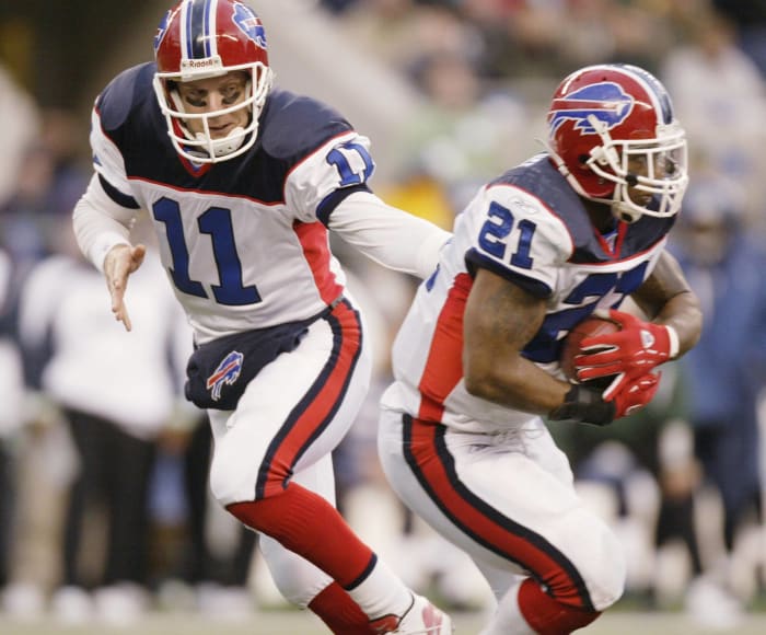
Buffalo Bills, 2011
Kevin Hoffman-USA TODAY Sports
Like the Seahawks, the Bills corrected a mistake in the early 2010s. Their move back to this vintage look could not have come at a better time. The 2010s represented an underappreciated decade for uniform adjustments; the Seahawks, Lions, Titans and Vikings did well to address issues. The Bills' current design is still one of the best in the game today, and it coincided with the end of a 17-year playoff drought and a return to hobnobbing with the NFL's blue bloods. The Bills' blue jerseys pop, and their alternate reds also stand out as upper-echelon attire.
9 of 31
San Francisco 49ers, 2009
Jed Jacobsohn-Getty Images
49ers Classic doubles as one of the NFL's iconic looks. In addition to being associated with a dynasty, it annually entrenched the 49ers as one of the NFL's best-dressed teams. The franchise drifted away from that in the late 1990s but 10 years ago smartly reverted to what worked best. These are not identical to the Joe Montana-era uniforms, the "49ers" jersey logo being an update. But San Francisco's current pants are superior to the vintage design. This was one of the savviest uniform changes in many years, and success followed.
10 of 31
San Diego Chargers, 2007
Harry How-Getty Images
This is merely a partial criticism but not an unwarranted one. There was nothing wrong with the Chargers' Junior Seau/LaDainian Tomlinson-era uniforms; these less symmetrical kits are a downgrade (although, the Bolts' all-white road attire looked better with these helmets). For two games each season, however, the Bolts featured what may have been the NFL's best uniform — the powder blue look Chris Berman swooned over. But the Chargers insisted on keeping this unspectacular navy blue as their primary for 12 years. It perhaps was not a coincidence the team became synonymous with bad luck during its run in these uniforms.
11 of 31
Minnesota Vikings, 2006
Icon Sports Wire-Getty Images
While the first Brett Favre year produced the most success any Vikings team has enjoyed this century, the Hall of Fame quarterback spent his time in Minnesota wearing the worst uniforms in franchise history. This goofy, unnecessarily complicated scheme — featuring an out-of-control, multicolored stirrup — was rightfully ditched fairly soon after it debuted. The Vikings were one of many franchises that realized its strange 21st-century deviation from a tried-and-true look missed the mark.
12 of 31
Arizona Cardinals, 2005
Eric Hartline-USA TODAY Sports
In almost identical territory, we have the look the Cardinals rolled with for nearly 20 years. With the Aeneas Williams-era kits producing scant success, other than a 1998 playoff berth and Rod Tidwell's run as a marquee mid-1990s receiver, the organization certainly had cause to make a change. But these unis are both unnecessarily complex (The late-'90s stirrup bomb still impacts the world today) and forgettable all at once. Arizona's '05 switch did not involve upgrading its bland white helmets either. Kyler Murray trashed the uniforms early in his career, and in 2023, Arizona finally ditched them — albeit for a monochrome setup.
13 of 31
Atlanta Falcons, 2003
Matthew Stockman-Getty Images
The NFL (literally) looked worse in the 2000s. Many teams made regrettable fashion decisions. Prior to an aughts update, the Falcons enjoyed a decades-long run of quality uniforms. From Tommy Nobis to Deion Sanders, Atlanta could dress. The black-red fusion did not work as well as when the franchise picked one of those colors as a clear base. The road uniforms, in particular, annoyed from this period. For all that went on with the numbers and the arm logo, the final product was quite uninspiring. The Falcons made a change in 2020, though the upgrade was modest.
14 of 31
Seattle Seahawks, 2002
Otto Greule Jr.-Getty Images
The aforementioned Seahawks misstep. If they had matched this unfortunate shade of blue with some of the gray that worked so well on their underappreciated 20th-century classics, these may not have been the fashion gaffe they were. But no, Seattle flooded screens with this horrid all-blue look for a decade. The Seahawks' welcome-to-the-NFC reboot represented a bizarre pivot in the moment, and no matter the euphoria associated with "Beastquake," these were a big mistake. All's fine on the Seattle uniform front now, but in between the Cortez Kennedy and Legion of Boom periods, we had a crisis on our hands.
15 of 31
Buffalo Bills, 2002
Otto Greule Jr.-Getty Images
Of all the unfortunate NFL fashion shifts to occur during this period, Buffalo's choice may have been the worst. The Bills did not allow Drew Bledsoe to wear what Jim Kelly did, debuting a convoluted look that doubled as the aesthetic low point in franchise history. The Bills kept their Super Bowl helmets, making for three shades of blue on one uniform. Both at home and on the road, this was a fashion catastrophe. Buffalo's hideous primary blue during most of the 2000s brought a shocking downgrade from what came before. It is appropriate these jerseys are most associated with the Bills' 17-year playoff drought.
16 of 31
New England Patriots, 2000
Boston Globe-Getty Images
Controversy. The Patriots won six Super Bowls, nine AFC titles and 17 division championships in these. They are associated with dominance. The Pats' glory years also involved worse uniforms than they utilized during most of their previous four decades. While the unis Tom Brady wore are not aughts Bills- or aughts Seahawks-level bad, they were less fun than the ones Drew Bledsoe primarily donned (which remain locked in storage) and those featuring the once-proud Pat Patriot. Rings and all, the Patriots did not live their optimal uniform life during their dynasty.
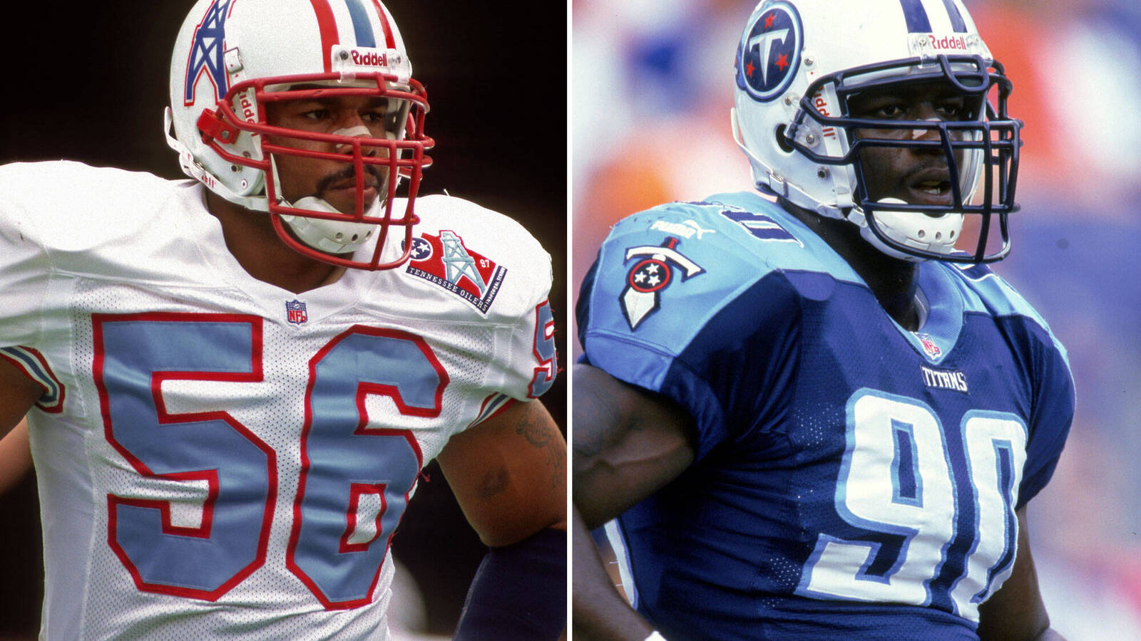
17 of 31
Tennessee Titans, 1999
Allen Kee-Getty Images
While this was a relocation-based rebrand, the Titans' initial uniform still brought a steep decline from what they utilized as the Houston/Tennessee Oilers. The franchise's third year in Tennessee ushered in unis in step with what turned out to be a bad era for NFL art. The franchise stuck with this primary look for 18 years. When considering the marvelous uniform they chose to abandon, Titans 1.0 certainly belongs on this list. The Mike Vrabel years have brought a bit of an upgrade, even though the franchise is decades removed from its fashion zenith.
18 of 31
Denver Broncos, 1997
Allen Kee-Getty Images
The NFL still feels the effect of this seismic uniform switch. The Broncos were coming off a shocking divisional-round upset loss to the Jaguars and were 0-4 in Super Bowls in the otherwise sublime scheme they used for nearly 30 years, opening the door for a radical metamorphosis. Denver sent a stirrup tornado at the football world. The NFL, college, and high school teams added them en masse. The Broncos ditched the blues as their primaries upon Peyton Manning's arrival, but the dull and orange-less whites have now been in place for 27 years. Super Bowl titles do not suddenly justify this kind of uniform regression.
19 of 31
Tampa Bay Buccaneers, 1997
Andy Lyohs-Getty Images
Early in a stretch of landmark NFL uniform alterations, the Buccaneers steered their ship as far away from Bucco Bruce as possible. Tampa Bay eradicated orange from its color scheme, and the red-pewter combination would go on to accompany the franchise's pinnacle moments. Performance issues in the creamsicle kits aside, the Bucs had boasted a stupendous (and original) uniform. Futility in those unis for most of their history brought about an unfortunate casualty. Even when the Bucs rightfully shelved their alarm-clock scheme of the late 2010s, they picked the wrong throwback to restore.
20 of 31
San Francisco 49ers, 1996
David Madison-Getty Images
The 49ers deciding to jazz up their look in the mid-1990s brought a sneaky-steep downgrade. The team had drifted from 49ers Classic, wearing throwbacks for most of its 1994 Super Bowl title season and was coming off a home divisional-round loss to the Packers. But Steve Young was forced to wear these gold-less threads — a strange choice for a "49ers" outfit — to close out his career. Jerry Rice had to both suit up in these and the 2000s Seahawks' jerseys, dishonoring the legendary receiver. With the 49ers since moving back to their premier design, it is fair to say the uniform Terrell Owens wore during his San Francisco days was a bust.
21 of 31
Philadelphia Eagles, 1985
Ronald C. Modra/Sports Imagery-Getty Images
Just in time for one of the more interesting quarterbacks to come through the NFL, the Eagles restyled their scheme. The team scrapped the massive sleeve stripes of the Ron Jaworski years and brought Kelly green into the mix. Randall Cunningham's Eagles career ran from 1985-95, the same duration of these green-on-gray uniforms. These flashy threads undeniably enhanced Cunningham's appeal. The Eagles' current home jerseys — Super Bowl appearances notwithstanding — come nowhere close to these, yet they have lasted nearly 30 years. Thankfully, the NFL loosening its rigid helmet policy reintroduced these slick throwbacks in 2023.
22 of 31
Cincinnati Bengals, 1981
Focus On Sport-Getty Images
One of the wilder changes in NFL uniform history came when the Bengals zoomed ahead of the curve with their seminal switch. It was no secret their pre-'81 unis fairly closely resembled the Browns', with Paul Brown bringing Cincinnati into the NFL fold after his revolutionary Cleveland tenure ended bitterly. (Bengals-Browns games featured some similarities for a while.) The Bengals' tiger-striped helmets — far flashier than their previous headgear — brought a new-age presentation at the time, drawing scrutiny. The Bengals, who qualified for Super Bowl XVI in these helmets' rookie season, have been the NFL's helmet kingpins for 40-plus years.
23 of 31
Los Angeles Rams, 1974
Peter Brouillet-Getty Images
This look was so good the Rams recently resurrected it. The NFC's Los Angeles franchise made the blue-and-yellow switch in the mid-'70s, a light-years leap from their practice-jersey-esque Fearsome Foursome style. The blue-and-gold combination stuck until 2000 — when the Rams introduced their sleek post-Super Bowl attire, which is now probably a bit underrated. But none of the Rams' other kits shined like their Eric Dickerson-years threads. The helmet and jersey stripes were unlike anything in the NFL at that point, and even the 2020s update remains one of the league's better looks.
24 of 31
San Diego Chargers, 1974
Focus On Sport-Getty Images
This is not a full-on knock on how the Air Coryell Chargers dressed; it just set the franchise on a course from which it took decades to recover. In 1974 the Bolts ditched powder blue — a staple of their John Hadl-Lance Alworth uniform — and did not reintroduce their still-signature jersey as a full-time alternate until the 2000s. This decision nearly 50 years ago changed the course of Charger uniform history, and although the darker blue did produce a better design in the 1990s and early 2000s, the mid-'70s marked a rather significant moment in franchise annals.
25 of 31
Pittsburgh Steelers, 1972
Diamond Images-Getty Images
Gold pants have been a staple of Steeler uniforms for 50-plus years. Few NFL teams can say they have boasted a better look than the Steelers' once they ditched the white pants for good. Pittsburgh had experimented with gold in the late 1960s but did not fully commit until 1972. The Steelers, who have been the league's most consistently successful franchise since the '72 Immaculate Reception season, have not looked back. While they stubbornly resist a double-logo helmet, the Steelers present a classic look — albeit with italics infiltrating the design over the past two decades — that is tough to beat.
26 of 31
Washington, 1970
Nate Fine-Getty Images
Did Washington miss an opportunity? This is probably the minority opinion, but is it impossible, in an alternate universe, to have seen these becoming a flagship NFL uniform? These may look a bit too collegy for some, but Washington wearing them for only two years — cutting bait before its 1972 NFC title season — seems like a rash decision. The yellow helmets — with a less problematic logo compared to what followed — combined with a superior red shade are a hidden gem in NFL history. They have not been included in Washington throwback games, which is a shame. The modern public should at least have a look at what could have been.
27 of 31
Denver Broncos, 1968
Focus On Sport-Getty Images
One of the biggest uniform jumps in pro football history occurred in 1962 when the Broncos moved on from their one-of-a-kind brown/yellow look (one you may remember from the 2009 season involving AFL throwbacks) to orange. But that mid-'60s design, which displayed a much wilder horse on the helmet, did not last. It gave way to the team's premier uniform — arguably the preeminent use of orange in American professional sports. The Broncos rode this Orange Crush scheme for nearly 30 years and have turned back to it on recent Color Rush occasions, albeit with a bit of Clemson influence.
28 of 31
Dallas Cowboys, 1964
Focus On Sport-Getty Images
The 1994 Cowboys made the team's original look, the four-star concept, somewhat fashionable. But come on. One of sports' most important uniform changes took place prior to Tom Landry's fifth season in Dallas. The simpler blue/silver design became one of American sports' signature appearances and has remained such from Don Meredith to Dak Prescott. Although the Cowboys have tampered with their royal blue look — which is not as bad as the sparse usage suggests — the fact they rarely don those illustrates how revered their classic uniform became.
29 of 31
Oakland Raiders, 1963
Focus On Sport-Getty Images
The Raiders have done well to hide this, but their first three years did not involve silver and black. Gold was originally included in the Raiders' color scheme. Sounds impossible, and no color photographic evidence is readily available, but it happened. Oakland's 1963 concoction proved vital. The NFL would be a less fun place without the Raiders' trademark silver and black. Even their silver numbers on most of their 1960s away uniforms, which were revived during throwback weeks, would be a top-tier look if the franchise decided to bring it back.
30 of 31
Chicago Bears, 1962
Focus On Sport-Getty Images
Credit the Bears for resisting the urge to make a major change. While both the Lions and Vikings succumbed, the Bears have kept their classics for more than 50 years. The Chicago "C" appeared on Bears helmets for the first time in 1962, and a year later the franchise won an NFL title. This timeless look is nearly perfect, with the Bears getting in their own way whenever they deploy one of their lesser-refined throwbacks each season. The team improved on its standard further when it incorporated the blue pants with white jerseys in 1984 — the start of the Bears' modern-era apex.
31 of 31
Green Bay Packers, 1961
Focus On Sport-Getty Images
The Packers formed their hallmark uniform combination in 1961 and then promptly won five NFL titles in seven seasons. While minor tinkering occurred between Vince Lombardi's third season and present day, the Green Bay uniform has gone mostly unchanged over the past 62 years. Good thing, because this franchise has some unpleasant throwback options. Like the Cowboys' white jerseys, the Packers' greens — although, their away-from-Green Bay white-on-gold look is not far off — double as one of the iconic images associated with the NFL.


 +
+