Ever since the mid-1970s, thanks to expansion and relocation there has been a a steady shuffle of NHL teams across the league. The Vegas Golden Knights are the new kids on the block, but how does their inaugural look compare to the inaugural looks of other newcomers to the NHL?
Bruce Bennett Studios/Getty Images
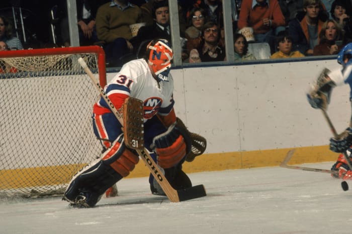
Following the NHL's first major expansion after the Original Six period, the New York Islanders became the Rangers' noisy neighbors. They started out with a look that eventually underwent slight tweaks to become the signature look of the team's days as a dynasty. The Islanders abandoned the look in the 1990s and 2000s but eventually returned to a very similar look.
2 of 27
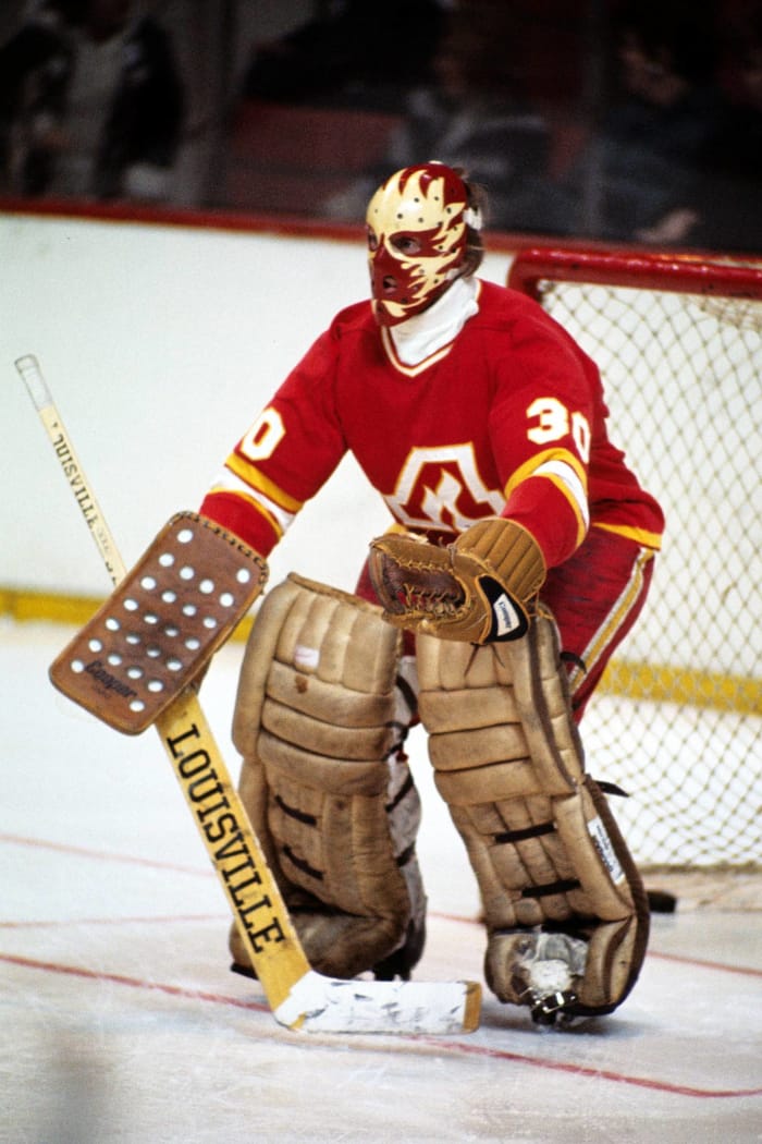
1972: Atlanta Flames
Steve Babineau/NHLI via Getty Images
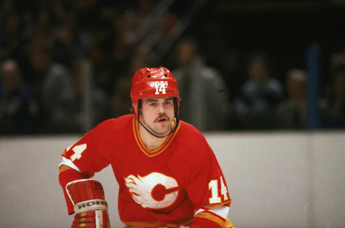
Atlanta's first crack at NHL hockey came in the form of the Flames. The nickname was clever when you consider Atlanta's role in the Civil War, and the uniforms were solid as well. They were definitely emblematic of the style of the 1970s.
Bruce Bennett Studios/Getty Images
When the Flames made the move up North to Calgary, they kept the same uniforms for the most part, with the only change being a flaming "C" replacing a flaming "A." In a perfect world that still includes the imperfections of relocating sports teams, this is how this type of transition should go, and fans are still clamoring for the team to return to this look.
B Bennett/Getty Images
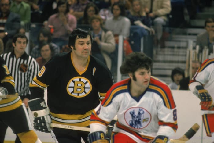
The Capitals entered the NHL's fray in the mid-70s and did so with patriotic uniforms that the team's current look is based on. They also entered the league with white pants, which was a disastrous experiment that the team quickly ditched. As usual for expansion teams, the Caps were a laughingstock in the early days and they didn't need to add insult to injury with the ridiculous white pants.
5 of 27
1974: Kansas City Scouts
Bruce Bennett Studios/Getty Images
The Kansas City Scouts joined the Caps in 1974, but they wouldn't be long for this world before moving to Colorado. The good news is that they left behind some good looking uniforms, so at least they didn't look like a joke during their brief time in the league.
B Bennett/Getty Images
Lucky for Colorado, the color scheme that they inherited from Kansas City just happened to match the state flag of Colorado. As such, they didn't have to change too much about the uniforms -- other than the logo and a few other tweaks. Once again, Colorado wouldn't be long for the NHL and it would be a while before the league returned.
Graig Abel Collection/Getty Images
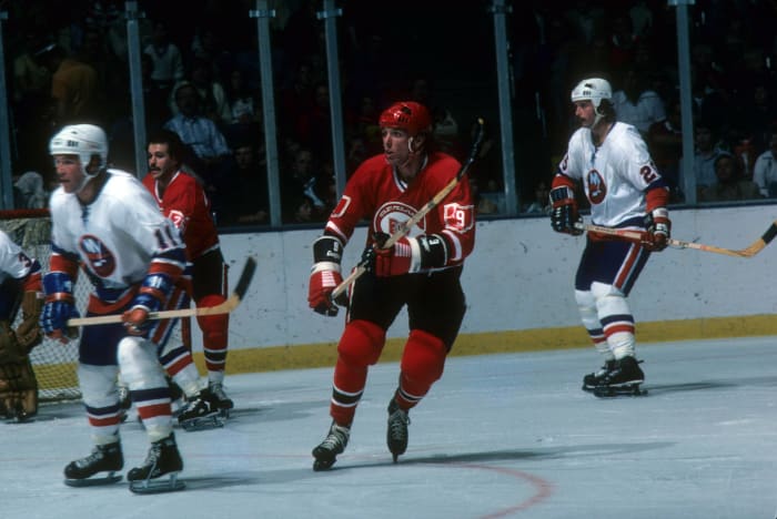
The Rockies moved to New Jersey in the early 1980s and that's where they reside to this day. The Devils may be known for red-and-black nowadays, but they had a look that invoked memories of Christmas during their first days in the swamp. It's actually a good look, but the Devils didn't win much while wearing these so it's not exactly fondly remembered.
8 of 27
1976: Cleveland Barons
B Bennett/Getty Images
The old California Golden Seals decided to move to Ohio to become the Cleveland Barons. Congratulations if you knew that this happened, because you're either an astute historian of the NHL or you have an incredible memory. The Barons only lasted two seasons before merging with the Minnesota North Stars, and their inaugural uniforms included the state of Ohio serving as an outline for their sleeve numbers.
B Bennett/Getty Images
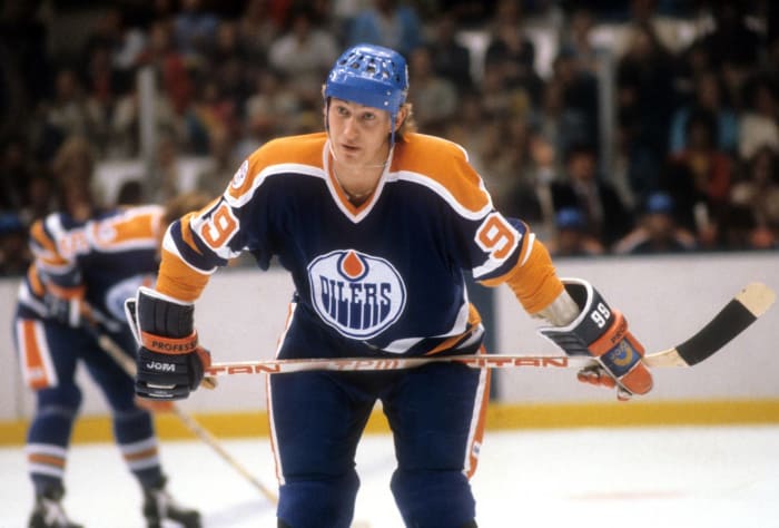
The World Hockey Association merged with the NHL in 1979, which meant that the NHL ended up adding a handful of new teams into their fold. Every WHA team switched up their look a little for their arrival into the new league and the Oilers took on a look that would be synonymous with their Dynasty era in the 1980s.
10 of 27
1979: Quebec Nordiques
Denis Brodeur/NHLI via Getty Images
The Oilers went on to have massive success as an NHL team, but the same couldn't be said for the other three WHA arrivals. The other three teams basically served as fodder for the NHL's best teams, but at least the Nordiques had an interesting look that managed to last for two decades before they moved.
11 of 27
1979: Hartford Whalers
Denis Brodeur/NHLI via Getty Images
This was probably the best uniform period for the Whalers, as they embraced their shade of green and adopted blue as well. This was also when they came up with their crest logo, which is one of the best usages of negative space that you will ever see on a sports logo.
Bruce Bennett Studios/Getty Images
When the Jets entered the NHL in 1979, they bore a striking resemblance to the New York Rangers during the mid-70s. That's because the GM of the Rangers at the time liked the look (which he designed) so much that he ported it over to the Jets when he took on the GM job at Winnipeg. Other than the crest and the pants striping, they're basically the same look.
B Miller/Bruce Bennett Studios/Getty Images
After things calmed down a bit during the 1980s, the NHL had another boom of expansion and relocation in the 1990s. It all started with the San Jose Sharks, who helped pioneer the explosion of teal into the American sports scene with their unique look.
B Bennett/Getty Images
The capital city of Canada made its return to top-flight hockey after an incredibly long layoff, and they did so with a pretty solid look. The white uniform that the team wore with this uniform in their inaugural season in 1992-93 actually lasted until 2007. The Senators really got a lot of mileage out of this initial look.
345N /ALLSPORT/Getty Images
Florida got their first taste of the NHL in 1992 when the Lightning entered the league. Just like the Senators, Tampa Bay got plenty of mileage out of this look by staying with it (with minor tweaks every now and then) until 2007. They even won a Stanley Cup while basically wearing this very design, so this look definitely holds a special place in the eyes of their fanbase.
Focus on Sport/Getty Images
South Florida got in on NHL action as well with the debut of the Florida Panthers in 1993. The team started out wearing a brilliant shade of red, and thankfully the team has returned to that shade of red with their new identity.
17 of 27
1993: Mighty Ducks of Anaheim
Al Bello/Getty Images
The explosion of teal in sports continued with the introduction of the Mighty Ducks of Anaheim in 1993. Yes, that was the team's official name since Disney was the owner of the team back then and it's quite obvious where they got the name from. The uniforms themselves actually weren't that bad and the crest logo was actually recolored and used on one of Anaheim's recent alternate uniforms, so the logo still managed to live on despite losing the connection to Disney.
Rick Stewart /Allsport/Getty Images
In 1991, the Minnesota North Stars updated their identity and that included logos and uniforms that didn't have the word "North" anywhere in the set. If you're a cynic, you'd say that this was a precursor to the team making their move to Dallas to become simply the Stars as simple as possible. All they did when they moved to Texas was add Texas state logos to the jersey and the city's name to the pants. Ah, the cruel efficiency of shameless relocation.
Denis Brodeur/NHLI via Getty Images
Speaking of painful relocation, imagine what Quebec Nordiques fans had to deal with as they watched their old team relocate to Colorado and win the Stanley Cup in their first season in their new town? For what it's worth, the Avalanche wore some very good uniforms during their first days in the Rocky Mountains. It's a look that they shouldn't ever have abandoned and have fortunately returned to with the league's move to Adidas as a uniform supplier.
20 of 27
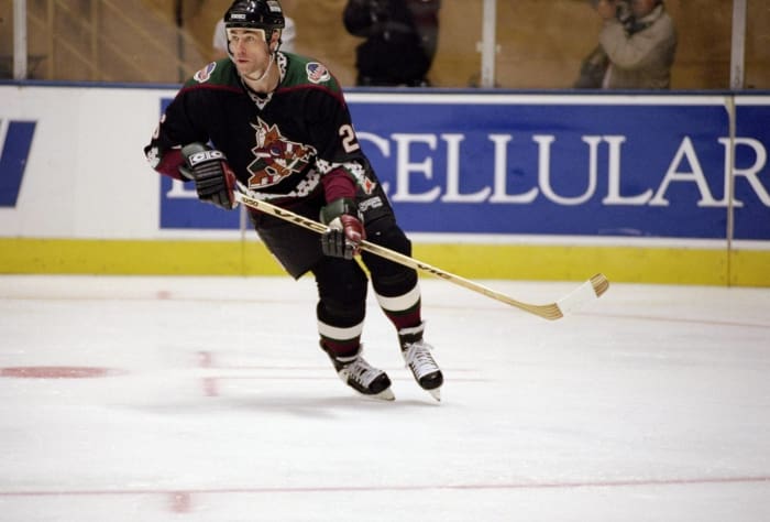
1996: Phoenix Coyotes
Elsa Hasch /Allsport/Getty Images
Winnipeg was the next former WHA city to have their NHL leave for a warmer climate, as the Phoenix Coyotes became the next Sun Belt team on the NHL's map. The best thing you can say about these uniforms is that it definitely fit the idea of what you'd expect a hockey team from Arizona to look like during the 1990s. The logo was big and gaudy and the striping pattern was unlike anything we've seen in the NHL, but it fit right in with everything else that was going on in sports at that time.
John Giamundo/Getty Images
The former WHA's three-year relocation period ended with the Hartford Whalers going down to the Carolinas to become the Hurricanes. Fortunately for Carolina, the look that they came up with back then is one that they've stuck with for the most part during their existence as a hockey franchise.
Elsa Hasch /Allsport/Getty Images
After a spate of relocations, the NHL continued their actual expansion into the South by awarding Nashville an expansion team. The Predators may be known for their mustard-gold home jerseys now, but they broke into the league as another team who went with navy blue as their dominant color.
23 of 27
1999: Atlanta Thrashers
Rick Stewart /Allsport/Getty Images
A year after Nashville entered the league, Atlanta followed suit with the Thrashers. Just like the Predators, they started out as a mostly navy-blue team before evolving into a team that embraced powder blue. Unlike the Predators, they weren't long for this world and would be gone before even making it 20 seasons.
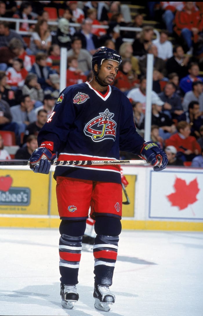
Tom Pidgeon /Allsport/Getty Images
For the third straight season, the NHL expanded and in 2000 they added two teams. The Blue Jackets have kept their color scheme, but I think that everybody is grateful that they've evolved their logos in the time since they entered the league as an expansion team.
Kellie Landis/ALLSPORT/Getty Images
Minnesota returned to the NHL in 2000 and like their predecessors, they embraced green in their color scheme. If you were a fan of the Wild wearing green as their primary color back then, you're probably happy now since the team has gone back to wearing green as their main color.
26 of 27
2011: Winnipeg Jets 2.0
Lance Thomson/NHLI via Getty Images
Atlanta's second loss of an NHL team was Winnipeg's team, as Manitoba got the NHL back when the Thrashers were abruptly sold and moved to Winnipeg. There were actually rumors that the ownership would just promote the Manitoba Moose identity from the AHL to the NHL, but there is no way that you can have the NHL in Winnipeg and not have them known as the Jets. So that's why we have what is an interesting update of the Jets identity today.
27 of 27
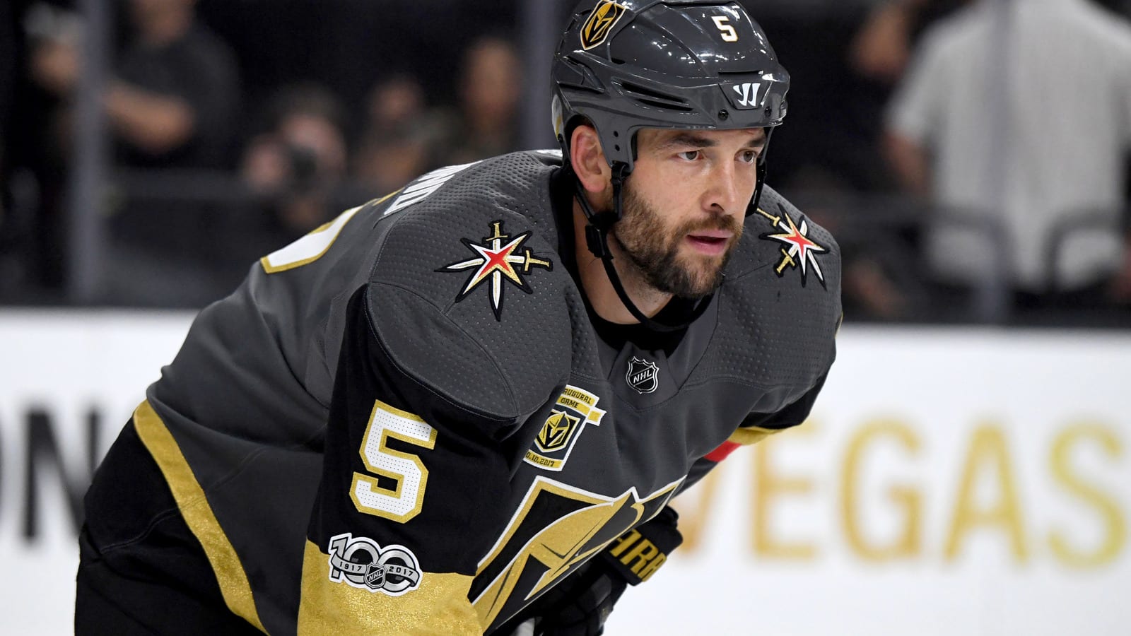
2017: Vegas Golden Knights
Bruce Bennett/Getty Images
All of the relocation and expansion eventually brought the NHL to Las Vegas of all places, where Sin City now has a major league sports team of their own to root for. When it comes to inaugural looks, the Golden Knights have an extremely solid look that should serve them well for a very long time. With that being said, if there's anything you can take from this list, it's that we may not have to wait long for some sort of change to happen when it comes to the new kids on the block.


 +
+