-

-


Follow Us
-


It’s Halloween, which seems like the perfect time to talk about costumes. Or, as they’re referred to in hockey, jerseys.
The Vancouver Canucks have, somewhat infamously, worn a lot of different jerseys in their roughly 55 years as an NHL franchise. From the original blue-and-green stick-in-rinks to the various variations of black, red, and yellow, and then mostly back again, with several one-off stops in between.
It’s a somewhat unique phenomenon in this sporting league in particular. And it’s something that fans of the team have named as the source of a potential identity crisis. After all, the Canucks are already in the midst of an injury crisis. What’s one more i-word crisis for the pile?
In all seriousness, the fans may raise a good point, and they raised it recently again during our weekly WDYTT column. For those unfamiliar, that’s a call-and-response article in which we ask a weekly question, and then collate the answers from our comment section on the previous week’s question. Recently, we asked our readers “Which jersey should be the Canucks’ permanent home jersey moving forward?”, and the replies were predictably scattered.
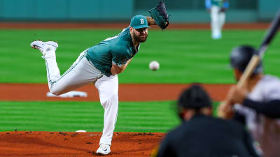
Some, naturally, prefer the Canucks sticking with their current whale-themed uniforms. Others, of course, prefer the so-called “Black Skate,” and that must include folks within the organization, because that’s what the team wore for the 2025-26 home opener against Calgary, and what it will wear several more times this season as a ‘third jersey.’
Still others advocated to returns of shorter-lived and less-widely-beloved jerseys, like the Flying V or the Salmon-Belly, and then there were those who voted for ‘none of the above’ and wished for a new set of jerseys altogether.
It’s not a problem that the fanbase can’t agree on a topic. If they always agreed with each other, our call-and-response columns would get pretty repetitive. But there are those who see this particular disagreement as a problem, and they might have a point.
CanucksArmy user Uncle Jeffy wrote “A consistent colour palette for the entire history should have been the way to go. But that ship sailed long, long ago.” Banduzzi shared similar sentiments, and put name to the crisis, writing “This team has had an ongoing identity crisis for 50 years – quit messing with the damn brand and stick with the blue and green.”
But it was the punnily-named CoconutsGrow who really laid the issue out in eloquent terms:
“One thing is for certain, no team in professional sports has as much of an identity crisis as the Canucks. Going to Canucks games now where half the stadium is in black and the other half clashing in blue is the most ridiculous thing to witness for a fan base. They just need to pick one and commit to it. Problem is, they waffled between jersey overhauls every decade in the franchise’s existence, so now when multiple alternates are in vogue for jersey sales, they don’t know what to do…”
And, damn, if that doesn’t hit the nail on the head.
Just a quick look around the rest of the Canadian franchises will provide proof of concept.
You won’t find a more classic set of uniforms and the colours thereof than in Montreal and Toronto. But then they’ve got history on their side. Teams as young or younger than the Canucks, however, like their Albertan rivals in Calgary and Edmonton, also have strong and consistent themes throughout their existence. See the “C of Red” or the preponderance of blue and orange in Oiltown for evidence.
The newest edition of the Winnipeg Jets has a fairly drab set of colours, but then that is offset by the tradition of the Whiteout.
If there’s a comparison to be drawn to the Canucks here, it’s with the Ottawa Senators, who have never really landed on a true, permanent jersey design. Then again, they’ve at least stayed within the same rough range of colour options, and so they don’t experience that same clash that CoconutsGrow outlined above.
The Canucks, of course, have their own tradition in the form of towel-waving, and there’s still plenty of chills to be achieved by seeing Rogers Arena in full postseason frenzy. But that’s a little aside from the cognitive dissonance that comes from seeing a dozen different jersey variations streaming into that same arena on that same night.
There’s no real solution here, other than officially settling on one design or another – or, as some have suggested, picking an altogether new design and then really committing to it. Does the issue matter enough to warrant such a response?
That, like a Canucks jersey, will vary from person to person. But it might be food for thought for a franchise that often seems to be in a stage of figuring itself out, roster-wise. The Canucks have struggled to forge a consistent identity on the ice ever since the Sedins retired, and though they’ve since built up an identifiable core, there remain lingering questions about how long that core is going to be around.
Perhaps a little uniform uniformity could be a small, and intangible, but important factor in defining whatever era of Canucks hockey comes next.
Or, as some have said, perhaps it’s too late, there are too many beloved jerseys on the docket already, and this has now become an unavoidable aspect of cheering for this franchise.
As we’ve said a few times here, this is hardly the most important or pressing issue facing the team in this 2025-26 season. Then again, this is also the season in which Rogers Arena is finally getting updated seats. Maybe the time is ripe to take steps to ensure a little more consistency in the outfits that tend to occupy those seats.
For now, this is just food for thought on threads.
More must-reads:
- Maple Leafs' Auston Matthews has forgotten what it means to be captain
- Stars make key move that could open door for big trade-deadline addition
- The 'Most NHL goals by an American' quiz
Breaking News
Trending News


Customize Your Newsletter
 +
+
Get the latest news and rumors, customized to your favorite sports and teams. Emailed daily. Always free!

PRIVACY POLICY COOKIE POLICY CONTACT US
ABOUT YARDBARKER TERMS OF SERVICE
By using this site, you agree to our Terms of Service and Privacy Policy.
This site is for entertainment purposes only.
There is no gambling offered on this site.
Gambling Problem? Call 1-800-Gambler.