-


Follow Us

Brand identity is an crucial part of building any sports team, but especially in the NHL, where many fans rightfully treat their jerseys as sacred.
Every team has had its share of good jerseys, but also one or two duds over the years. So, in the dead of the offseason, let's take a trip down memory lane to look at each team's best and worst uniforms in franchise history.
Before getting started, however, let's quickly go over a couple of things. First, this series is inspired bya recent piece from The Athleticgoing over the same concept, so be sure to check that out as well. Second, links to every jersey mentioned will be provided to give a visual reference without cluttering things up.
With that out of the way, let's dive right into the Metropolitan Division.
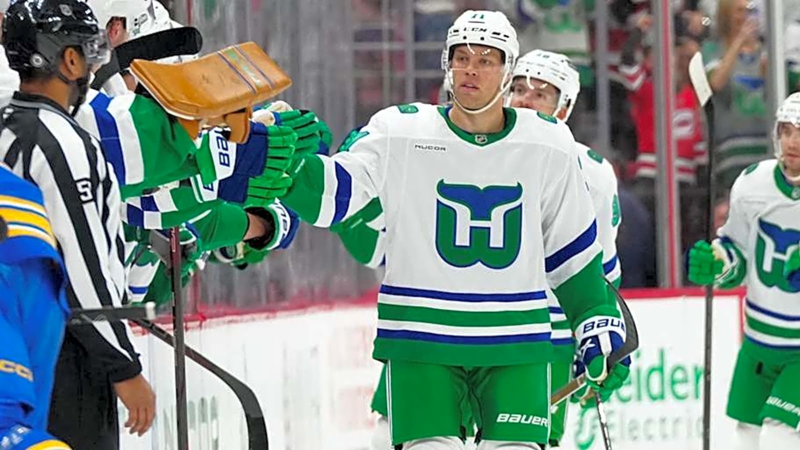
Carolina Hurricanes
Best: Current Heritage
Is it cheating to have the Whalers uniforms here? Maybe, but they're just too gorgeous to pick anything else as the best. In addition to having one of the best logos in sports history, the Whalers also had an incredible green-and-blue color scheme that very few other teams use. The white version, introduced last year, allows the colors to pop the way they should.
Worst: Current Road
If there's any sign that the Hurricanes' brand desperately needs a refresh, it's this jersey. The decision to use the diagonal lettering that plenty of other teams also use already wasn't a great one, but the more recent decision to pair it with red and sometimes even black helmets makes this one of the worst looks in the league today.
Columbus Blue Jackets
Best: Current Alternate
For a relatively new franchise, the Blue Jackets pull off the vintage look incredibly well. The two different shades of blue combined with the off-white makes for a unique look in today's NHL, and the cannon logo on the chest is the cherry on top. They've been wearing these since 2010, and they should continue for the foreseeable future.
Worst: 2021 Reverse Retro
The decision to give a team called the Blue Jackets a primarily red sweater was certainly an interesting one. Beyond that, though, it looks too similar to some of the Washington Capitals' jerseys throughout their history.
New Jersey Devils
Best: 2007-17 Home
The Devils haven't changed their uniforms much over the years, but this one outshines the current home jersey due to the stripes at the bottom. The red and black color scheme also looks good on pretty much any Devils uniform over the past 30+ years.
Worst: 2021 Reverse Retro
For their first decade in New Jersey, the Devils actually wore green as their secondary color rather than their current black. They still occasionally reference that era, but a primarily green jersey (especially this shade of green) was a step too far.
New York Islanders
Best: 1978-84 Road
The Islanders won four straight Stanley Cups in these jerseys, embodying the phrase "look good, feel good, play good." These jerseys are very simple, as one would expect from a look from the late 70s and early 80s, but less is more in this case. One of the prime examples of a classic jersey being better than its modern recreation.
Worst: 2011-14 alternate
While many would put the Islanders' infamous fisherman jerseys here, they've had a few truly terrible alternates over the years, and this is the worst of them. The black base with weird gray striping, the wordmark and numbers across the chest, absolutely nothing about this jersey works.
New York Rangers
Best: 1999-2007 Alternate
As an Original Six team, the Rangers haven't changed their look much over the years, but their most notable alternate just so happens to be their best jersey ever. This navy blue jersey, which was originally introduced in 1996 but took a one-year break in 1998-99 in favor of a white version, features the head of the Statue of Liberty with the team's "NYR" abbreviation. It's outright criminal that the Rangers haven't brought these back as a full-time alternate.
Worst: 2014 Stadium Series
This jersey isn't terrible, but in the Rangers' outstanding wardrobe, it's easily the worst of the bunch. The futuristic look - which, to be fair, was the point of the early Stadium Series jerseys - just doesn't mesh well for a team that's normally so traditional.
Philadelphia Flyers
Best: Current Home
The Flyers are another team that hasn't changed their uniforms much over the years, but we'll give the nod to the current look for correcting a major error. From 2010-23, Philadelphia wore a brighter orange that looked like it came straight off a traffic cone. With this "redesign," though, they went back to their traditional reddish-orange color, and it looks so much better.
Worst: 2002-07 Alternate
This jersey has the same problem as the aforementioned Rangers Stadium Series jersey, being a futuristic look for a very traditional team. The chrome logo and number outlines just don't look very good. It's no surprise the Flyers haven't touched their classic logo since retiring this alternate.
Pittsburgh Penguins
Best: Current Home
The Penguins have been more experimental than their in-state rivals, even changing from a blue color scheme to the black and gold we all know and love today around 1980. Just like Philadelphia, however, Pittsburgh's best look is a modern interpretation of a classic. The skating penguin logo just stands head-and-shoulders above any other in the franchise's history.
Worst: 2007-16 road
For around 15 years, the Penguins ditched their traditional bright gold in favor of "Vegas gold," and their jerseys suffered as a result. Add in Reebok's odd striping pattern, and this look is easily the worst in Penguins history.
Washington Capitals
Best: Current Alternate
The Capitals are known for their red, white and blue look, but it's actually their black, blue and copper alternate that takes the cake here. Originally debuted as Washington's 2022-23 Reverse Retro, the team brought it back as a regular alternate last season and gave its wardrobe a significant boost. The "screaming eagle" logo also far outshines any other in team history.
Worst: 2018 Stadium Series
The "Caps" wordmark on the chest is already a misstep, as team nicknames on jerseys rarely work out (see: Carolina). What truly sinks this look, however, is the gigantic red "stripe" that takes up essentially the entire bottom third of the jersey. At least they were able to tweak this jersey and make a pretty solid alternate out of it in the future.
More must-reads:
- Kraken announce lucrative new deal for veteran winger
- Flyers first-round pick expected to commit to Michigan State
- The 'NBA all-time 50-point game leaders' quiz
Breaking News
Trending News


Customize Your Newsletter
 +
+
Get the latest news and rumors, customized to your favorite sports and teams. Emailed daily. Always free!

PRIVACY POLICY EDITORIAL POLICY CONTACT US
ABOUT YARDBARKER TERMS OF SERVICE
Use of this website (including any and all parts and
components) constitutes your acceptance of these
Terms of Service and Privacy Policy.
This site is for entertainment purposes only.
There is no gambling offered on this site.
Gambling Problem? Call 1-800-Gambler.