After a spell without them, third jerseys are back for the NHL! Now, that may cause fear to rise in your gullet. At least it will if you are old enough to remember that first wave of (largely hideous) third jerseys from the ‘90s. Somehow, the Anaheim Mighty Ducks managed to make themselves look even worse! The NHL didn’t have alternate/third jerseys last year due to switching all their jerseys to Adidas. Now Adidas is able to crank out third jerseys for what is expected to be about 15-20 teams. Some of the looks have been seen before but not for the past few years. Here's a look at all the third jerseys we know about, ranked in terms of quality.
21. Arizona Coyotes
Dave Sandford/Getty Images/NHLI
Apparently we’re at a place where we’re willing to nostalgically accept these Coyotes jerseys as existing? Until they changed their look to a simpler style, Arizona, then Phoenix, was rivaled by only the Minnesota Wild for worse look in the league. We don’t care if they’re ironically bringing back the Kachina jerseys. They still look bad and are WAY too busy for a sports uniform.
Gary A. Vasquez/USA TODAY Sports
Sorry, we aren’t going to buy your nostalgia, take two. The Anaheim logo with the duck-shaped hockey mask was dumb then, and it’s dumb now. However, the purple-and-teal look feels like it has aged a little better. The stripes are nice. The logo is still hot garbage.
Brad Penner/USA TODAY Sports
There are two things going against the Islanders’ third jerseys. One, it’s basically a replicant of the black third jersey they wore before, but now it’s blue. Two, it’s not an interesting logo, and it’s much worse than the traditional Islanders logo. It also lacks the kitschy fun of the fisherman logo. Just blah all around.
Brian Babineau/NHLI via Getty Images
These jerseys are too basic to be offensive but also too boring to be interesting. They look fine. This is a shrug in hockey jersey form. They better wear it around Halloween.
Aaron Poole/NHLI via Getty Images
Straight up, we miss the yellow-and-purple crown look from the expansion era. Instead of that, the Kings are going with another gray alternate, a slight tweak from their 50th anniversary look. It’s not a bad look, but it doesn’t really stir up much in the way of feelings.
Aaron Doster/USA TODAY Sports
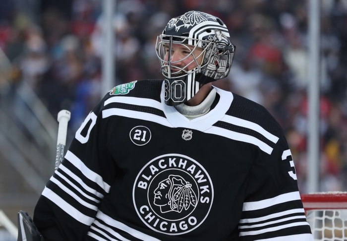
The Blackhawks and the Bruins aren’t wearing third jerseys, per se, but they did wear retro looks for the Winter Classic. Both are harkening back to their ‘30s looks. These Chicago ones are kind of crazy because they are just black and white. A Blackhawks jersey without a hint of red? That’s practically sacrilege!
Dave Sandford/NHLI via Getty Images
The Oilers' jersey is good and a reflection of their old look for their 40th anniversary. However, it’s not all that different from their usual look. They are just wearing a bright royal blue with the orange. It pops, but it’s not different enough to rank too high.
Darren Yamashita/USA TODAY Sports
Shocker! The Sharks have a black alternate jersey. Back in the day, “third jersey” basically meant “black jersey,” but now that isn’t the case so this isn’t quite as eye-rolling. They also have made the new logo blacker as well, borrowing from the aesthetic choices of "Spinal Tap." And there's a new shoulder logo with a fin poking out of the water, which is actually cool.
Richard A. Whittaker/Icon Sportswire via Getty Images
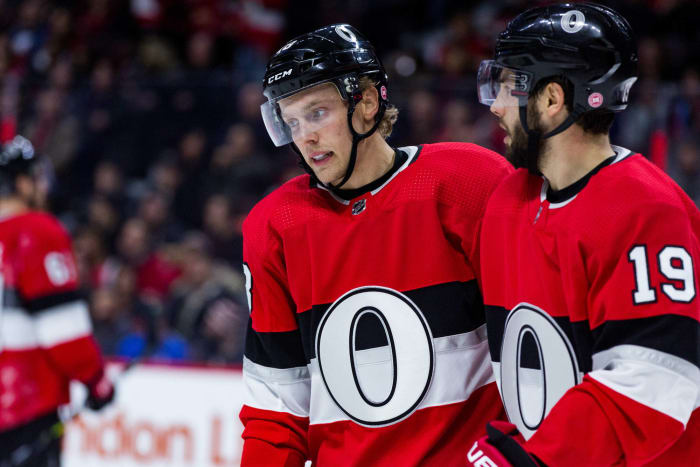
Everything is terrible about the Senators…save for their expected third jersey. They are bringing back their centennial look, which has a great old school vibe. Their logo is just a big “O.” The simplicity works.
Charles LeClaire/USA TODAY Sports
Like a character from the least-popular Austin Powers movie, the Penguins seem to love gold. That being said, these jerseys really pop. They are bright but not garish, and gold is deeply tied to Pittsburgh sports. The Stanley Cup may be silver, but gold still has its charm in the NHL.
Terrence Lee/USA TODAY Sports
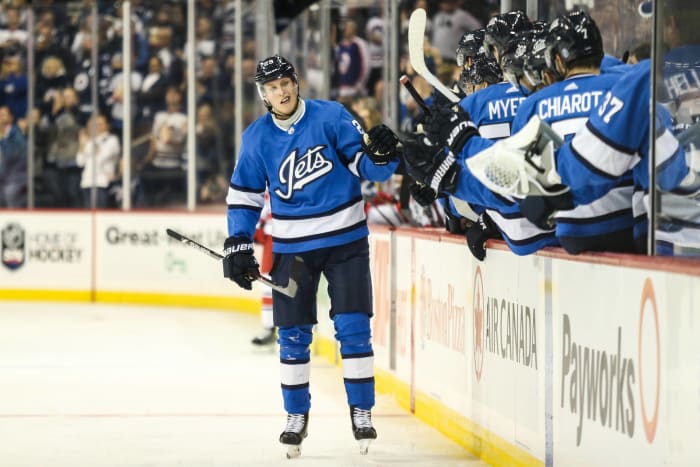
The Jets’ look is cool. The blue they usually sport works great, the lettering of the logo is sharp, and I really like the stripe. It definitely is a classy jersey, but the Jets have such a good look normally, it feels like an unnecessary alternative.
Mark Blinch/NHLI via Getty Images
Toronto is expected to kick it very old school again by busting out its St. Pats jerseys, a shout out to a defunct hockey team based in the city. Hey, you can always wear it on St. Patrick's Day and have it be a hit. It’s weird to see the Maple Leafs not wearing blue, but to be fair they also aren’t even wearing the words “maple” or “leafs.” That’s fun in and of itself, and the St. Pats jerseys are pretty nice as well.
Aaron Doster/USA TODAY Sports
The Bruins look is definitely the better of the two Winter Classic jerseys. The logo is nice, and going with brown is a nice touch. It's not the most beautiful color, but it works with golden yellow. These feel like college jerseys but in the best way.
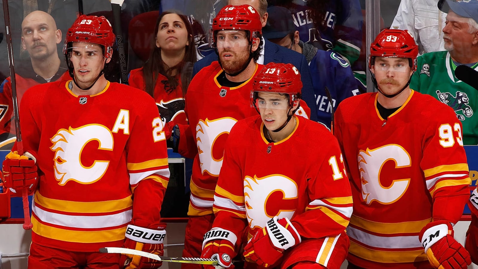
Gerry Thomas/NHLI via Getty Images
The Flames will bring back their throwback look, which is a good thing. The colors are a lot better than their normal look — cutting black helps — and the logo is a major improvement over the regular icon. The white flaming “C” (no relation to Conan O’Brien’s superhero alter ego) is just simply pretty.
Patrick Smith/Getty Images
The Caps are yet another team going retro, but they actually have a great look to throw back to. Red, white, and blue work great for a team in our nation’s capital, and that logo is a real beaut. The stars should be too much, but they aren’t, and the white shoulders are a good touch.
Jamie Sabau/NHLI via Getty Images
To think, the Blue Jackets used to wear those awful jerseys with a Civil-War-fighting bug on it. They’ve looked better in recent years, but the return of the 2010 third jersey with the cannon is a joy. Somehow, a team that hasn’t even been around for 20 years has a great, vintage look. It’s a cool logo, even if the cannon art work is a little weird.
Jared Silber/NHLI via Getty Images
Christmas has come to New Jersey! In another retro look, the Devils are repping their look from the ‘80s. Instead of black, they use a forest green to stripe the jersey and outline things. Honestly, it’s an improvement on their typical look. Jersey should bring this back for good.
Denis Brodeur/NHLI via Getty Images
Bust out your Pavel Bure uniforms, because the ‘90s look is back! OK, so technically they aren’t donning the black, orange and yellow “Flying Skate” look until next season, their 50th anniversary. On the other hand, who cares? This jersey is awesome! While we understand the desire to have environmental colors like sea blue and forest green for a city like Vancouver, this is definitely the best logo the Canucks have ever had.
Rick Osentoski/USA TODAY Sports
The Hurricanes’ normal logo has always been kind of bland: a bunch of colors swirling to intimate a hurricane. This third jersey is a rare completely new look, but it works great. Maybe some people don’t recognize a hurricane warning flag when they see one, but the two frayed flags flying from a hockey stick is an awesome logo and a major improvement. The plain red striping on the black jersey is much sleeker as well. It's also been announced that the Canes will wear Hartford Whalers throwbacks for two games. If they were to be included on this list, they would be No. 1.
Jeff Curry/USA TODAY Sports
God, what a beautiful color combination. This look, which apes the jerseys the Blues wore at the time of their expansion, is gorgeous. That blue! That yellow! Plus, St. Louis knew better than to mess with that logo. These look great, but since they aren’t that innovative, we couldn’t quite justify putting them atop the charts.
Michael Martin/NHLI via Getty Images
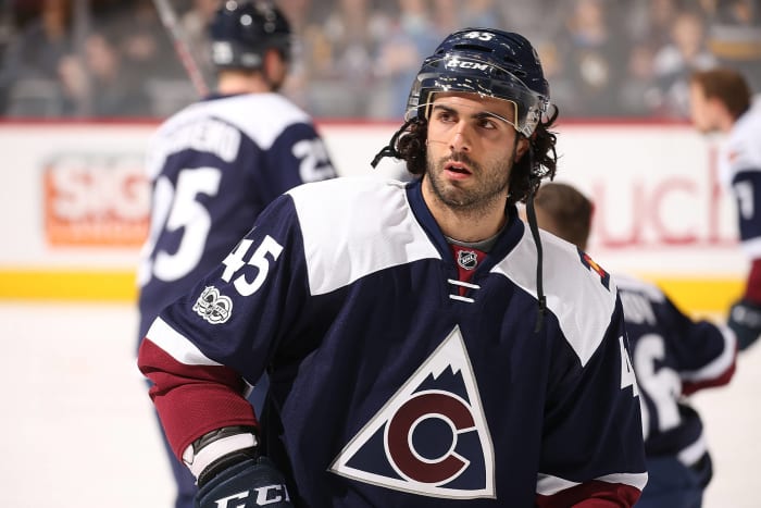
In the words of Bill and Marty, "hot dog, we have a weiner!" Yes, they are basically aping the old Colorado Rockies look (the defunct hockey team, not the extant baseball team), but who cares? That logo is beautiful. Those colors are so sharp. The Colorado flag on the shoulder is a great pop of color. Everything about this is great. We can’t wait to see these jerseys on the ice this season.


 +
+
