A uniform change is always an event that brings about a lot of interest and intrigue. There have been plenty of upgrades over the years, but there have also been a lot of missteps as well. Here we try to determine which uniform changes worked out and which were total downgrades.
Mark J. Rebilas-USA TODAY Sports
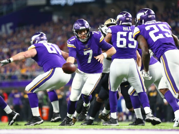
When Nike became the NFL's uniform and apparel supplier, one of the teams that immediately took advantage of this change was the Minnesota Vikings. They went from having a complete mess of a uniform to having arguably the best look in the NFL, so this was a huge upgrade on their part.
Kim Klement - USA Today Sports
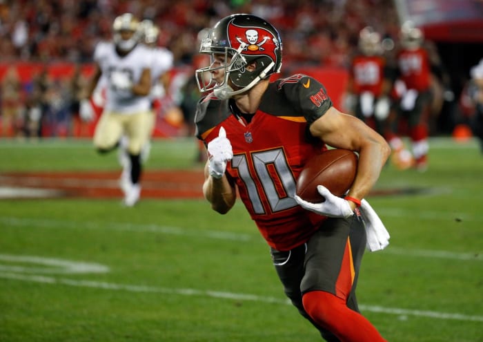
While the Vikings may have upgraded under the Nike umbrella, the Bucs took a steep step downward. They had a great set of uniforms that could have been considered modern classics. Instead, they sullied their visual identity with a cluttered look. Their wacky new numbers are the biggest offender on what is an all-around bad uniform.
Timothy T. Ludwig-USA TODAY Sports
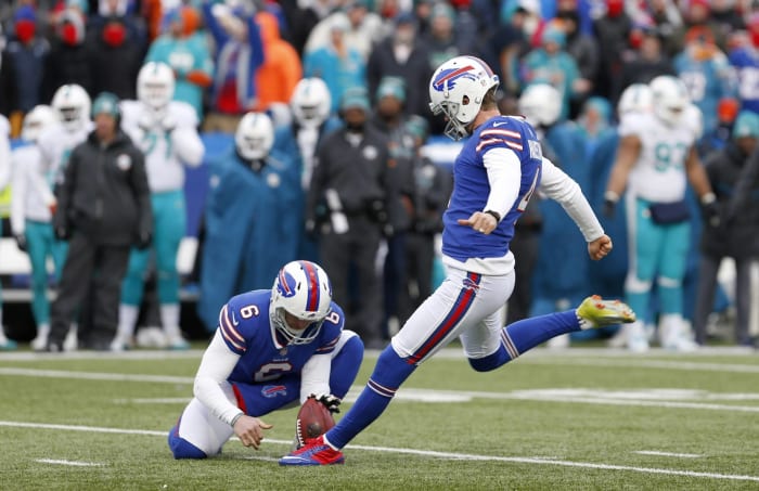
Buffalo was another team that realized that changing from an overdesigned mess to a simple design was the way to go. The Bills went back to a retro-inspired look in 2011, and it's one they should stick with for a long time if they're smart.
Ken Blaze-USA Today Sports
While teams like the Vikings and Bills realized that simplifying things was the way to go, the Browns decided to muddle things with their most recent uniform change. They kept their simple, plain helmet design but decided to go for a modern look with their uniforms. The result is a uniform that just seems confused instead of focused.
Nick Turchiaro-USA TODAY Sports
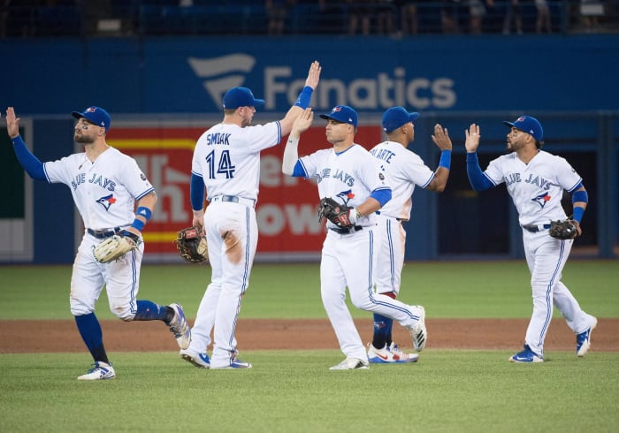
The back-to-back World Series champions from the early 1990s are still popular when it comes to Toronto baseball, so of course it made sense that the Blue Jays would finally stop messing around and go back to the look they had back then. Not only did they do that, but they also updated it to make it look even better. This is how you properly upgrade a classic look.
6 of 40
Worst: Toronto Blue Jays, 2004
Koichi Kamoshida-Getty Images
It's good that the Blue Jays finally came to their senses, because in 2004 they went off the deep end with this look. They decided that they didn't want to be the "Blue" Jays and experimented with black and "graphite" as their primary colors. It didn't work.
Erik Williams-USA TODAY Sports
Speaking of embracing tradition, the Astros finally did so when they went back to their original colors of orange and blue and updated their look from their early days. This ended two decades of confusion as to whether or not the Astros wanted to be a blue and gold team or a red and sandy brown team. Now when you think of the Astros, you think of orange and blue, especially after they won a title in those colors.
Diamond Images-Getty Images
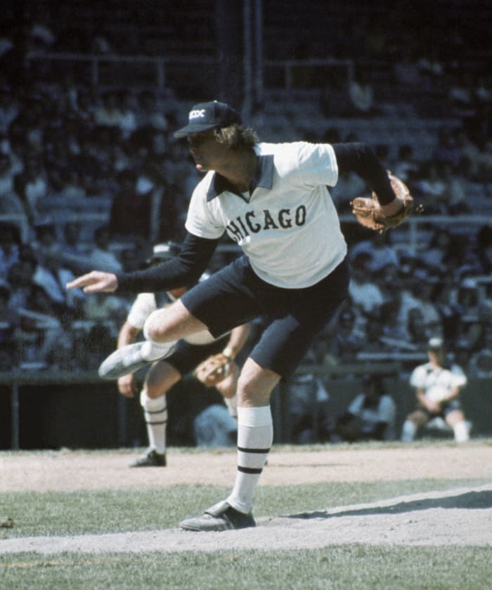
This is quite possibly the most infamous uniform change in baseball history. For some reason during the 1970s, the White Sox not only decided to start wearing navy blue and white, but they also added an interesting alternate uniform to the fold: one that featured shorts. This wasn't seen before 1976, and it wasn't seen afterward — and for good reason. It looked ridiculous.
Reinhold Matay-USA TODAY Sports
The Jaguars are the most recent team on this list to switch uniforms, and their new look is a massive upgrade, if only because they were going up from rock bottom. They easily had the worst set of uniforms in the NFL and now have a respectable look. Just the helmet alone is an enormous upgrade over the two-toned mess of a helmet that they wore for years.
Brad Mills-USA TODAY Sports
The Diamondbacks had decent uniforms and then for some reason decided to update them. The key word there is "update," because it certainly was not an upgrade. Instead, they added a whole bunch of bells and whistles that aren't really needed on a baseball uniform. MLB looks pretty good across the board right now, but the Diamondbacks are clearly bringing up the caboose in that department.
Aaron Doster-USA TODAY Sports;
The Detroit Lions are proof positive that you can update and upgrade your uniforms at the same time. They decided to focus on making their unique shade of blue the focal point of their uniforms and even went so far as to wear blue pants with their road uniforms. The result is a solid look that has them as one of the better-looking teams in the NFL.
Matthew Emmons-USA TODAY Sports
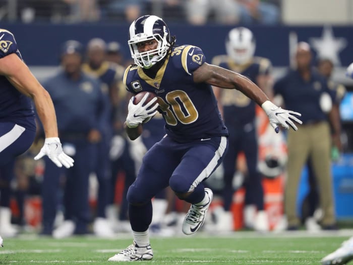
The Rams are currently in an awkward period where they can't make wholesale changes but badly want to distance themselves from the look they wore in St. Louis. Sometimes that leads to strange moments like when they made the interesting choice to wear all blue for a game. The white ram horns on the helmet and the thick white stripe made for a huge clash with the gold-accented jersey, which looked completely out of place and ruined the uniform.
Brad Penner-USA TODAY Sports
When the Nets made the move from the swamp of New Jersey to the concrete of New York City, they made sure they would stand out with a simple yet stylish revamp of their identity. This included going to a fashionable black-and-white design that was a huge upgrade over their nondistinct red, white and blue design from the final days in New Jersey.
Derick E. Hingle-USA TODAY Sports
This was arguably the most disastrous identity "refresh" in the history of the NBA. The logo was a complete mess, and the uniforms weren't much better. The black alternate uniform may go down as one of the ugliest in NBA history, which is saying something when you consider how many whoppers this league has had.
Kyle Terada-USA TODAY Sports
When the original Hornets franchise decided to become the New Orleans Pelicans, the former Charlotte Bobcats saw this as the ultimate opportunity to bring the buzz back to Charlotte. Sure enough, they were able to get the nickname back and used this to build on what was already a great identity before the Hornets skipped town.
David Butler II-USA TODAY Sports
During the clinching game of the infamous 2016 NBA Finals, the Cavaliers wore ugly black-sleeved uniforms as they finished the amazing comeback from 3-1 down in the series. That ended up being a curse in disguise because when Nike took over the uniform and apparel responsibilities for the NBA, the Cavs changed their look and made black an official team color. The result was this mess of an alternate uniform that looks like it should be in the 1990s instead of the present-day NBA.
Jeffrey Becker - USA Today Sports
This may be a bit of a controversial decision, but the Timberwolves did an amazing job of breathing life into their identity with their latest revamp. That included the new shade of green that they went with as an accent color for their primary uniforms and the extremely distinctive main color of their alternate uniforms. You can't miss these from a distance; that's for sure.
Andy Hayt-Getty Images
While these uniforms have some good memories associated with them (as long as you ignore the two consecutive Finals they lost to the Bulls), it's quite nonsensical if you think about it. What in the world do mountains have to do with Jazz? There were a lot of wacky NBA uniforms in the 1990s, but this was one of the weirdest ones around.
Kevin Jairaj-USA TODAY Sports
While this uniform is actually quite dated and you could actually argue that the Mavericks need new uniforms, there's no question that the set has withstood the test of time. It would not be shocking to see this uniform make it to 2021, which would mean that a look that was once considered a cutting-edge upgrade over their previously boring uniforms would end up almost being considered a classic after sticking around for the entirety of two decades.
Sam Forencich-Getty Images
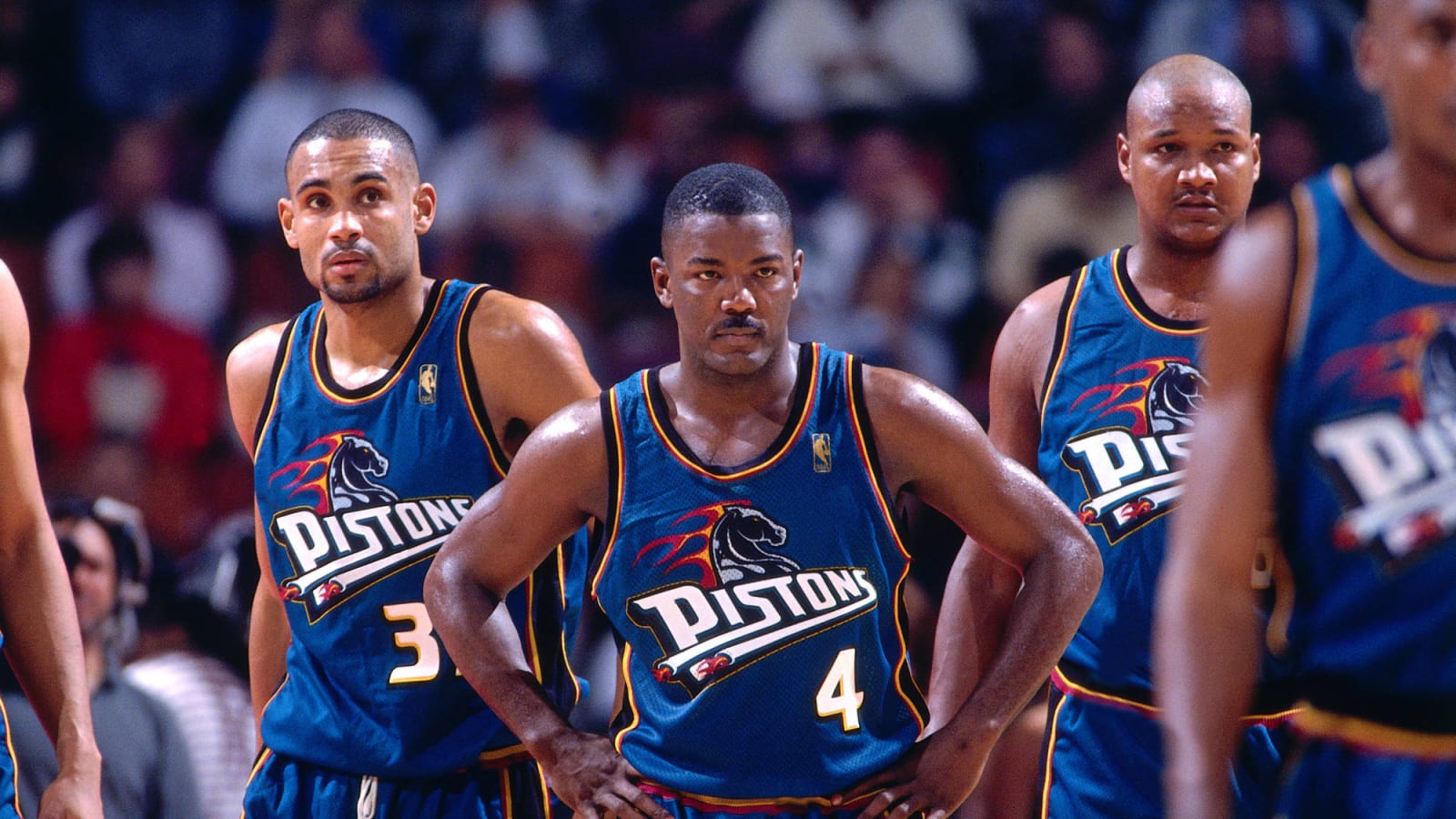
Add this as another example of nonsensical uniform decisions made during the 1990s. Looking back on this, it appears that the Pistons were shamelessly trying to jump on the teal bandwagon that so many sports teams hopped on during the '90s. As a result, the great Grant Hill spent most of his time in Detroit wearing these uniforms. Yikes.
21 of 40
Best: Detroit Pistons, 2001
Kamil Krzaczynski-USA TODAY Sports;
Fortunately, the Pistons realized that they were never supposed to be a teal team. They were always meant to be a red, white and blue team, and they went back to what is now their current design, which was an expertly updated version of what they wore during the Bad Boys era. This is how the Pistons are supposed to look.
22 of 40
Worst: Minnesota Golden Gophers football, mid-1990s
Brian Bahr-Getty Images
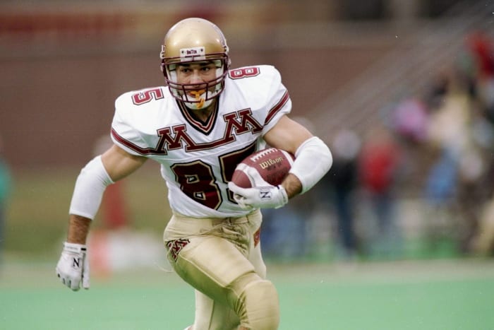
The NBA wasn't the only sport that went wacky with uniforms during the '90s. Almost every sport decided to push the boundaries of uniform design, even in the tradition-laden Big Ten. The Minnesota Golden Gophers decided to take to the field wearing this nonsense. The 1990s were a wacky time.
Isaiah J. Downing-USA TODAY Sports
The Broncos are still getting mileage out of their uniform change from the late '90s, and they got even more bang for their buck when they switched their home uniform colors from navy blue to orange. This gave them a nice connection to the team's vast history of wearing orange at home, which was a great move and pumped even more life into the modern classics.
Rick Stewart-Getty Images
This uniform is why the word "Fishsticks" sends a chill down the spine of New York Islanders fans. The team rebranded in the mid-'90s and decided to go with a primary logo that featured a fisherman who bore a strong resemblance to the one featured on the front of a Gorton's box. It was so bad that the team brought back the old crest and wore it on the new jerseys the next season.
Gary A. Vasquez-USA TODAY Sports
For casual fans of hockey, the first thing you think of when you think of the Los Angeles Kings is Wayne Gretzky flying down the ice while wearing the black-and-silver uniforms that they adopted for his arrival. They dropped that color scheme in 1998, but in 2011 they re-embraced the look and a Stanley Cup soon followed. Coincidence? I think not.
Sergei Belski-USA TODAY Sports
In 2007 when Reebok took over uniform and apparel duties for the NHL, this resulted in a lot of teams making ill-fated changes to their uniforms. The Calgary Flames were one of them, as they tweaked their uniform into a vertically piped mess. They had a chance to fix this when Adidas took over in 2017, but they decided to keep the vertical stripes, which means that the Flames had two opportunities to right a wrong and whiffed on both.
Jerome Miron-USA Today Sports
While the Flames have been bumbling around in the uniform wilderness, the Dallas Stars got it right. Before they made the glorious decision to go to a predominately Kelly green look, the Stars had a drab black-and-gold color scheme with green used as a trim color. Now their green is on full display to admire.
Denis Brodeur-Getty Images
If you thought Calgary's piping or the Islanders' "Fishsticks" uniforms were gaudy, they are actually quite conservative compared to what the Canucks wore during the early '80s. The team kept the colors until 1997, but it took the Canucks a few years to realize that this was just too strange to be on the ice on a regular basis.
Ron Chenoy-USA TODAY Sports
This is another example of a team righting the wrongs that a previous apparel provider inflicted upon it. The Avalanche took advantage of Adidas' takeover by going back to a design that was reminiscent of their Stanley Cup-winning days. The Avs look like "The Avs" again, and it's a joyous sight to see.
Rick Stewart-Getty Images
The Sabres entered the NHL in 1970 and were immediately one of the better-looking teams in the league with their blue-and-gold color scheme. It was a classic look by the time the 1990s rolled along, which meant that it was time for them to inexplicably change their uniforms and switch colors. Can you tell that the 1990s were a strange time for sports uniforms?
Ron Chenoy-USA TODAY Sports
This is an example of how a small tweak can go a long way. The Nashville Predators embraced a bold shade of gold as their main color, but their initial uniforms with the new color scheme were plagued with piping. Once again Adidas came to the rescue by offering a simplified option for the uniforms, and now Nashville has one of the better looks in the league.
32 of 40
Worst: Buffalo Sabres, 2006
Rick Stewart-Getty Images
Congratulations to the Buffalo Sabres, who are the only team to appear on the "worst" segment of this list twice. The Sabres "listened" to the fans who were clamoring for the return of blue and gold, and they gave them blue and gold, all right. They released the infamous "Buffaslug" uniforms, which somehow lasted for four seasons.
33 of 40
Best: Maryland Terrapins football, 2013
Brad Mills-USA TODAY Sports
This may be another controversial choice for the "best" segment of this list, but this is actually a prime example of how "organized chaos" can actually work when it comes to a uniform. There's a lot going on here, but it all makes sense because there is a lot going on in Maryland's state flag. Plus, it blows away what Maryland wore before this change, and it will definitely be memorable when it comes to uniform history.
Ed Mulholland-USA TODAY Sports
Here's an example of when making things simpler can actually make matters worse. The Devils had no reason to mess with their classic uniform set that they'd had since 1992. So naturally they decided to tweak their sweaters, and the result is a downgrade that didn't need to happen at all.
Steve Mitchell-USA TODAY Sports
"The U" used to be one of the college football schools that started to get more notoriety for uniform decisions than for what it did on the field. Fortunately, both the on-field results and the uniforms received an upgrade with Mark Richt's arrival in 2016. The Hurricanes went back to uniforms that were reminiscent of the glory days of the 1980s, and it's a welcome sight for college football fans.
36 of 40
Worst: Oregon Ducks football, 1999
Jeff Gross-Getty Images
This is the uniform that started it all for the Oregon Ducks. While the program has finally come into its own with a uniform that's both modern and still sane, the team's first venture into uniform weirdness hasn't stood the test of time at all. I highly doubt that you will see this as a throwback uniform on the field any time soon.
Robert Mayer-USA TODAY Sports
The Panthers are the best example of an NHL team making a huge upgrade in both logos and uniforms. The previous uniforms were piped-out messes, and the logo had run its course. Now they have a fresh new logo that could stand the test of time and spiffy new uniforms to go along with it. This upgrade was excellent.
David Kohl-USA TODAY Sports
Before 2004, the Bengals probably could've stuck with their uniforms for as long as they wanted and nobody would have complained. Unfortunately, they fell into the same trap that the Bucs fell into when they unnecessarily updated their uniforms. The classic helmet design remains, but everything from the neck down is a debacle.
39 of 40
Best: UCLA Bruins football, 2017
Mark J. Rebilas-USA TODAY Sports
You have to give credit to Under Armour for bringing order back to the chaos that had become UCLA's football uniforms. Under Adidas, UCLA's uniforms had sneakily been completely messed up and one of the ugliest in college football. Now as you can see, the uniforms are back to being a joy to look at.
Vincent Carchietta-USA TODAY Sports
The good news about soccer kits is that if a team makes a mistake, you only get to see the unis for two seasons at the most. In MLS, the Columbus Crew came out with a clash kit that was just plain ugly. It was ditched after just one season, which is a lesson that a lot of teams on this list could have learned.


 +
+