As a whole, baseball uniforms are in a good place. It's now time to figure out which baseball team is in the best place when it comes to uniforms.
Norm Hall / Getty Images
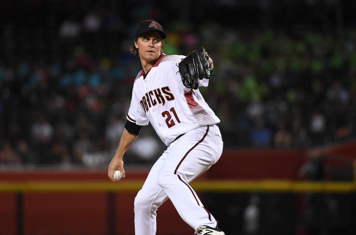
In 2018, the Diamondbacks did a "Throwback Thursday" promotion where they wore various old uniforms from their 20 seasons as a major league team. It served as a bittersweet reminder of the team's glory days — both when it came to on-field success and its uniform looks. They are far, far removed from the glory days when it comes to their uniforms.
Denis Poroy / Getty Images
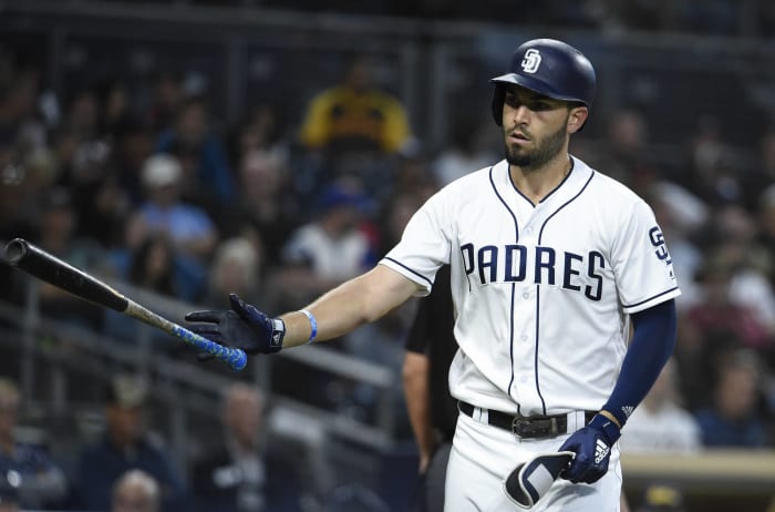
The good news is that 2019 will be the final year Padres fans will have to deal with their team wearing the most boring uniforms in all of baseball, as they will be going back to brown in 2020. The bad news is that they still have to make it through one more season. We're all pulling for you, San Diego.
Dustin Bradford / Getty Images
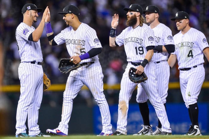
The Rockies don't necessarily have a bad set of uniforms; it's just that there's nothing really exciting about them. They also still inexplicably wear a sleeveless black uniform, which is a shame because sleeveless uniforms went out of style in baseball over a decade ago. It's time for some sort of change in Colorado.
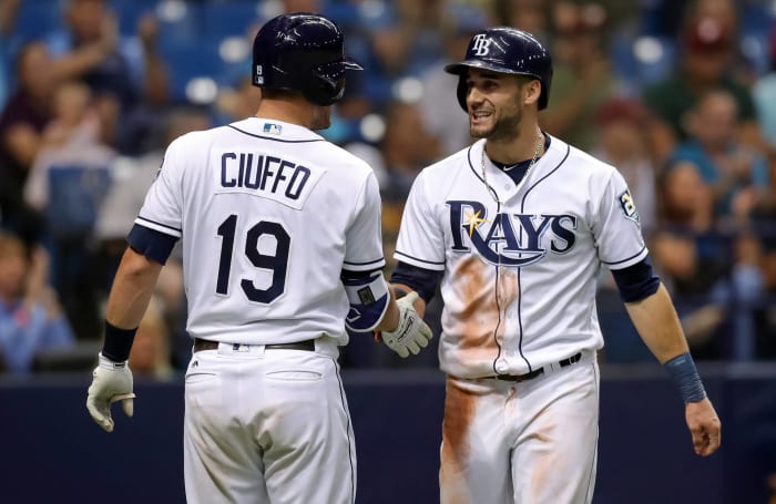
Mike Carlson / Getty Images
While the Rays don't necessarily have bad uniforms, they once again suffer from being bland and blending in with the rest of the baseball crowd. Their light-blue alternates are a nice change of pace, but other than that, they fall into the trend of being another team with navy blue as the main color when the Rays have had opportunities to go in a more unique direction. They're going to add the classic Devil Ray logo to their sleeves for the future, so there's a start?
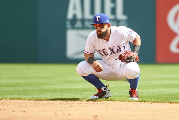
Cooper Neill / Getty Images
Like the Padres battling between brown and gold and navy blue, the Rangers are battling whether they want to be a red team or a blue team. Sometimes you see the Rangers wearing blue hats and socks, then the next day you'll see them wearing red hats and socks — and they do this with the same white uniform. It would be nice to see the Rangers pick one color and go with it. If that happens, they'd take a leap in these rankings.
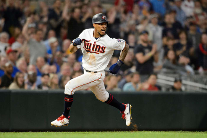
Evan Habeeb / USA Today Sports
The Twins have a solid set of away uniforms, and the navy blue road jersey is nice as well. The bad news is that their home jersey, their red alternate jersey and their new navy blue alternate jersey are all weighed down by an unnecessary touch of gold, and it really brings down the entire uniform rotation.
Mark Brown / Getty Images
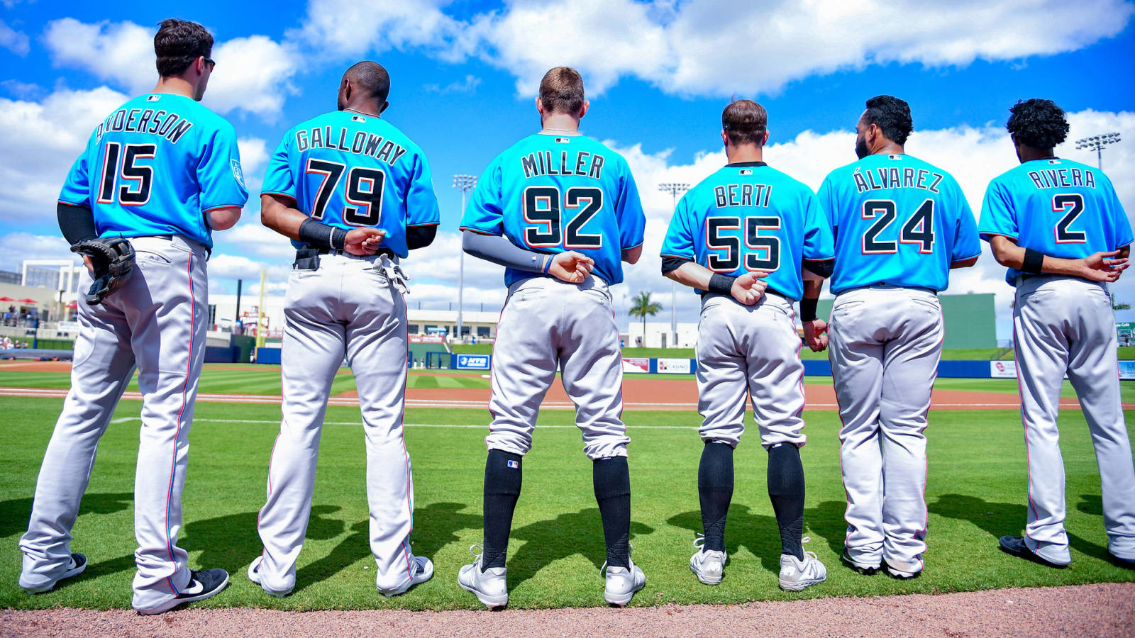
After retreating into a black hole when it came to their color scheme, the Marlins have finally embraced splashes of color once again after they made yet another identity overhaul. This time, the Marlins are using "Miami blue" and "Caliente red" as accent colors, and while there's still a focus on black, there's at least a bit more spice when it comes their uniforms.
Alex Trautwig / Getty Images
Do you see that glorious logo adorning Christian Yelich's helmet and sleeves? Unfortunately, the Brewers haven't figured out that all they need to do is make it their primary one. The ball-in-glove logo is timeless, and it looks great in the current color scheme. Once the Brewers decide to center their identity around the classic logo, they will be on the right path. Until then, they remain painfully close to success.
22: Cleveland Indians
Norm Hall / Getty Images
2019 has come and Cleveland has made the objective improvement of removing Chief Wahoo from all of their uniforms. It's a genuine improvement, but Cleveland is still stifled by having somewhat uninspired uniforms that get lost in the navy, blue and red pool.
Kirby Lee / USA TODAY Sports
The Giants look fantastic when they play at home. If this list took only home uniforms into consideration, then San Francisco would be top tier. Instead, we have to consider their road uniforms and those are the main reason why the Giants are in the 20s.
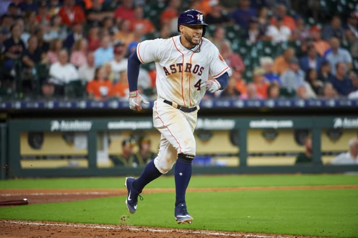
Cooper Neill / Getty Images
The Houston Astros have a solid look; their only real misstep comes in the form of their strange navy blue alternate uniforms that are loosely inspired by their infamous "Tequila Sunrise" ones. With that being said, Houston's uniforms are safe but still slightly interesting thanks to the embrace of orange. The Astros could do with wearing their orange jerseys more often, but these are just fine.
Cameron Hart / Getty Images
The Braves are similar to the Giants in that they have a great look whenever they play at home. Unfortunately, they have to leave Georgia to play games and when they do, they're stuck with a road alternate that's improved for the 2019 season but still superfluous and a road uniform that is brought down by an all-navy cap. Fix those problems, and the Braves would have an elite set of uniforms.
Lindsey Wasson / Getty Images
Amazingly, one of the first teams to adopt teal during the wacky logo and uniform days of the 1990s has stuck with it and been successful for the most part. The Mariners have made small tweaks to their uniform every now and then, but their core identity has stood the test of time. They even found a way to mash up the old colors with their current look, and it still worked. It should also tell you that baseball uniforms are in a good state right now when this is considered to be "middle of the road."
Rob Tringali / Getty Images
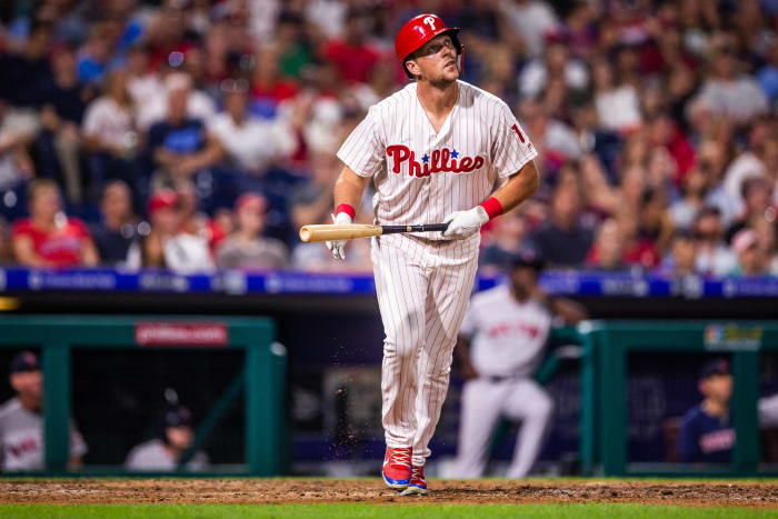
There are no frills with the Phils. They've stuck with this look since the early 1990s, and it's served them well over time. Better uniforms have been unveiled over the years, but the Phillies haven't felt the need to change. Why should they? It's a solid look and one that still gets the job done after all of this time, even if they slightly changed their primary logo ahead of the 2019 season.
Ed Zurga / Getty Images
The Royals are another team with a look that isn't going to be the most beautiful thing that you see. But it's still a good look. The royal blue is the star of the show here, and you can't go wrong with that classic K.C. hat as well. This uniform being in the middle of the pack isn't a bad thing, but it's more of an indication of the quality that's left to come.
Jamie Sabau / Getty Images
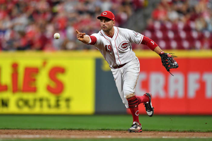
The Reds are still reaping the benefits of a an excellent identity refresh ahead of the 2007 season that saw them leave the dark ages of mostly black uniforms so they could once again embrace red uniforms. There are still traces of black, as it's unfortunately prominent as a brim color on the away uniform's hats, but it's used as an accent instead of a focal point. That is a minor quip to what's been a major success for the Reds.
Jim McIssac / Getty Images
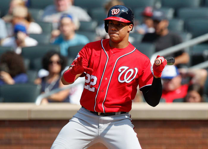
You can make all of the Walgreens jokes that you want, but there's no denying that the Nationals have some pretty good uniforms. The number font that they use is especially nice, and that's what helps it stand out from other uniforms. Plus, if there's ever a team that should be decked out in red, white and blue, it's the team that plays within walking distance of Capitol Hill.
Justin K. Aller / Getty Images
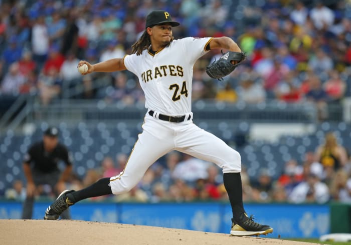
Speaking of unique number fonts that work well, the Pittsburgh Pirates are a prime example of that. The font fits the swashbuckling theme of a team that's nicknamed the Pirates, and the it has a great set of uniforms. What's holding Pittsburgh back is the fact that it tends to wear uniforms that throw out the amazing color scheme in favor of camouflage. It's always nice to support the troops, but the execution of the concept is not the best. Still, the Pirates have a nice collection of uniforms to choose from.
Adam Glanzman / Getty Images
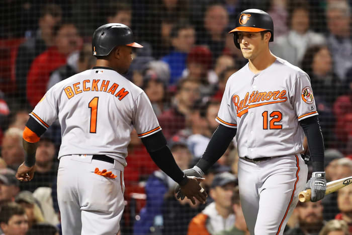
When it comes to hats, the Baltimore Orioles' caps are top-tier. Their home pinwheel hats are exceptionally nice, but the Cartoon Bird is what really makes their entire uniform stand out from the crowd. The uniforms below the neck aren't too exciting, but that hat logo is absolutely amazing and has basically carried the Orioles to this lofty position.
Jayne Kamin-Oncea / Getty Images
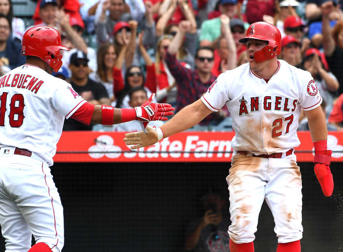
The Angels may have messed around with their official name a few times, but ever since they went to their current identity, they've stuck with it. That's for good reason — this is an absolute winner of a look, and there are no weak links in their uniform set. Their home uniform works, their away uniform perfectly complements the home uniform and while their alternate red uniform may overdo it with that color, it's still not ugly by any stretch of the imagination. The script works, the number font is great and the look is just a great one for the Angels.
Rick Osentoski / USA Today Sports
The Tigers have basically worn the same home uniform for the vast majority of their long history, but this year they made a small but important tweak to it. The Old English "D" logo on the jersey now matches the "D" on the hat! Everything is in perfect synergy, and the Tigers have a better overall look because of this.
John McCoy / Getty Images
The Dodgers have a uniform set that has truly stood the test of time. All you have to do is replace "LA" with "B", and the team will basically be wearing the same uniforms it wore when Jackie Robinson was blazing trails in Brooklyn. Plus, the away uniforms have caught up with the home uniforms in recent years. Los Angeles really can't go wrong with any choice of uniform on any given day.
Rob Tringali / Getty Images
The Mets are back on the rise, and they're doing so while wearing some lovely uniforms. Like the Reds, the Mets greatly benefited from putting black on the sidelines — only New York actually completely eliminated black. They're a strictly blue-and-orange team, and it's a look that is superbly done and works well for the Mets.
Adam Glanzman / Getty Images
All the Red Sox had to do to get things right was to simply wear red socks. However, the Red Sox have also gotten things right by not changing much. Their home uniform has remained basically untouched for decades, and their away uniform does the trick as well. Their unique number font is one of the best in all of sports, and even their alternate uniforms are well done. This is a lovely set of uniforms, and it's a look that Boston should never stray far away from.
Stacy Revere / Getty Images
The Cubs are no longer lovable losers with excellent uniforms — they're now big-time winners with great uniforms to boot. Their home, road and alternate uniforms are all good, and the best part is that they all share a great shade of blue. Combine that with the lovely shade of red that accentuates the entire look, and you have the recipe for a classic set of uniforms that the Cubs should never feel the need to change. They play in a classic ballpark, and the uniforms live up to the standards of it.
Abbie Parr / Getty Images
One of the best decisions that the Chicago White Sox made as a franchise was deciding to bring in the 1990s with the black-and-white look. This brought much-needed stability to a club whose tradition was to switch up uniforms every few years. Now, could you imagine seeing the White Sox wearing anything other than their classic black-and-white color scheme? No, you can't. The White Sox hit the jackpot with this look and even when they occasionally wear throwbacks, you can't see them in any other identity at this point.
Tom Szczerbowski / Getty Images
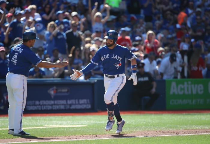
The Blue Jays are another team that hit the jackpot when going back to a traditional look. Their identity from their days of winning the World Series on back-to-back occasions was beloved by fans. Not only did they update that look, but they improved upon it as well. From the hat to the pants, this is a fantastic look.
Jon Durr / Getty Images
The Cardinals have excellent uniforms from top to bottom. Their home uniforms are great, their road uniforms are more of the same and their home alternates are gorgeous. The only real misstep is the navy blue hats that they wear on Sundays at home. But even still, that's minor for what is a truly elite set of uniforms.
Alex Trautwig / Getty Images
They've had this look for what feels like forever, and they haven't felt the need to add any alternate uniforms or other bells and whistles because there's no reason to mess with perfection. The New York Yankees have stuck with a winning uniform set throughout their long history of doing a lot of winning. You will never see the Yankees change things up with their uniforms, and that is one of the only assurances that we have in life.
Leslie Plaza Johnson / USA Today Sports
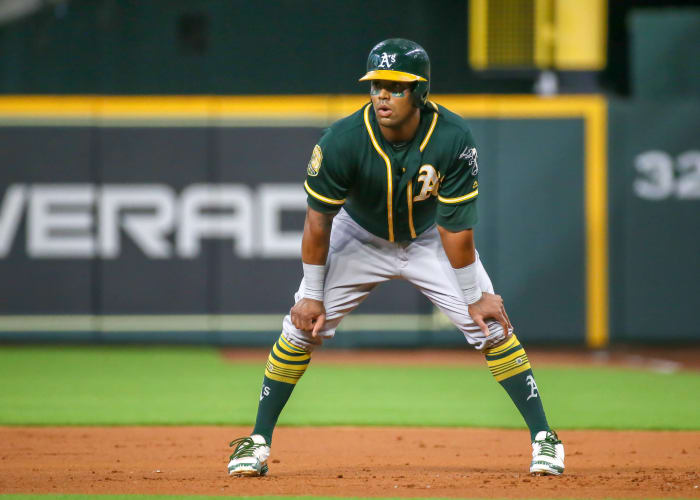
The Oakland A's have achieved uniform perfection. Their home uniform is iconic, their road uniform matches it, their regular green alternate is fantastic, their gold alternate is lovely and they may very well have one of the best alternate uniforms in all of baseball with their kelly green alternates. Simply put, the A's have excellent uniforms across the board, and it's the best in all of baseball.


 +
+