This is a ranking of the courts that are in the NBA for the 2016-17 season. Which one is the best?
Andy Lyons / Getty Images
The courts at the top of this list are bold, innovative, colorful and exciting to look at. The Indiana Pacers' court has none of those facets. It's not a particularly ugly court; it's jut bland, and in this day and age, being bland is one of the worst things that you can be.
Juan Ocampo / Getty Images
Every time the players cross center court, you get a good look at one of the worst logos in the league. That logo alone is worth bringing this court down a few notches, but the unnecessary black baselines mixed with the red, white and blue color scheme clash with each other. It's just not a good-looking court.
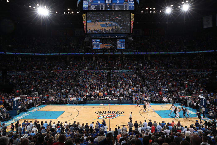
Joe Murphy / NBAE
Similar to the Clippers, the Thunder's court is brought down a few notches due to the fact that the center court logo is just bad. The color scheme in the paint and on the baselines and sidelines is a nice shade of blue, but the color can't save the rest of the court being dragged down by the bad logo.
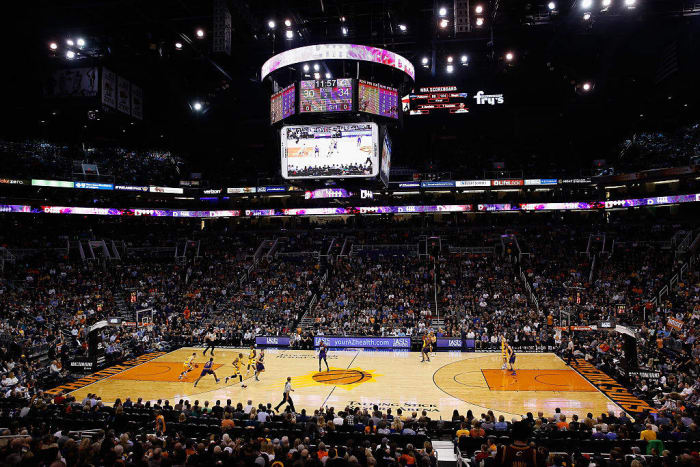
Christian Petersen / Getty Images
The Suns have a solid color scheme that includes purple. Unfortunately, purple is nowhere to be found on this court, as they only use black and orange. It's a far cry from the eye-catching court that they played on during the '90s.
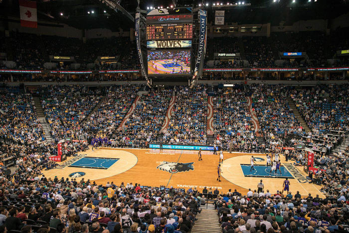
Jordan Johnson / NBAE
The two-toned court would look better if the baselines and sidelines were actually painted in team colors. Instead, we get a court that's almost good-looking but not quite there yet for the Timberwolves.
Patrick Smith / Getty Images
This court would actually benefit from having just one tone of hardwood all over instead of going to a different tone inside of the arc for seemingly no reason. Other than that, the Wizards play on a perfectly serviceable court, but it's nothing too special.
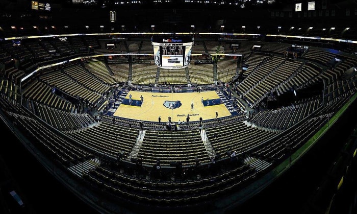
Frederick Breedon / Getty Images
The Grizzlies have been playing on this court design since shifting to their current visual identity, and it's starting to show. They could do better with a smart update to the court so it looks like it belongs with the rest of the courts in the league and not stuck in the past decade.
Ronald Martinez / Getty Images
The general design of the Mavericks' court isn't completely bad. It just falls into the trap that the Clippers and Thunder also fall into — a decent court design brought down by the logos. Granted, the Mavericks don't have awful logos, but they're pretty outdated and could use a tweak or two in order to improve their identity and the court as well.
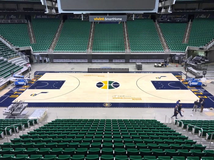
twitter.com/utahjazz
During this offseason, the Jazz made the smart decision to go back to using its classic logo as the primary logo. It was already at center court on the previous court design, but the new court design just includes the basketball from the logo. Is it simple? Yes. Is it a downgrade? Also, yes.
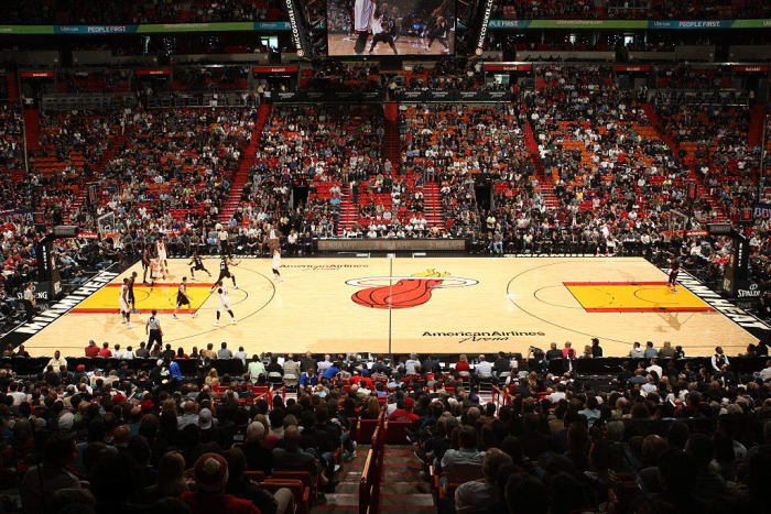
Oscar Baldizon / Getty Images
The Heat has played on the same general court design (with very small tweaks) since moving into the American Airlines Arena back in 2000. That's not a bad thing, but like most designs from the year 2000, it could use a major tweak in order to give the court a better look.
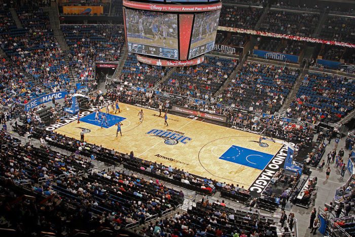
Paul Chapman / Getty Images
The Magic is one of a few teams in the league that uses a special design for its hardwood. In this case, it's parquet. The design isn't quite on the level of what you see in Boston, but it's not ugly. It's just kind of there.
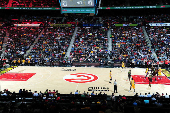
Scott Cunningham / Getty Images
The Hawks get big points for the use of the excellent "Pac-Man" logo and the "feather" pattern in the paint, but the black sidelines and the odd volt color scheme on the baseline brings this down a bit.
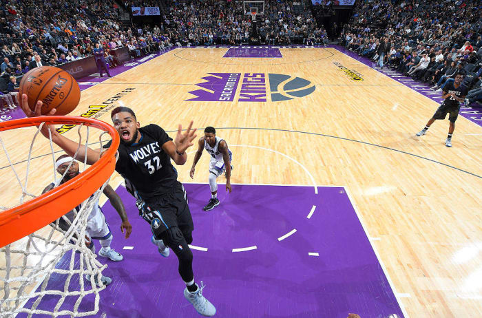
Rocky Widner / Getty Images
There is plenty of purple to go around on the Kings' brand-new court in their brand-new arena. The center court logo would've looked better with a white background instead of going with a transparent background, but otherwise there are no major complaints with this court.
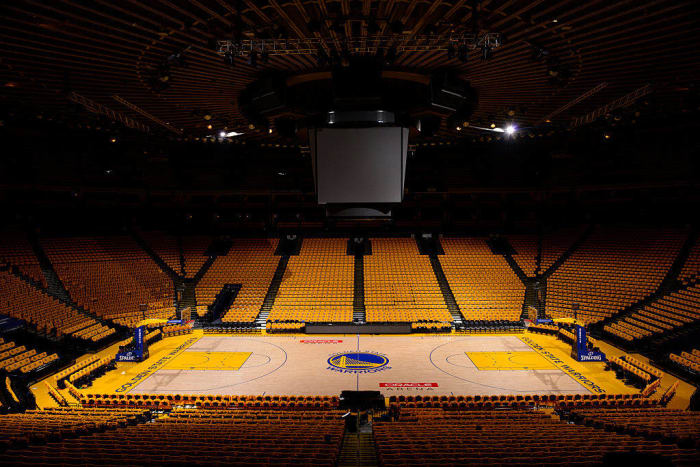
David Dow / Getty Images
The copperplate font that surrounds the center court logo and runs down the baselines is basically what makes this court simply mediocre instead of possibly being great. Additionally, the Warriors would probably benefit from inverting the painted portions of the court from gold to blue, but that's just a personal nitpick.
Chris Schwegler / NBAE
The Pistons have been making slight tweaks to their court design for years now, but they may have come upon a design that could stick for years to come. This is a solid-looking court for the Motor City representatives.
Bill Baptist / NBAE
The Rockets benefited from going from a court with mostly no paint to letting their shade of red run rampant all over. As a result, the Rockets now have a much livelier-looking playing surface.
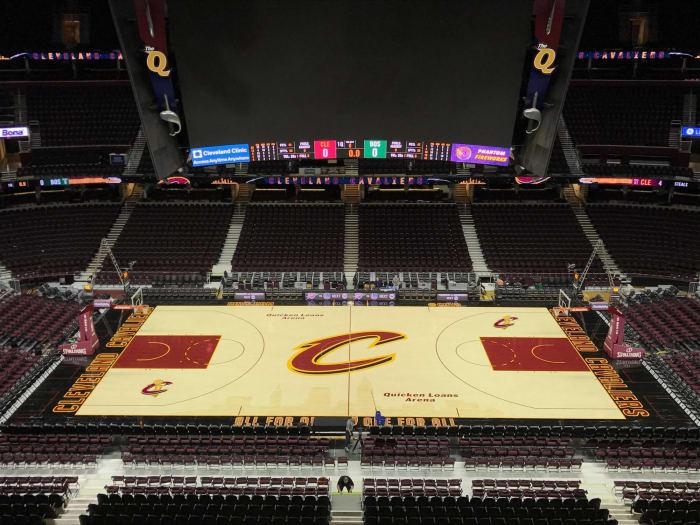
twitter.com/cavsdan
The Cavaliers managed to clinch the NBA title wearing those ugly black sleeved jerseys, and now black has replaced navy as the baseline color. It's perfectly fine as far as design goes.
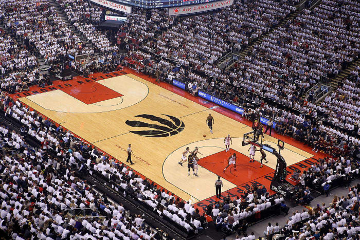
Tom Szczerbowski / Getty Images
The center court logo is very bold, and the design itself is simple but very effective. Plus, it helps that the current Raptors court is a pretty big upgrade over their previous court with the optical illusion logo at the baselines.
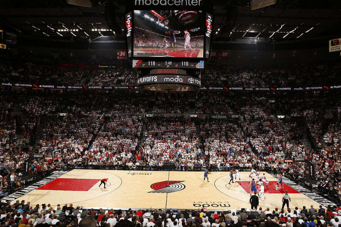
Cameron Browne / NBAE
This is a simple design that's enhanced by the fact that the Blazers' logo and wordmark set are among the best in the league. There's nothing too crazy going on, but the pinwheel logo at center court is a classic and a good thing to lean on.
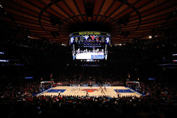
Mike Stobe / Getty Images
In the relatively recent past, the Knicks made the smart decision to ditch the orange paint in the key in favor of blue, and they also standardized the colors on the court to match their color scheme. As a result, the Knicks now play on a court that resembles what the beloved teams from the '90s played on, and it's a look that's very easy on the eyes.
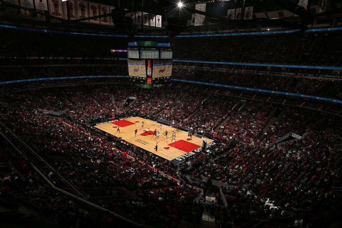
Jeffrey Phelps / Getty Images
The Bulls are another team that benefited from a recent tweak. They replaced the generic wordmark on the baselines with the wordmark from their logo, and they removed the basketball that was behind their iconic Bull logo at center court so the logo could stand on its own. Now the Bulls have a very aesthetically pleasing court, and it's one of the best in the league.
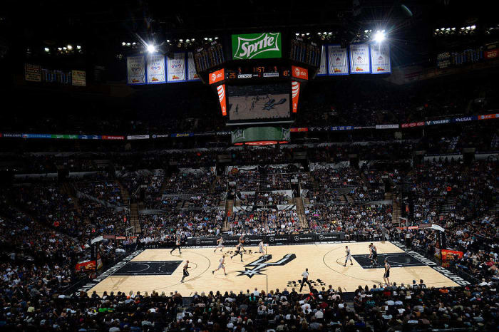
D. Clarke Evans / NBAE
This court fits the Spurs' identity to a tee. The center court logo is bold and effective, and the rest of the design is solid. It's the perfect fit for a team that goes about its business in such an effective way.
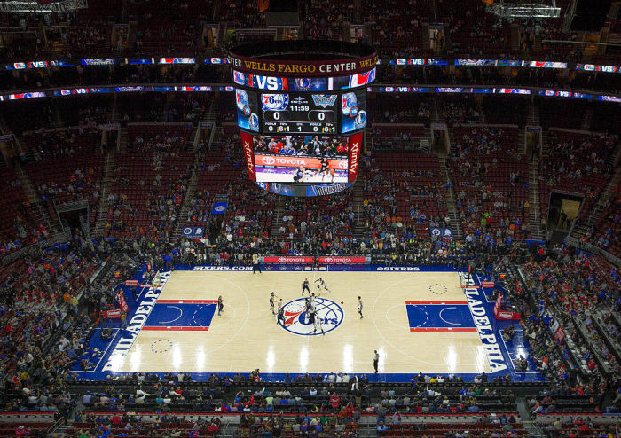
Mitchell Leff / Getty Images
The Sixers got new uniforms for the 2016-17 season, but they didn't change their court design. They didn't need to — in fact, this court probably fits in better with what they wear now than what they wore before. From the wordmark on the baseline to the classic logo at center court, this is a fantastic playing surface.
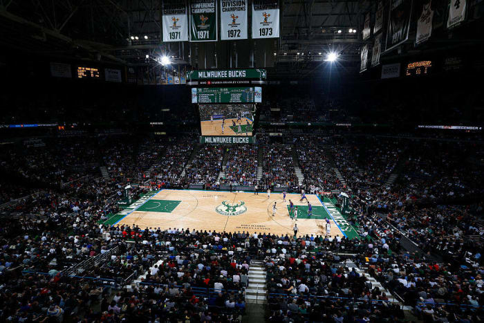
Jeffrey Phelps / Getty Images
A few years ago, the Bucks made the lovely decision to sublimate the old MECCA court design onto their court. They kept that look as they picked up new logos in time for the 2015-16 season, and as such, the team now has one of the best-looking and most unique courts in basketball.
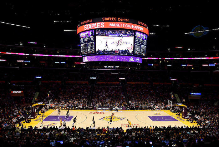
Harry How / Getty Images
It's fitting that a team with such a star-studded history would use stars at center court to represent its massive number of NBA title victories. The team's color scheme is utilized very well, and it's a big upgrade over the court that the Lakers had before. You could make the argument that it's the best court that they've ever had.
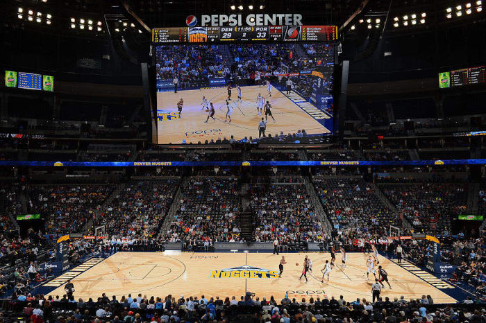
Garrett Ellwood / NBAE
If you aren't going to paint the key, then this is how you should do it. The Nuggets get huge points for individuality and uniqueness by sublimating their pickax logo within the arc. They also have a sublimated image of the Rocky Mountains on their court as well. It's one of the most unique courts not only in today's league, but in the history of the league as well.
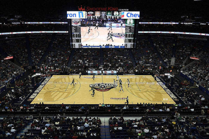
Stacy Revere / Getty Images
Similar to the Nuggets, the Pelicans also have a sublimated logo in the arc in lieu of a painted key. They get extra points because the Pelican bird logo looks amazing in sublimated form. This was a well-thought-out and well-executed idea from all parties involved.
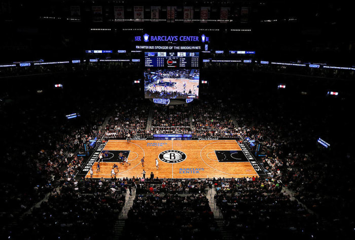
Rich Schultz / Getty Images
When you have a color scheme like black and white, you have to try very hard to stand out. The Nets' court does a great job of doing that, as they're the only team in the league with a herringbone court design on the hardwood. In addition, the baseline design takes inspiration from NYC subway designs. The attention to detail is what makes this court one of the best in the league.
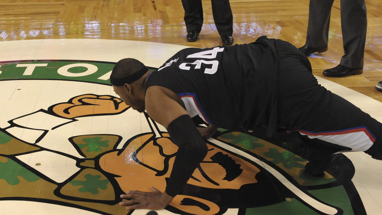
Brian Babineau / Getty Images
What else can you say about this court that hasn't been said already? Over the course of Boston's storied history, the Celtics have won the majority of their titles on a parquet floor. From the Boston Garden to the TD Garden, this design has stuck and become as much a part of the Celtics' identity as the leprechaun logo itself. It's an excellent court design, and it won't be going away anytime soon.
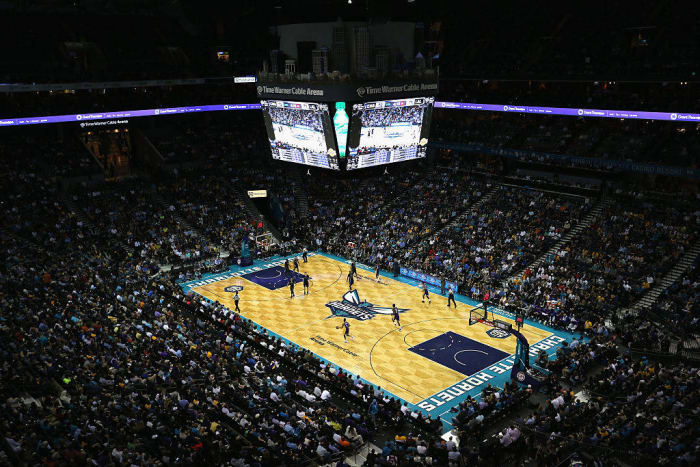
Streeter Lecka / Getty Images
Where do you start? The color scheme is unique, the logos are fantastic and the honeycomb pattern is incredibly unique. While it may not have the history of the Celtics' classic parquet look, it's a look that fits the Hornets' visual identity to a tee. It's perfect for the Hornets, and it's the best-looking court in the NBA.


 +
+