Yardbarker
x

Ranking the field designs of the NFL

Ranking the field designs of the NFL.

 
1 of 32

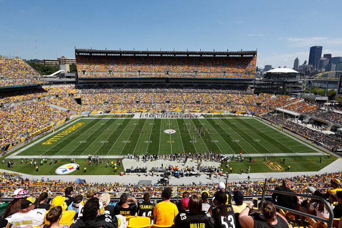
32. Pittsburgh Steelers

Pittsburgh Steelers
Getty Images

The Steelers may play in a lovely stadium and have six beautiful Lombardi Trophies to fall back on, but nothing about their field designs have made the gridiron really stand out from the rest of the pack. Granted, they share the stadium with the Pitt Panthers, but they could still get a bit more creative than simply putting the city's name on one end and slash marks on the other. 

 
2 of 32

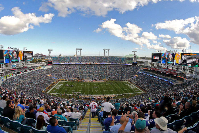
31. Jacksonville Jaguars

Jacksonville Jaguars
Getty Images

While the Steelers have a decent set of logos and scripts to choose from but awful execution, the Jaguars just don't have a good set of logos to begin with. As a result, a bad logo at midfield plus an end zone that just has a bad wordmark script and barely any color in it makes for a drab-looking field. 

 
3 of 32

30. Atlanta Falcons

Atlanta Falcons
Getty Images

Before the Falcons switched from the concrete-like AstroTurf to FieldTurf, they had a decent-looking end zone with a nice paint job. Now, they've had nearly the exact same field design since going to their current visual identity. Consistent? Yes. Boring? Also, yes.

 
4 of 32

29. Detroit Lions

Detroit Lions
USA Today

The Lions would've been a few spots higher on this list (not many, though), but for some reason they decided to muddle their end zone design. Instead of just going with the "LIONS" script, they decided to add the city's name to the script logo as well. It makes the entire wordmark uneven, and it's not a good look as far as field designs are concerned.

 
5 of 32

28. Miami Dolphins

Miami Dolphins
Getty Images

The good news is that Hard Rock Stadium has undergone a massive renovation and almost looks like a brand-new stadium. The great news is their days of sharing a baseball diamond with the Marlins are long gone, so they don't have to worry about a dirt eyesore being on their field. The bad news is that they share a stadium with the Miami Hurricanes, which limits them to generic end zone designs for most of the season.

 
6 of 32

27. San Diego Chargers

San Diego Chargers
Getty Images

Here we have another case of shared facilities resulting in a less-than-inspiring field design. The Chargers share the stadium with the San Diego State Aztecs, so that results in the Chargers not being able to keep their lovely shade of blue in their end zone for the entire season.

 
7 of 32

26. Chicago Bears

Chicago Bears
Getty Images

While some teams have the excuse of having other tenants in their stadiums, the Bears don't. Granted, the field conditions at Soldier Field are rarely ever stellar, but it would be nice to see some color.

 
8 of 32

25. New Orleans Saints

New Orleans Saints
Getty Images

The Saints are another team that suffered aesthetically from the switch from the brutal AstroTurf to FieldTurf. Instead of having a colorful end zone, the playing surface of the Superdome has a pretty boring look whenever the primary tenants are playing.

 
9 of 32

24. Seattle Seahawks

Seattle Seahawks
Getty Images

Another victim of shared stadium syndrome, though this time it's a soccer team that shares  the stadium. The lovable Seattle Sounders and their schedule don't overlap for very long with the Seahawks' schedule, but when it does, it results in some tacky field designs. Plus, the Seahawks in general just seem averse to painting their end zones with color at times.

 
10 of 32

23. Tennessee Titans

Tennessee Titans
Getty Images

Imagine seeing those end zones colored in the Titans' amazing shade of blue. Just imagine it! Now you see just how big of a missed opportunity the Titans have. They could have one of the better-looking end zones in the NFL, but instead they refuse to color them in. 

 
11 of 32

22. Green Bay Packers

Green Bay Packers
Getty Images

The Packers are actually really thrifty when it comes to their field design. They don't have to use green because the shade of green on the field is actually close enough to the shade of green that the team uses. As a result, the only colors that the Packers use to paint their field are gold and white. This looks good in the early parts of the season, but when the grass gets brown during playoff time, it doesn't look so good.

 
12 of 32

21. New England Patriots

New England Patriots
Getty Images

Yet another end zone that could use some more color. The Patriots do get points for having a stadium logo on their field and a nice, big logo in the end zone, but it's still mostly a white script and an unpainted end zone. Nothing too inspiring here.

 
13 of 32

20. Arizona Cardinals

Arizona Cardinals
Getty Images

This is the section of the rankings where most of the designs could be interchangeable. Most of these field designs are totally acceptable but not exciting at all. The Cardinals are a prime example of this.

 
14 of 32

19. Houston Texans

Houston Texans
Getty Images

The Texans get credit for switching things up at times. Whenever they go to their Battle Red uniforms, the outline of the script logo in their end zone is painted red. It's a nice shift but nothing too special. 

 
15 of 32

18. Philadelphia Eagles

Philadelphia Eagles
Getty Images

The Eagles have been known to give their end zone a black paint job at times, which is at least an effort to shake things up a bit. Other than that, they normally stick to the typical field design that you see here.

 
16 of 32

17. Kansas City Chiefs

Kansas City Chiefs
Getty Images

The good news is that the grounds crew in Kansas City has apparently learned from the tragic mistake that it made back in the 1990s when it painted "Chefs" in the end zone. Great googly moogly. All kidding aside, this is a perfectly acceptable field design, and while the "CHIEFS" wordmark in the end zone is nice, it's not exciting enough to stand on its own.

 
17 of 32

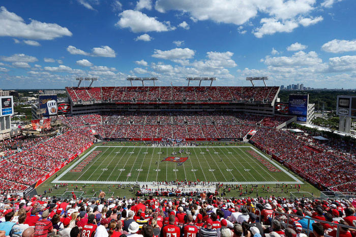
16. Tampa Bay Buccaneers

Tampa Bay Buccaneers
Getty Images

While the Bucs may have some of the ugliest uniforms in the NFL right now, their logos and wordmarks are actually really solid. The team's primary logo is placed boldly at the 50-yard-line, and the wordmarks cover a good chunk of the end zone and are actually painted in team colors, instead of given a generic white paint job. This is not a bad field design at all!

 
18 of 32

15. Washington Redskins

Washington Redskins
Getty Images

The logo and nickname may not be popular at all, but the franchise is definitely proud of it and makes sure to let you know it. The logo will always be front-and-center at the 50, and the end zone is adorned with the team's helmet on both sides of the wordmark. Love the identity or hate it, but the field design is indeed solid.

 
19 of 32

14. Baltimore Ravens

Baltimore Ravens

The Ravens have proved that they aren't afraid to give their end zone a nice paint job at times, but for the most part, they stick with unpainted end zones. However, the logo and wordmark that are placed in their end zone covers up enough of it to actually make it look pretty good, even if it's unpainted. The 50-yard-line logo is nice as well, and it's a decent design overall. 

 
20 of 32

13. Denver Broncos

Denver Broncos
Getty Images

This is another field that would jump a few spots higher in these rankings if the Broncos ever put some more color in their end zone. Imagine that end zone fully painted in blue or even orange with white or blue lettering? It's a missed opportunity, but the Broncos still play on a decent field.

 
21 of 32

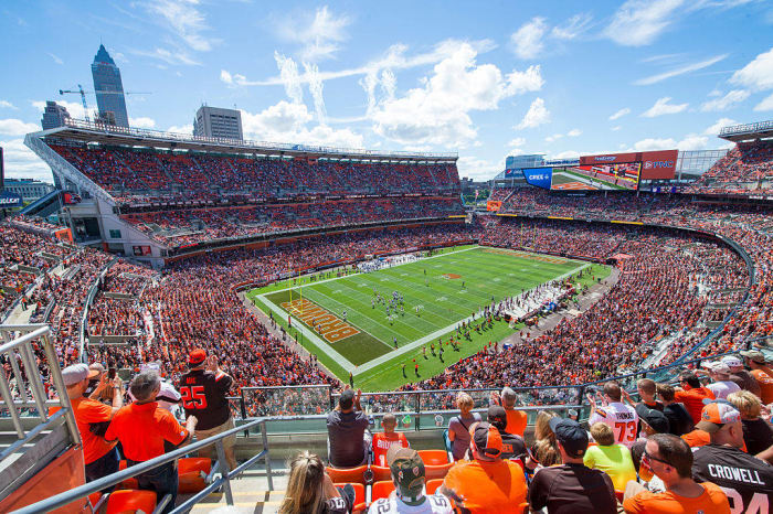
12. Cleveland Browns

Cleveland Browns
Getty Images

They're the Cleveland Browns. The team may not be named after the color (they're actually named after the legendary Paul Brown), but everything about this field design makes sense. Brown end zones for the Cleveland Browns? It's so simple yet brilliant at the same time.

 
22 of 32

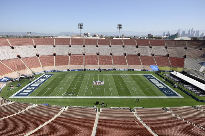
11. Los Angeles Rams

Los Angeles Rams
USA Today Sports

The NFL is back in Los Angeles, and the home team will at least have a good-looking field design to play on during its first season back in town. The wordmark being used in the end zones is actually an update of what the team used to use during its first stint in Los Angeles. It's a nice update on an old classic.

 
23 of 32

10. Buffalo Bills

Buffalo Bills
Getty Images

If you ever need a template for how to design an NFL field, then this is what you start with. Paint your end zone in your team's colors, put your best wordmark in the middle and place your logo boldly at the 50. That's what the Bills have done, and there's really nothing to complain about with this design.

 
24 of 32

T-9. New York Giants

T-9. New York Giants
Getty Images

The Jets and Giants are tied for ninth place. They both get credit for painting their end zones in their team colors and logos, and that's no small feat when they easily could've gone with a generic, unpainted end zone with just white names in there. So props to the crew at MetLife Stadium for coming up with this design.

 
25 of 32

T-9. New York Jets

T-9. New York Jets
Getty Images

It's also interesting to note that they have the conference logos in there as well. Normally that's reserved for the bygone days of past end zones or just the Super Bowl end zone designs, but both the Jets and Giants decided to show off their pride for their conferences. Not bad.

 
26 of 32

7. Indianapolis Colts

Indianapolis Colts
Getty Images

The Colts could've gotten extra points if they had decided on just one end zone design — either the one with the "COLTS" nickname and logos in it or the one with the city name in it — but they decided to go with both, and that's not the worst decision in the world either. It's a lovely design, and it's also a design that's stood the test of time since this is the same exact design that they used during their days in the RCA Dome.

 
27 of 32

6. Carolina Panthers

Carolina Panthers
Getty Images

The end zones here are excellent. The electric blue wordmark is bold, and it pops off of the black end zone to the point where it's impossible to not catch your eye. If the Panthers' logo was at midfield, then this design would've been in the top three. Instead they'll have to settle for being just outside of the top five. 

 
28 of 32

5. Dallas Cowboys

Dallas Cowboys
Getty Images

This is a simple but extremely effective field design. It's all about the star in Dallas, and there's plenty of stars on display on this field. Combine that with the blue end zones and that classic wordmark, and this is definitely one of the best-looking fields in the NFL today.

 
29 of 32

4. San Francisco 49ers

San Francisco 49ers
Getty Images

San Francisco has been known to paint its end zones red, and the Niners even went with a black paint job to match their (ill-advised) black uniforms. That's fun, and the 49ers do a good job of making sure that hitting the paint in pay dirt is actually worth it.

 
30 of 32

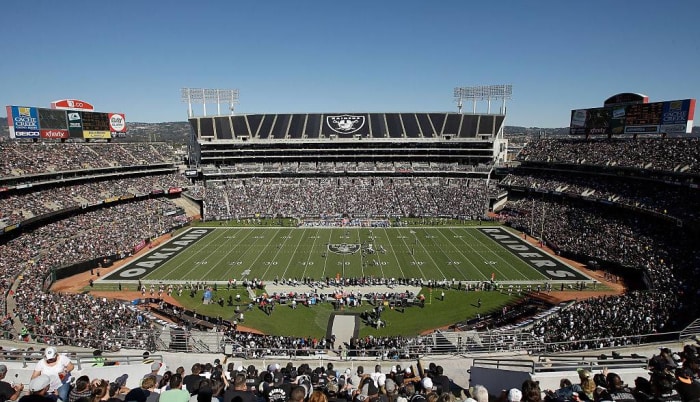
3. Oakland Raiders

Oakland Raiders
Getty Images

If the Raiders had to play on the version of their field that includes the baseball diamond on the middle of the field and absolutely no paint design in the end zones, then they'd be the worst. However, when the team actually has control of the field design, it actually has a lovely-looking field design — it's to the point where it's actually one of the best-looking field designs in the league.

 
31 of 32

2. Minnesota Vikings

Minnesota Vikings
Getty Images

After playing on a generically designed field due to sharing a stadium with the Minnesota Gophers, the Vikings are taking advantage of their brand-new stadium by giving their field design a very, very nice look. The purple end zones are great, and the update of the classic Vikings wordmark is excellent. All in all, a very good-looking field.

 
32 of 32

1. Cincinnati Bengals

Cincinnati Bengals
Getty Images

This is the gold standard for NFL field designs. While some other stadiums choose to just put their teams' names in white and only put small logos at the 50-yard line, the Bengals go all out. That "B" logo is boldly placed at the 50, and the end zone is adorned with bengal stripes. This is easily the most eye-catching field design in the NFL.

Demetrius Bell can be contacted on Twitter @fergoe, which is where you can catch him tweeting mostly about any and everything under the sun. If you enjoyed what you've been reading, then go ahead and give him a follow!

More must-reads:

Customize Your Newsletter

+

Get the latest news and rumors, customized to your favorite sports and teams. Emailed daily. Always free!
This site is protected by reCAPTCHA and the Google Privacy Policy and Terms of Service apply.