-

-


Follow Us
-

 On Facebook
 On Flipboard



On Tuesday, Nov. 3, the Montreal Canadiens unveiled their version of the NHL’s Hometown Remix line of alternate kits. It wasn’t exactly a smash hit; however, many of the players said they loved it. But the fact that the team suffered an ignominious defeat wearing them didn’t help.
Montreal isn’t a club known for switching up its uniforms often. Today, we look back at the past 20 years of alternate kits.
A Kit Is a Team’s Identity
First and foremost, what is a kit’s purpose? Yes, much of the answer has to do with selling as much of it as possible to the masses who support a franchise. For this exercise, cynicism will be shunned in favour of a more impassioned, invested look into why a team such as the Canadiens wear what it does at the office at all.
The jersey is a team’s identity. The colours, the crest, the detailing, the overall design language – all these elements are supposed to communicate what the club is about. The more eyeballs see it, the more it becomes recognizable and, if we extend the logic, the more it is recognized as the team’s identity. “We wear red,” “We wear blue,” “We wear a ‘C’ with a small ‘h’ inside it” are examples of the connection fans have with their favoured team.
If a uniform has become so ingrained in the minds of a fanbase, so intimately associated with a franchise, the decision to mix things up can cause a stir. If not handled judiciously, what was once a very recognizable ensemble becomes the opposite: a design one has an emotional attachment to. It has to be done right, not merely to look attractive when worn by centre Nick Suzuki or netminder Jacob Fowler, but to say something about the club.
Many thanks to the delightful website NHL Uniforms Database for its renderings of everything the Canadiens have worn since their inception.
White Retro (2006-07)
Going back two decades to the 2006-07 campaign, the Canadiens rocked a look that only hardened Habs fanatics would recognize. It was a predominantly white jersey, much like their typical away look. However, the shoulders and neck areas remained white, and the crest was hugged by the blue band found on the regular home jersey.
This was in fact a callback to the club’s second uniform during the 1944-47 seasons. It wasn’t your father’s jersey. More probably your grandfather’s. Was it a success? Beauty is in the eye of the beholder. As far as the Canadiens’ identity, it made just enough sense. Seeing so little red in a colour scheme most fans associate the team with (red, white and blue, le Tricolore in French) was perhaps a bit odd. To be clear, red was present as little stripes that flanked the bigger blue one.
A solid jersey, if perhaps a bit on the bland side.
Reverse Retro (2021)
Sometimes the best solution to a problem is the simplest. In this case, the problem was devising a uniform that still spoke to who the Canadiens are while still showing a different side.
In 2021, the answer was: why not just invert the colour scheme? In other words, where the uniform is red, make it blue, and vice versa. A fairly simple idea that toyed with what would be expected from a home kit, but still in the general ballpark of acceptability. Seeing a big red stripe hug the crest was a notable departure from the usual contrast between blue and red. All the same, it was a beautiful shade of blue that caught the eye.
Despite the team’s poor results when sporting them (1-6-1), it was nevertheless a campaign that concluded with a Stanley Cup Final appearance.
Expos Homage (2022-23)
One of the more controversial choices was the alternate kit for the 2022-23 campaign. Here is where ideas of what a team is supposed to represent arguably got lost in translation.
In essence, this jersey replaced everything red – save the crest – with baby blue. Why in the world would they do that? Baby blue was never, ever a Canadiens colour.

The answer lies not with the history of the city’s fabled NHL franchise, but rather with its defunct Major League Baseball (MLB) franchise: the Montreal Expos. It operated from 1969 to 2004. Throughout the years, it not only changed homes – they didn’t always play at the Olympic Stadium – but also uniforms. One of the more fondly remembered ones was predominantly baby blue, their away design for many years.
Clever? Yes. Too clever? For one, why pay homage to a road uniform when playing at home? Two, it was a baseball team, not a hockey team. Third, as sad as it may be for some to read, the Expos hadn’t been around for nearly 20 years by then and hadn’t worn that specific colour scheme in over 30. Were there that many fans who knew what the kit represented? For disclosure: I did not, at first.
The 2026 Heritage Classic
Montreal faced the Winnipeg Jets outdoors in Manitoba for the 2026-27 season’s Heritage Classic match. It was a splendid evening with plenty of enviable pomp and circumstance, all of which harkened back to the players’ and fans’ youth playing a good old hockey game on a frozen pond or backyard rink.
For the occasion, the Canadiens – and of course the Jets – were provided with special attire. In Montreal’s case, the designers certainly got the assignment right. The night’s jersey looked a lot like the typical home sweater, complete with red and blue and the famous CH on the chest. Yet the details stood out. For one, there was no pure white; it was replaced with a warm shade of cream.
The gloves were also a dark brown, reminiscent of the basic, leathery hockey mittens of yore. Lastly, and this was only spotted if one got up close to the jersey, there was stitching etched into the team’s crest, lending it a “hand-made” feel.
For all intents and purposes, this was an alternate jersey done right. The same, but different.
The Hometown Remix (2026-27)
Which brings us to the latest entry in the long list of Canadiens jerseys. Woeful first match wearing them aside, what is the Hometown Remix about?
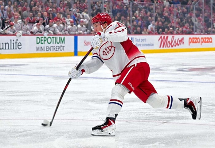
At first glance, it almost feels like a gag. Montreal is in Canada, and Canada is super cold, so make something that looks like snow. That was, in all honesty, the first thought that sprouted in my mind.
Thankfully, there is more to it than that, even though it is a lot of white. For one, it is nice to see the players’ numbers and surnames in red. It definitely pops. There is also nice ribbing on the numbers, name, and logo on the chest. It’s subtle and wouldn’t be spotted from afar, but up close, it’s nice texturing.
The part about identity gets quite interesting. The city’s flag has a white background and a red, heraldic cross. In each quadrant and in the cross’s center lies a different icon pertaining to Montreal’s heritage: a fleur-de-lis (France), a red Rose of Lancaster (England), a shamrock (Ireland), a thistle (Scotland), and a pine (the region’s Indigenous peoples). Look closely, and those four icons are in red on the lower part of the jersey’s sleeves.
As vastly different as the look is from what fans expect from the Habs, it is branded as a Hometown Remix. Not a Franchise Remix.
Too much white? Probably, but love it or hate it, it says a lot about Montreal, and that was the point.
More must-reads:
- Predators' Juuse Saros introducing new goalie mask that pays tribute to Dolly Parton
- Red-hot Cutter Gauthier achieves franchise first with rare feat
- The '1,500-point, 150-block seasons' quiz
Breaking News
Trending News








Customize Your Newsletter
 +




Get the latest news and rumors, customized to your favorite sports and teams. Emailed daily. Always free!
PRIVACY POLICY COOKIE POLICY CONTACT US
ABOUT YARDBARKER TERMS OF SERVICE


By using this site, you agree to our Terms of Service and Privacy Policy.
This site is for entertainment purposes only.
There is no gambling offered on this site.
Gambling Problem? Call 1-800-Gambler.