-

-


Follow Us
-

Alright, let’s get into the nitty-gritty of these supposedly “leaked” FC Barcelona kits for 2025/26. I mean, it’s football fashion people get almost as heated about this as they do about actual games. So, here’s the breakdown, minus the PR gloss and with a little more honesty (and a bit less grammar perfection, sorry not sorry).
## 1. Home Kit: Tradition Gets a Techno Remix!
So yeah, we’re talking about those classic FC Barcelona red-and-blue stripes, but this time someone at Nike had a little too much fun with Photoshop’s gradient tool. The stripes kinda blur and fade as they head toward the middle, which is either “ooh, digital age!” or “my screen’s dirty”—depends on who you ask.
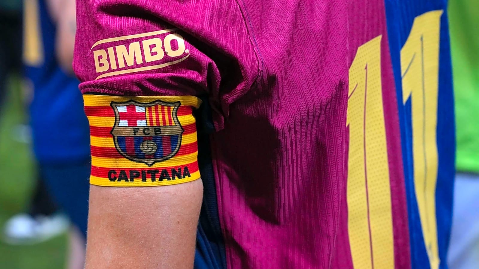
Logos? All switched to a punchy yellow (“Midwest Gold,” if you wanna get fancy about it), which honestly does pop, even if it’s just another way to make sponsors louder. The Catalan flag detail is still tucked up top on the back—nice, subtle flex about local pride.
### Collar & Sleeves!
Here’s where things get spicy. The collar’s gone all asymmetric—one side red, one blue, then an oddball sleeve that just doesn’t match. Some people love this kind of “rule-breaking” style. Others? Calling it messy, even ugly. Reddit’s not holding back, with hot takes about “thick stripes” and “that collar ain’t it.” Honestly, it’s not for everyone, but at least it’s not boring.
### The Internet Reacts!
It’s the classic split: old-school fans want the hard lines and symmetry, while others dig the shake-up. Some say the gradient looks slick, others think it’s just trying too hard. As for the collar, let’s just say if you’re a perfectionist, this kit will haunt you.
### Quick Pros and Cons!
| ✅ Pros | ⚠️ Cons |
| — | — |
| FC Barcelona Heritage colors, but not stuck in the past | Gradient = “gimmick” for the old guard |
| Yellow logos are easier to spot in the stands | That collar’s never gonna look normal |
| Senyera flag = local pride | Spotify logo still hogging the spotlight |
—
## 2. Third Kit: Orange You Glad It’s Back?!
### Colors & Vibes
Now, this one’s a wild throwback to FC Barcelona’s 2000s days. It’s basically radioactive orange, officially “Bright Mango,” with some deep navy trim—a straight-up homage to those late-2000s FC Barcelona kits. Nike’s Total 90 vibe is strong here: bold, simple lines, nothing too fussy. Feels like something Ronaldinho would wear while embarrassing defenders.
Nostalgia is powerful, but so is neon. It’s gonna stand out, for better or worse.
### How People Feel!
Orange kits always split the crowd. Some folks love the retro nod and the streetwear potential—like, this is the one you’ll see on TikTok kids. Others think it’s one glow stick away from a safety vest. Either way, it’s memorable which is always a positive.
—
## Home vs. Third: The Strategy!
1. **Home kit**: Still FC Barcelona, just updated for the TikTok/Spotify era. The fade almost looks like a Spotify visualizer, so… synergy?
2. **Third kit**: Pure nostalgia, but with sharper lines and way more attitude. It’s like Barça’s saying, “Remember when we were unstoppable? Yeah, that’s the vibe.”
—
## What Are Fans Actually Saying?!
Reddit’s having a field day. Some are warming up to the gradient home kit (literally said “It’s growing on me”), while the rest wish for stripes that don’t look like they’ve been through the wash too many times.
On kit ranking polls, the Kobe-collab away kit’s apparently the crowd favorite, then comes the home kit, then orange—though plenty of folks still respect the retro energy.
—
## Final Thoughts!
Look, the home kit’s a decent compromise: tradition in the colors, but not afraid to mess with the formula. The fade and collar are gonna be divisive, no way around it.
The third kit? Yeah, it’s loud. It’s not for purists, but it’s got swagger and nostalgia. Plus, it’ll look sick in highlight reels and on Instagram.
Nike and FC Barcelona are clearly trying to keep things fresh without totally ditching the club’s DNA. Between the bold colors, the throwback touches, and the shouty sponsor logos, these kits are meant to get people talking—whether they’re complaining or copping them for streetwear. In the end, I guess that’s the point.
More must-reads:
- World Cup 2026 Friday takeaways: Belgium surprises, Spain pulls ahead
- Tuesday's 2026 World Cup takeaways: Egypt manager Hossam Hassan claims Argentina comeback was 'rigged'
- The 'Most three-pointers by NBA team' quiz
Breaking News
Trending News


Customize Your Newsletter
 +
+
Get the latest news and rumors, customized to your favorite sports and teams. Emailed daily. Always free!

PRIVACY POLICY COOKIE POLICY CONTACT US
ABOUT YARDBARKER TERMS OF SERVICE
By using this site, you agree to our Terms of Service and Privacy Policy.
This site is for entertainment purposes only.
There is no gambling offered on this site.
Gambling Problem? Call 1-800-Gambler.