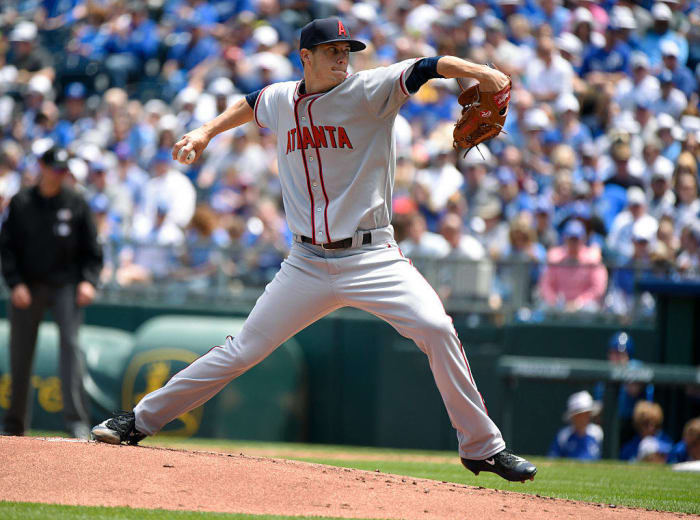
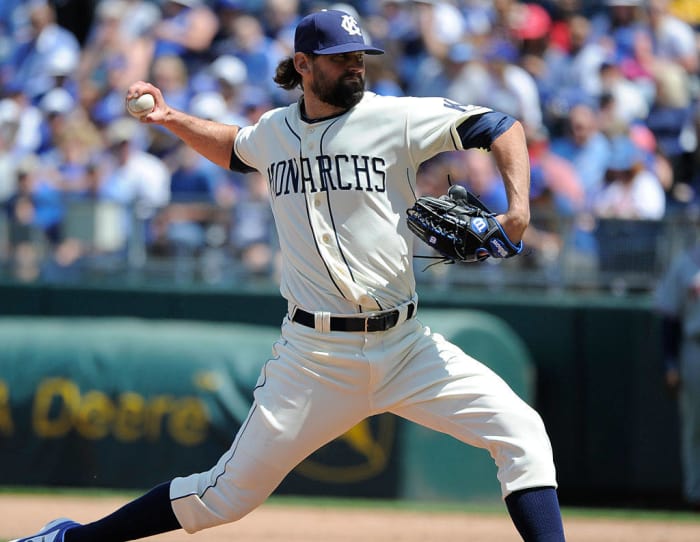
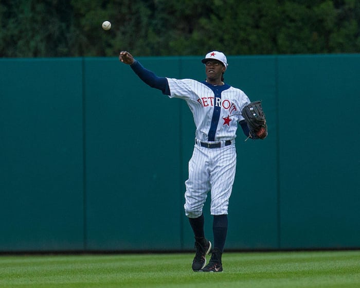
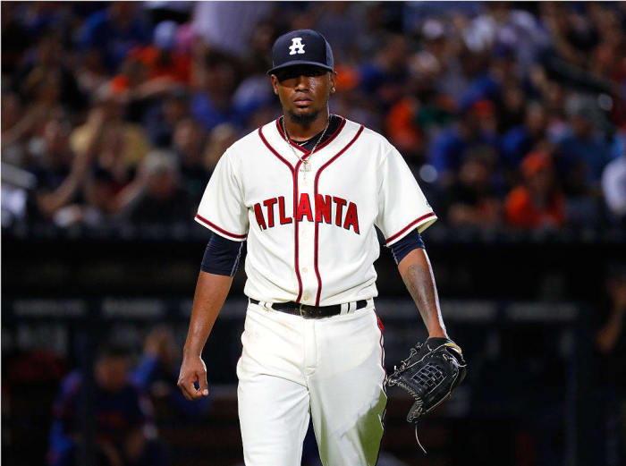
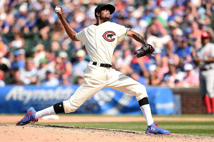
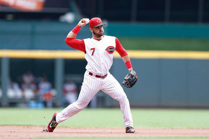
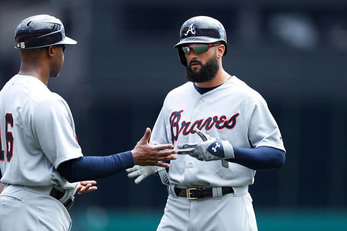
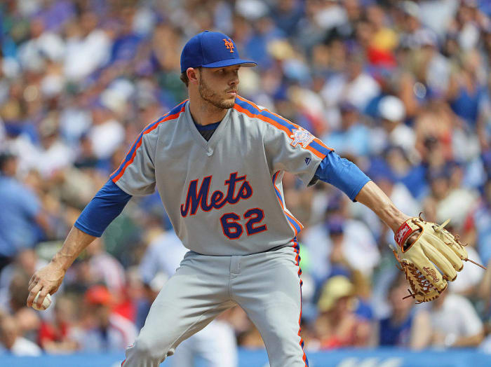
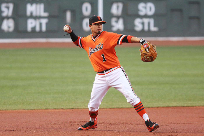
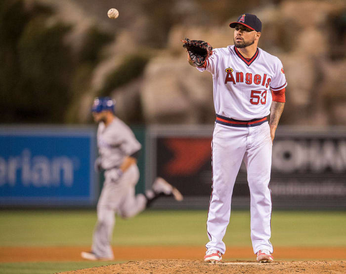
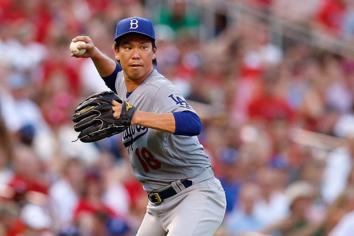
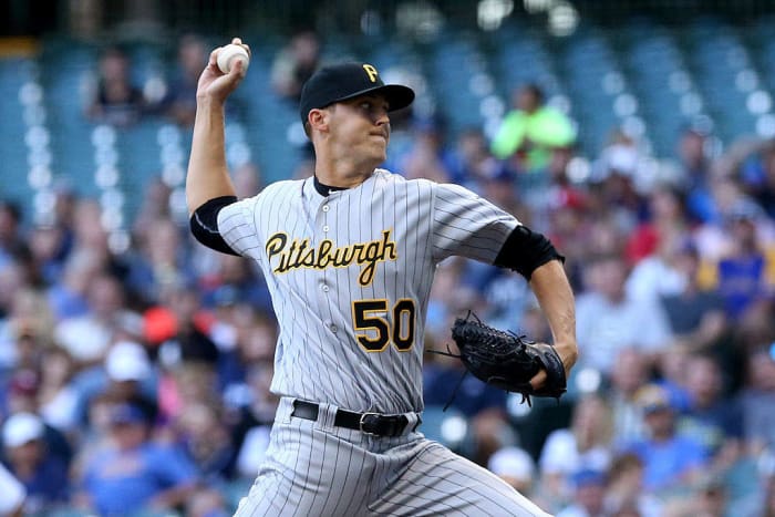
A look at the MLB Turn Back the Clock uniforms of 2016
May 15th: Atlanta Braves (Atlanta Black Crackers)
The Braves and Royals kicked off this season's special Turn Back the Clock series back in May with Kansas City's annual Salute to the Negro Leagues days. The Braves played along by wearing their Atlanta Black Crackers uniforms. This wouldn't be the last time the Braves broke out Black Crackers unis in 2016.
May 15th: Kansas City Royals (Kansas City Monarchs)
The home team for this game paid tribute to the Kansas City Monarchs. After wearing pinstriped Monarchs throwbacks in 2015, the Royals went with a simpler uniform from the Monarchs' history for 2016.
June 3rd: Milwaukee Brewers (1976)
The Phillies and Brewers took things back to the 1970s in early June. Old-school powder blue away jerseys are always lovely to look at, and the Brewers' unis from the early 1970s are no exception to that rule.
June 3rd: Philadelphia Phillies (1976)
Hey, look at that -- pillbox hats! The Pittsburgh Pirates managed to bring back the look for their Sunday throwbacks, and the Phillies also followed suit for their Turn Back the Clock uniforms from the Bicentennial year.
June 4th: Detroit Tigers (Detroit Stars)
The Tigers paid tribute to the history of Negro League baseball in Detroit by suiting up in Detroit Stars uniforms back in early June. Even for this particular era of baseball, it's a very unique look.
June 4th: Chicago White Sox (Chicago American Giants)
The White Sox were the visitors for Detroit's tribute to the Negro Leagues, and they played along by wearing Chicago American Giants uniforms. Again, this is a very unique-looking uniform, and it's also sharp-looking as well. Also, this is visual evidence that Chris Sale doesn't hate all throwbacks -- just the ones from the 1970s.
June 25th: Seattle Mariners (1984)
The Mariners may wear blue-and-gold retro-inspired alternates on Sunday afternoons, but they decided to go all the way back for a game against the Cardinals in late June. The 1984 look meant that we got to see typical baseball design trends from the 80s: Pullovers, waistbands, and racing stripes.
June 25th: St. Louis Caridnals (1984)
The Cardinals played along with the Mariners for this game, and that was great because we got to see even more powder blue road uniforms, and one of the best-looking road uniforms from the 1980s.
June 25th: Atlanta Braves (Atlanta Black Crackers)
The Braves brought back the Black Crackers uniforms for their Heritage Weekend game. There's not much difference between what they wore on the road and the home uniforms.
June 25th: New York Mets (New York Royal Giants)
Meanwhile, the Mets were the visitors, and they decided to break out the all-blue Royal Giants uniforms. Just like you rarely ever see a team wearing navy blue with white pinstripes, you absolutely never see a baseball team wearing all-royal blue from head-to-toe. Yet, there are the Mets, doing it and doing it well.
July 6th: Chicago Cubs (1916)
Two clubs with extremely long histories went deep into their uniform catalog in early July, with both the Cubs and Reds going back to 1916. This was back when the Cubs were a black-and-red team, instead of the familiar blue-and-red that we see them in today. It's still a very nice look from back then.
July 6th: Cincinnati Reds (1916)
On the other side, the Reds were truly dressed to the nines -- complete with a gray, pinstriped cap! This was a very nice look for the Red Stockings.
July 8th: Baltimore Orioles (1966)
The Orioles celebrated the 50th anniversary of their 1966 World Series title by wearing uniforms from that season. That included the classic Cartoon Bird hat, which is slightly different from the Cartoon Bird that they currently wear on their hats.
July 20th: Cincinnati Reds (Early 2000s)
The Reds paid tribute to Ken Griffey Jr.'s Hall of Fame enshrinement by wearing uniforms that The Kid wore during his time in Cincinnati. It's not the best look that the Reds have had during their long history as a baseball club, but at least the uniforms were accurate.
July 20th: Atlanta Braves (Late 1960s-Early 1970s)
The Braves played along, but an accurate-looking game would've meant that the Braves would've just worn their current home caps with their gray road uniforms. Instead, the Braves decided to wear uniforms from the late '60s and early '70s (with the team's Native American head logo omitted from the right sleeve for obvious reasons). This resulted in a bizarre time-warp game where one team was wearing uniforms from the current century and the other was wearing uniforms from the 1960s. Very weird, but at least Atlanta's uniforms didn't look bad at all.
July 20th: Chicago Cubs (1988)
The Cubs had another Turn Back the Clock day in July, but they decided to only go back three decades instead of a full century. What we got was a pullover/waistband version of their uniforms. This is proof that even traditional clubs like the Cubs were willing to at least fall in line with the design trends of the day, and this was an accurate reproduction of those uniforms.
July 20th: New York Mets (1986)
The Mets have been wearing their 1980s racing stripe uniforms as Sunday home alternates, but they broke out the road uniforms in order to play along with the Cubs on this particular day. It's not a powder blue uniform, but it's the Mets so they already had enough blue in their identity to where traditional gray uniforms worked out just fine for them.
July 20th: Boston Red Sox (1975-1976)
The Phillies weren't the only team to throw it back to the Bicentennial days during the 2016 season. The Red Sox also went back to that year with their Turn Back the Clock night. The late '70s saw the dawn of the Pullover/Waistband Era in baseball, and the Red Sox (with red caps, to boot) were one of the better-looking teams in that era. Also, props to the players who went with the striped socks to really complete the look.
July 20th: San Francisco Giants (1978)
The Giants played along, and the entire team got into the spirit of things by wearing striped socks. The orange pullovers were definitely eye-catching, but the hats actually had a small inaccuracy -- they were the current alternate hats, instead of the hats that the team actually wore back in the late 1970s.
July 20th: Los Angeles Angels (Late 1970s-Early 1980s)
The Angels and Rangers capped off the busiest Turn Back the Clock day of the 2016 with a throwback night in Anaheim. The Angels wore throwbacks from the late 1970s. The uniform on the field was accurate, but the team nearly ruined the entire vibe by wearing red batting helmets with the retro logo on them -- completely inaccurate!
July 20th: Texas Rangers (1993)
On the opposing side, the Texas Rangers opted to wear throwbacks from the early '90s, which means that we ended up with another time-warp game. Again, the main positive is that the uniforms that Texas wore were completely accurate.
July 23rd: St. Louis Cardinals (1956)
The St. Louis Cardinals are known for their classic look of having two cardinals perched upon a baseball bat. However, for one ill-fated season in 1956, the team decided to break with tradition and go with a standard script logo on their jerseys. For some reason, the team decided to wear these throwbacks on July 23rd against the Dodgers.
July 23rd: Los Angeles Dodgers (Brooklyn Dodgers hats)
In what has to be one of the lazier attempts at throwbacks that you'll see, the Dodgers did indeed try to play along with the Cardinals. Unfortunately, Los Angeles made the decision to wear Brooklyn Dodgers hats with their current uniforms. Granted, they're not too different from what the Brooklyn Dodgers wore back in '56, but come on -- how hard would it have been for them to drop the red numbers and the interlocking "LA" logo on the sleeve so that this could've been an accurate look?
July 30th: Milwaukee Brewers (1994-1996)
The Brewers held a '90s-inspired Turn Back the Clock day to cap off July, which meant that Milwaukee got to dust off the look that they had during their final days as an American League team. It's clearly a notch below their previous TBtC look from earlier this season and it's far below the standard of their near-perfect throwback alternates with the classic Ball-In-Glove logo, but it was a fun look for a one-day-only game, and it was accurate as well.
July 30th: Pittsburgh Pirates (1999-2000)
The Pirates got in on the fun by wearing uniforms from the late '90s. That means pinstriped gray uniforms and the old cursive script from back then, complete with the Pirate head logo on the sleeve. It's not as good as what they wear now, but it was still a pretty good look when you consider what baseball looked like during those days.
August 6th: Oakland Athletics (1981)
The Oakland A's and the Chicago Cubs treated the baseball world to the most colorful (and arguably the best) Turn Back the Clock day of the 2016 season. The A's went back to 1981 and broke out their beautiful yellow-and-kelly green uniforms, complete with beautiful striped socks. This is a nearly perfect uniform for its time, and it was great to see it on the field again.
August 6th: Chicago Cubs (1981)
The Cubs were another team that experimented with powder blue away uniforms during the 1970s and 1980s, and that experiment peaked with this look from 1981 -- a powder blue away jersey with white pinstripes and blue lettering. This is a wild-looking uniform that shouldn't look good in theory, but as you can see, the execution worked out just fine.
August 27th: St. Louis Cardinals (1927)
One of the most recent traditions in baseball today is for the defending World Series champions to open the season wearing gold-tinged uniforms for their home opener. However, this isn't exactly a new thing -- in fact, teams used to play through entire seasons with "World Champions" on their uniforms, and the 1927 Cardinals did just that when they were attempting to defend their 1926 World Series crown. On August 27th, the Cardinals paid tribute to that team by wearing those uniforms, complete with the "World Champions" script circling around the Cardinals logo on the chest.
September 7th: San Diego Padres (1936 Minor League Padres)
The San Diego Padres as you know them have only been around since 1969. However, San Diego's baseball history goes back much further than that, and the Padres were able to pay tribute to the original San Diego Padres from the AAA Pacific Coast League by wearing uniforms from 80 years ago. They were simple enough -- white jerseys with plain black hats, black numbering/lettering, and black pinstripes.
September 7th: Boston Red Sox (1936)
Meanwhile, the Red Sox have a long history that is entirely in the major leagues, so all they had to do was throw back to what the team actually wore in 1936. This was a faithful recreation of the team's uniforms from 80 years back, right down to the striped socks.
More must-reads: