This slideshow presents the best and worst of NBA All-Star uniforms through the years. Some years the uniforms were able to capture the essence of the constantly changing fashion map as well as the aesthetic utility required for basketball, while other years they were just plain ugly.
NBA Photo Library/Getty Images
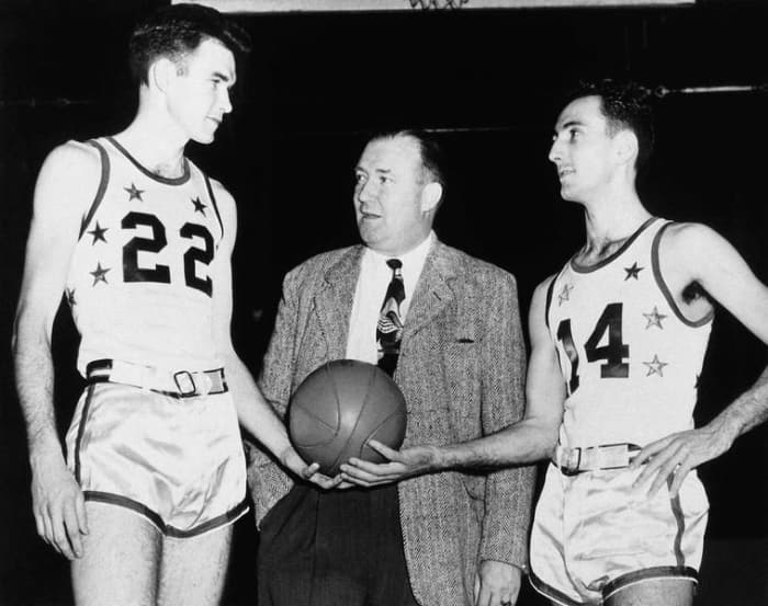
The first NBA All-Star uniforms were just as plain as you would imagine, but they receive a best on this list for the inclusion of the unnecessary belts — as if those skin-tight shorts had ANY chance of falling down on their own.
2 of 26
BEST: 1963: Los Angeles
NBA Photos/Getty Images
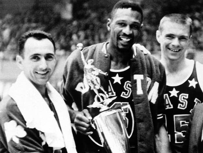
Retro props to the marketing genius in the 1960s who decided to put EAST and WEST on the uniforms for easy identification.
3 of 26
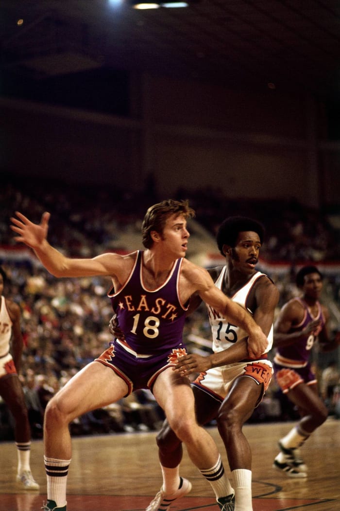
BEST: 1975: Phoenix
Dick Raphael/Getty Images
One of the first All-Star jerseys to give a customized shout-out to the host city.
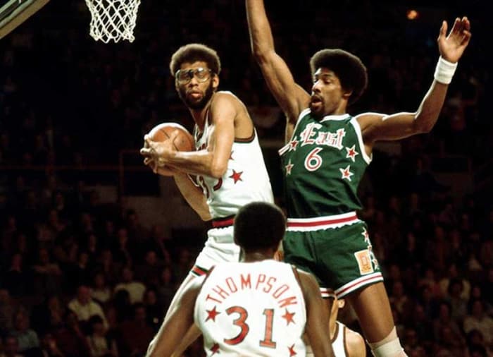
4 of 26
BEST: 1977: Milwaukee
NBA Archives
The notorious difficulties that come with being green are well-documented, but it's tough to find a flaw in the unis from the 1977 game.
5 of 26
WORST: 1979: Pontiac, Michigan
NBA Photos/Getty Images
Certainly not the worst uniforms on the list, but the slanted stripes and typeface make them look more like a printing error than an intended design.
6 of 26
WORST: 1980: Landover, Maryland
Jerry Wachter/Getty Images
The NBA All-Star Game made the transition from the exciting and colorful '70s to the boring '80s with this uninspiring get-up inspired by the host team's uniforms.
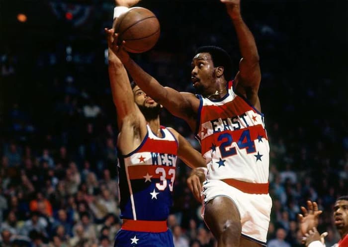
Andrew D. Bernstein/Getty Images
It's almost as if the NBA was buying the star decals in bulk and wanted to make sure it was getting its money's worth here.
Brian Drake/Getty Images
Perhaps it's just because of the iconic players who were wearing these jerseys, but the simple yet elegant uniforms from the second half of the 1980s are still widely regarded as the benchmark in NBA All-Star Game aesthetics.
Andrew D. Bernstein/Getty Images
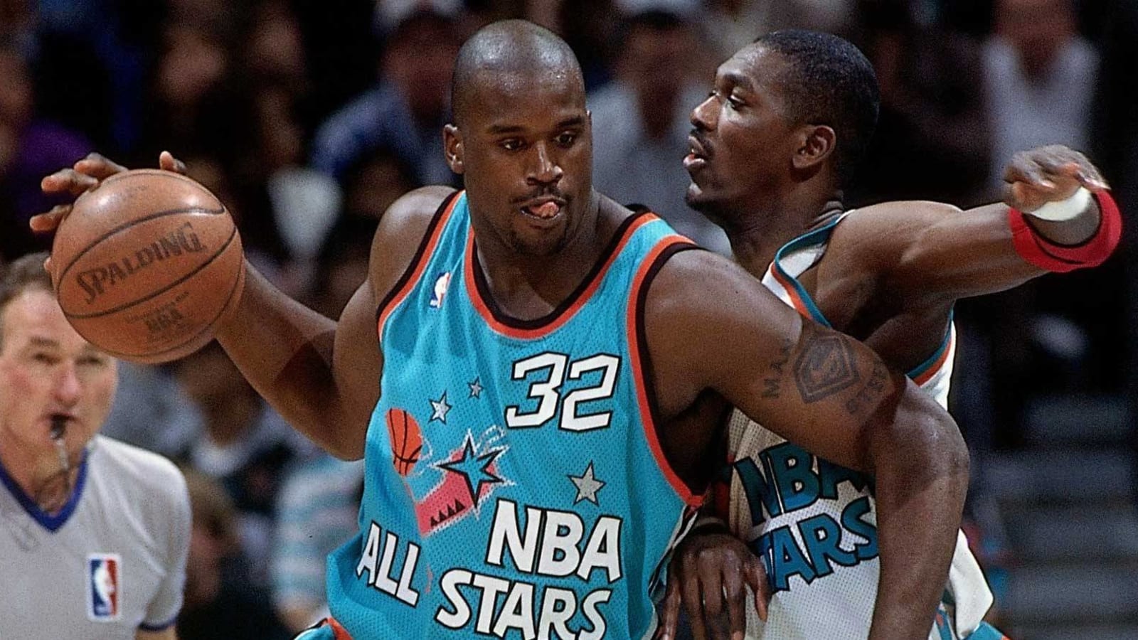
Gradients! Clip art! Multiple fonts! Welcome to the '90s!
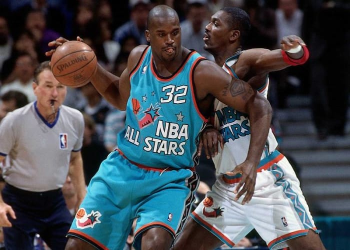
10 of 26
WORST: 1995: Phoenix
Andrew D. Bernstein/Getty Images
Somewhere in the middle of the 1990s, someone thought it would be a fantastic idea to dress up the best basketball players in the world in a uniform that had a cactus in a giant asymmetrical star blazoned upon it. The '90s were a weird decade. Speaking of...
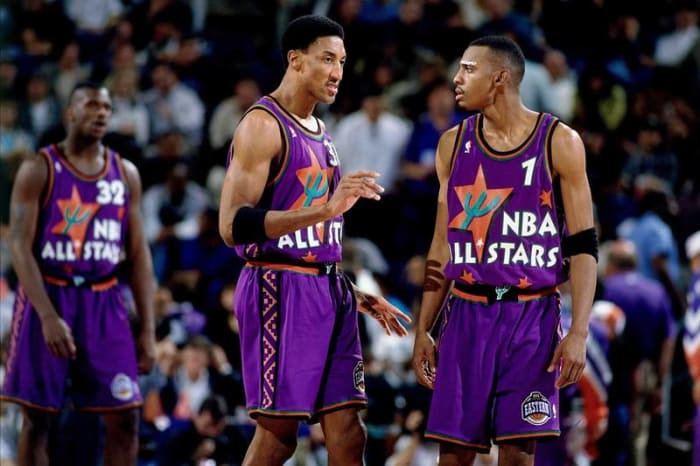
11 of 26
BEST: 1996: San Antonio
Noren Trotman/Getty Images
The '90s were also the decade in which the sports world discovered the color teal, and it was certainly not shy about using it any and everywhere. But you know what? Any time you can throw a chili pepper spinning a basketball on a jersey, you HAVE to go for it.
12 of 26
WORST: 1997-2002
Andrew D. Bernstein/Getty Images
For the next few years, the NBA decided to forgo All-Star uniforms all together and instead just had the players wear their regular uniforms, which made the midseason showcase look like a Saturday morning pickup game at your local park.
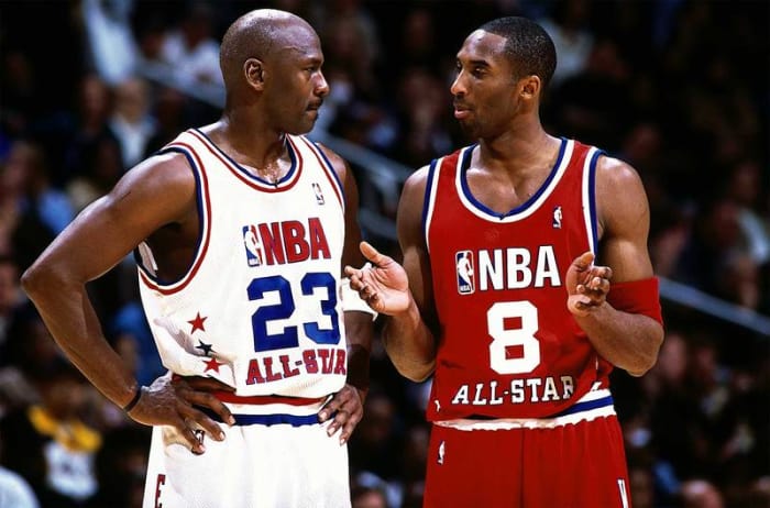
13 of 26
BEST: 2003: Atlanta
Andrew D. Bernstein/Getty Images
When in doubt, revert back to what works. And that's just what the NBA did in 2003, which was fittingly Michael Jordan's last All-Star appearance.
14 of 26
WORST: 2004: Los Angeles
Andrew D. Bernstein/Getty Images
It's as if someone who had never seen a basketball jersey before tried to guess where the letters and numbers went — and failed miserably.
15 of 26
WORST: 2005: Denver
Nathaniel S. Butler/Getty Images
There's nothing really great or awful about these jerseys from 2005. They just sort of existed to be ultimately forgotten and never thought of again, except by those who are putting together NBA All-Star jersey retrospectives.
16 of 26
BEST: 2006: Houston
Jesse D. Garrabrant/Getty Images
2006 was when the NBA really started to experiment again with the overall look of All-Star uniforms, to varying degrees of success. But these are both simple and sharp.
17 of 26
BEST: 2007: Las Vegas
Nathaniel S. Butler/Getty Images
Oooooh, look at that script-ish star flourish! That's how you know you're in a crazy town like Las Vegas!
18 of 26
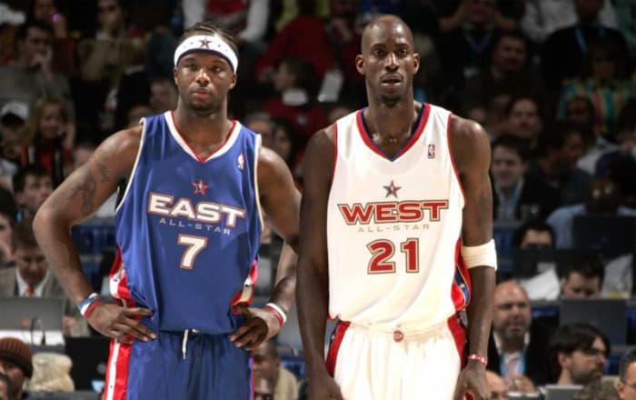
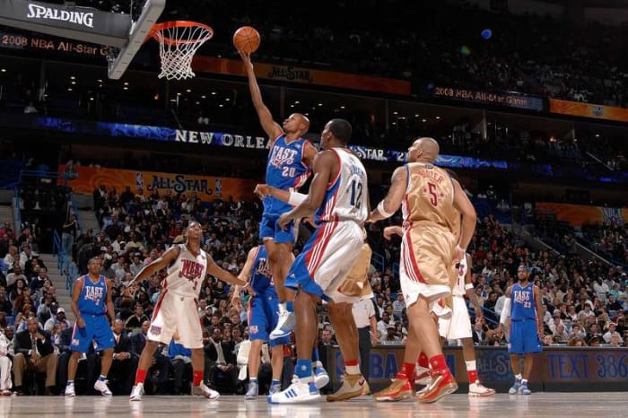
WORST: 2008: New Orleans
Andrew D. Bernstein/Getty Images
The uniforms themselves weren't terrible-looking, per se, but the two-toned jerseys were confusing to viewers who couldn't always easily tell which players were on what team.
19 of 26
BEST: 2009: Phoenix
Nathaniel S. Butler/Getty Images
Aesthetically pleasing, straightforward design that also gets bonus points for having the players' names underneath the numbers on the back of the jersey.
20 of 26
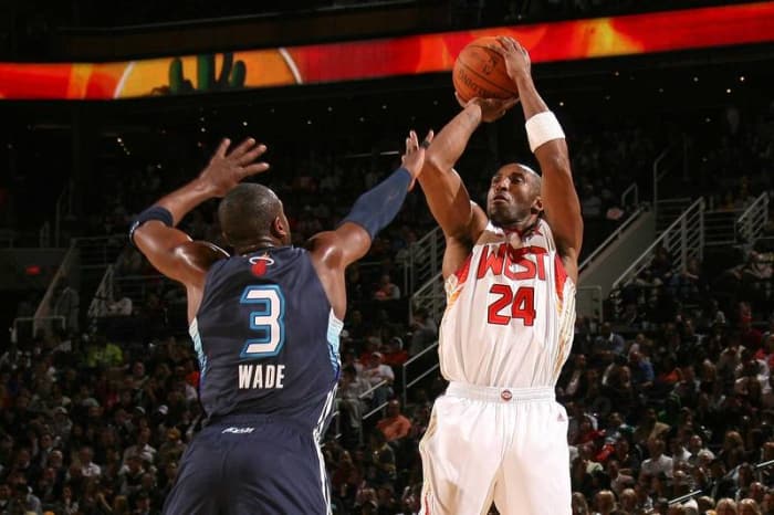
BEST: 2010: Arlington, Texas
Jewel Samad/Getty Images
With the game taking place in the newly opened Cowboys Stadium, these jerseys get a best simply for not having Jerry Jones' face or likeness anywhere on them.
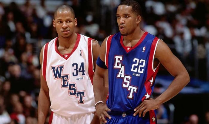
21 of 26
WORST: 2011: Los Angeles
Kevork Djansezian/Getty Images
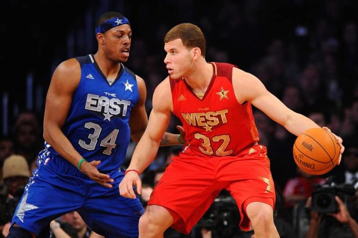
With too many stars, too much gold and the unnecessary "the" above each team name, the 2011 jerseys were just another overproduced entity to come out of Los Angeles.
22 of 26
WORST: 2012: Orlando
Garrett Ellwood/Getty Images
These jerseys look like what someone from the 1980s would think jerseys from the future would look like, and that's not a good thing.
23 of 26
BEST: 2013: Houston
Ronald Martinez/Getty Images
For whatever reason, having the NBA All-Star Game in Houston really brings out the best in the uniform designers.
24 of 26
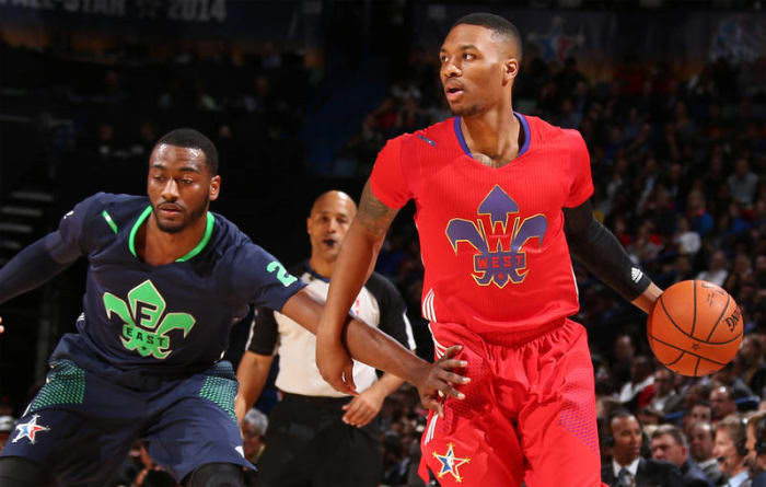
WORST: 2014: New Orleans
Nathaniel S. Butler/Getty Images
Oh no. Oh no. OH NO. Note to the NBA: Uniforms with sleeves and only logos on the front make it look like your players are wearing pajamas. By far, the worst of the worst when it comes to All-Star unis.
25 of 26
BEST: 2015: New York City
Joe Murphy/Nathaniel S. Butler/Getty Images
Some have criticized the 2015 jerseys for being too minimal, but with the game being hosted in NYC, you can't expect too much flash. Getting away from red and blue for the black and white jerseys is also a nice touch, even if putting both first AND last names on the back seems like gimmicky overkill.
26 of 26
BEST: 2016: Toronto
Elsa/Getty Images
There was nothing flashy about the 2016 NBA All-Star Game jerseys, and that's a good thing. The big block letters reading "EAST" or "WEST" are classic, the color scheme is simple and the names on the lower back instead of across the shoulder blades make for a nice touch.


 +
+