Ranking all 30 MLB teams' uniforms.
Rob Carr/Getty Images
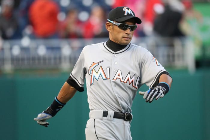
Like pretty much everything surrounding the Marlins (the stadium specifically), the team's uniforms leave a lot to be desired. The "M" logo on the hat looks like something out of a Vegas strip club. A seedy one at that. Cartoons come to mind when looking at the letters on the jersey as well. So yeah, a strip club cartoon. That's not necessarily playing into the whole idea that originality means something when looking at uniforms around the baseball world.
29. Cleveland Indians
Joe Robbins/Getty Images
The Chief Wahoo logo is my primary reason for having the Indians so low on this list. It's understandable that the team doesn't want to go away from a mascot that has defined it for the better part of the past seven decades. It also does offend the senses of anyone with a working knowledge of how Native Americans have been treated in this country. Political opinion aside, if the caricature wasn't so cartoonish — a lighthearted look at a serious situation — this might not be as big of a deal.
Norm Hall/Getty Images
Arizona simply has too many different uniforms. The red, the white, the gray and black. These are all jersey colors the team has used in the past. Heck, the team has used nearly two dozen different color schemes, including the horrendous purple look, over the past several years. Just go straight black or red caps with gray or white jerseys. That would be fine.
Greg Fiume/Getty Images
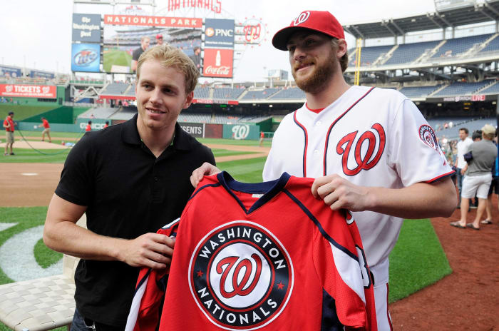
As you will be able to tell here, my subjectivity suggests an issue with red caps. More than that, the biggest issue here is that Washington has failed to take advantage of its distinction as America's team in the nation's capital. Full on red, white and blue should have been the look from the get-go. Instead, the team went with a watered-down version of this color scheme. Besides, the navy blue caps that the Nationals eliminated a couple years ago were by far the best.
Doug Pensinger/Getty Images
A purple and black combination was a good idea in theory. But as a traditionalist when it comes to this grand old game, the idea of grown men wearing purple while playing baseball doesn't sit well with me. I do, however, like the classic pinstripe look. That's a rarity in today's baseball world.
Rob Carr/Getty Images
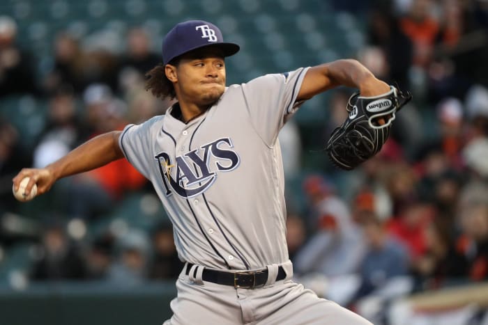
The "Rays" on their jerseys is a bit too big. "TB" on the caps also doesn't do much for me. Tampa Bay's uniform history is much like its stadium as in it leaves a whole heck of a lot to be desired. Though, it's still much better than the uniforms that saw a stingray take hold on the jersey under an ugly-looking rainbow-coordinated "Devil Rays" print. Ouch, those were just horrendous.
Rob Carr/Getty Images
Not a fan of the Oriole mascot. It looks absolutely dreadful. Also, the bright orange jerseys with the orange stirrups. This is too similar to the ugly Tampa Bay Buccaneers' creamsicle uniforms of yesteryear. The Orioles are a tad higher on this list than I'd normally have them. That's primarily due to their black alternate jerseys. Those are darn sexy.
Brandon Wade/Getty Images
The bright red jerseys (when used) and cap really do bother me. I am a fan of the traditional blue and white jersey options. In fact, if we were looking at home uniforms solely, the blue hat with white jersey top would be among the best. It's just the red here that acts as nothing less than an eye sore.
Rob Tringali/Getty Images
Going away from the orange, yellow and red rainbow look that defined the 1970s and 1980s wasn't a smart decision here. Simply not a fan of the "H" and star that make up the team's cap. And when the team goes orange for certain games, it becomes absolutely atrocious to look at.
G Fiume/Getty Images
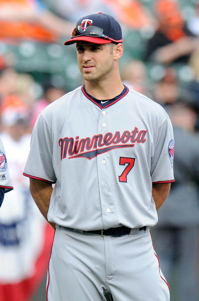
The "TC" has been a staple for Minnesota for years now. And in reality, it's one of the prettiest-looking caps out there. The primary issue here is the "Twins" marks on the road unis. They simply seem to be a bit out of place and don't really fit the bill of a traditional look from a historical franchise. That's the only real issue I have. Oh, that and the elimination of the pinstripes with the red "Twins" word written on it. That was all sorts of sexy.
Christian Petersen/Getty Images
I was a huge fan of the lighter blue caps with the "S" logo mixed in. It looked darn good with their solid white home uniforms. Since then, the Mariners have gone with some sort of a dark blue look with a funky looking "S." This doesn't sit well with someone who would don the old Mariners look growing up. If the Mariners wanted to go away from their past, they easily could have found a better color scheme. That's my primary issue here.
Norm Hall/Getty Images
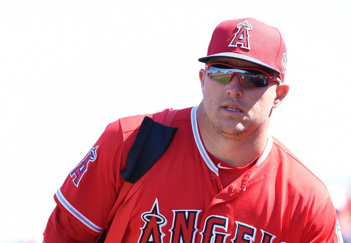
Back when they were the California Angels, this team had one of the top uniforms in baseball. It was always a modern look mixed with the tradition of the franchise. Now, the team has gone away from both. The solid red cap does absolutely nothing for me. Neither do the bright red jerseys the team uses on occasion.
Joe Robbins/Getty Images
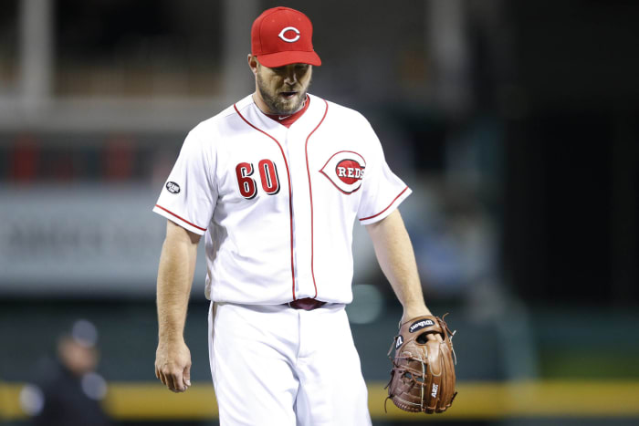
Mediocrity. That pretty much sums up the Reds' uniforms. Red and white as well as red and gray, depending on where the team is playing. This is about as traditional as it gets, so we can't hate too much on the Reds for it. Though, the black jersey look has always stood out as nice to this one scribe. There's not a better color scheme than red and black in sports.
Justin Edmunds/Getty Images
As you can tell, I am a bit of a traditionalist when it comes to baseball unis. I loved the pinstripe look with the team's name flashed across the jerseys. I was also a huge fan of the brown and yellow jerseys that defined this team's past. Now, it just seems that the Padres have done everything to go away from their history. The very same "SD" logo on the dark blue jersey and like-colored caps are very unoriginal.
Scott Cunningham/Getty Images
I absolutely love the all dark blue backdrop on the road jerseys. That's a sexy look and something the Braves haven't changed in forever. I do, however, think the team should go away from the tomahawks under its name all the time. Nothing political here, but the Braves by itself would be much more original and simple.
Mike McGinnis/Getty Images
The dark blue caps fit well. Though, I am one of the few who absolutely loved the Brewers' old-school uniforms. The glove and ball "MB" logo that was used from the late '70s to the early '90s was absolutely amazing. Sometimes, it just doesn't make sense to change a good thing. That's the case here.
Jonathan Daniel/Getty Images
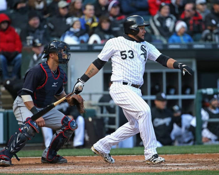
Black and white. I guess something this simple can also be seen as being darn original. It's a sleek look for the Sox, especially when they are going pinstripes at home. The reason Chicago is lower on this list than it would normally find itself is due to its use of a horrendous throwback from the 1980s. You know, the one with the whole used car lot look. Ugh.
Andy Lyons/Getty Images
The original pinstripe look is aces, as is the simple letter "P" on the cap. These are aspects of the Phillies' past that should never change. It is, however, using white as a secondary color to the gray road unis, which is a bit odd.
Ed Zurga/Getty Images
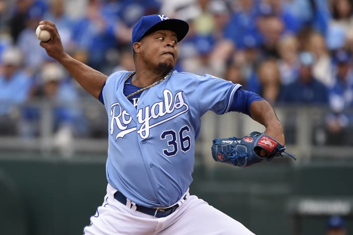
The powder blue alternate jerseys with "Royals" written in white and boasting a darker blue trim are simply about as good as it gets when it comes to nontraditional uniforms. Though, the Royals' current look of white home unis with simple blue trim is also legit. They only real issue here is that royal blue doesn't mesh too well with gray. Though, that's not really anything the Royals can fix.
Mark Cunningham/Getty Images
If we were talking about home uniforms, the Tigers would likely be among the top three. It is, however, the use of an orange and blue color combination in the word "Detroit" when it comes to the road unis that has this team a bit lower on the list than it should be. Still, the white home uniforms with the dark blue hat are pretty darn awesome.
Marc Serota/Getty Images
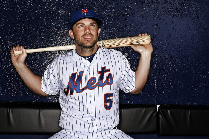
The "NY" logo on the caps is about as good as it gets, as is the Mets' continued use of pinstripes with the backdrop of home white jerseys. That's tremendously sexy. The only issue I can point to here is the use of gray with an orange outline in road alternatives. But hey, it sure beats the heck out of the black unis the team ditched a few years back. Those were atrocious.
Tom Szczerbowski/Getty Images
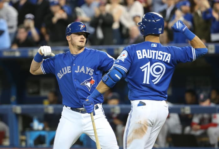
Part of me wishes the Jays would go with their powder blue throwbacks. Those were among the sexiest uniforms during the late 1970s and early 1980s. Now that this isn't the case, I still like the use of the blue jay on the side of the jerseys as well as on the cap. It's an original look that no other team can repeat. Let's just hope the Jays remove the red jerseys from the rotation. We know it's about paying homage to Canada. But man, it's ugly.
Justin K. Aller/Getty Images
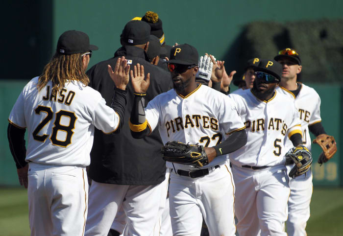
The yellow and black caps are tremendous. When factoring in the all-white backdrop of the home jerseys, that's among the best set in baseball. Though, I am not a huge fan of the black alternates. In reality, the all white or gray backdrops work well with what the Pirates have done in the past. They shouldn't change it up too much. But it's all about marketing, and people love black on their apparel. That's just the way it is.
Ron Vesely/Getty Images
Here's a team that's made sure to stay true to itself. The pinstripes, the Cub blue, the "C" on the hats. These have been staples of this historical organization. I also love the use of "Chicago" across the front of the road jersey. Wish every team would go in that direction to announce its presence in front of a hostile crowd. It's baseball, pure and simple. Though, I do wish they'd bring back the powder blue pinstripes. Talk about originality.
Victor Decolongon/Getty Images
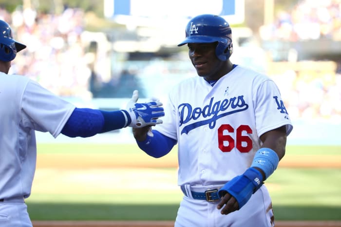
Blue, red and white. Those colors have defined the Dodgers' uniforms since their move from Brooklyn back in the late 1950s. It's a pretty blue with the numbers in red, all made complete by clean white home jerseys. Talk about great color coordination. Not a huge fan of the use of "Dodgers" on their alternate road jerseys. Instead, they should go back to Los Angeles for good. That's tradition. That's also why the Dodgers aren't any higher on this list.
Michael Zagaris/Getty Images
The solid white uniforms with green cap and yellow bill are about as good as it gets when it comes to a home uniform in baseball. I will say the solid green road cap leaves a bit to be desired. In reality, the A's would be better off going with their home hats on the road. If that's my only issue, the team is surely doing something right. It's about as sleek as it gets in baseball.
Elsa/Getty Images
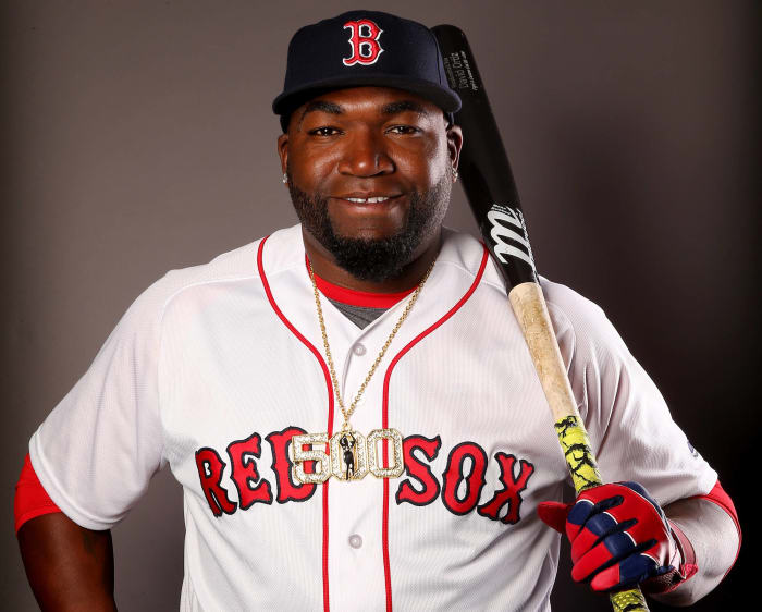
By now it's pretty obvious that this one scribe prefers traditional uniforms over all the rest. The "B" on the navy blue cap to go with "Red Sox" in red with a blue outline on all-white home jerseys. Yeah, that's about as good as it gets. Like most of the teams ranked high here, Boston has made sure to stay true to its past. And why not? It's iconic in the baseball world. Period!
Dilip Vishwanat/Getty Images
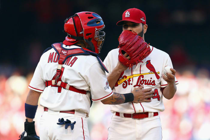
Nothing really to complain about here. The two cardinals perching on a baseball on the jersey are about as original as it gets. The red cap with the "StL" logo couldn't be better. Heck, even the throwback blue uniforms this team wears on occasion are sexy.
Ezra Shaw/Getty Images
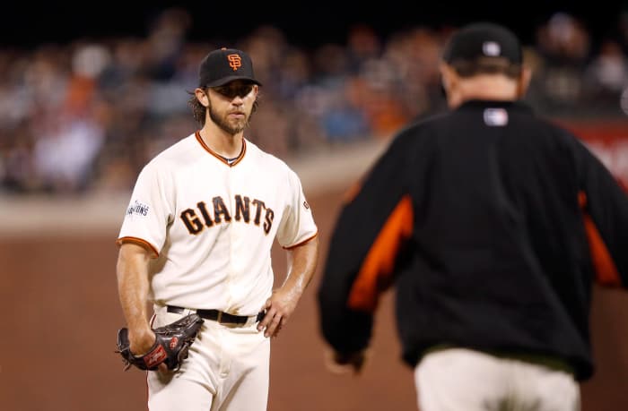
When Madison Bumgarner started opening day for the Giants, he was wearing the exact same uniform as when the team moved out west over 50 years ago. Staying true to your tradition is one of the biggest keys when it comes to unis around the baseball world. The black cap with the interlocking "SF" logo to go with standard grey jerseys and the term "San Francisco" written across it make up the best road uni in the game. Period.
Alex Trautwig/Getty Images
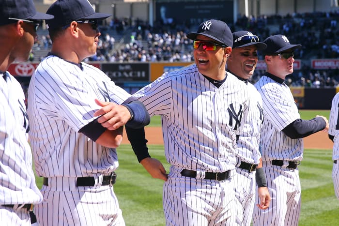
Did you honestly think anyone else would top this list? Like pretty much everything else baseball-related, the Yankees know exactly what they are doing here. Staying true to their heralded past, the Yankee pinstripe is pretty much the most iconic aspect of any uniform in baseball today. The interlocked "NY" on the navy blue hat debuted all the way back in 1909, and the Yankees have found no reason to change it. The Yankees also don't use alternate jerseys, a decision that allows them to stay true to their past.
 +
+
