-

-


Follow Us
-


 Free Newsletters
Nashville Predators News / NHL Rumors / June 18

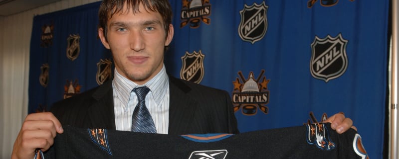
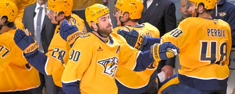
Nashville Predators Make a Trade and Will Keep Coaching Staff But Want to Improve
The Toronto Maple Leafs were not the only ones to make a trade on Tuesday. New President of Hockey Operations and General Manager Chris MacFarland is starting to leave his imprint on the Nashville Predators.
Ross Colton News / ESPN / June 16
Avs deal Colton to Predators, free up cap space 
Chris MacFarland's first trade as Nashville Predators GM came with his former team, the Colorado Avalanche, in a deal on Tuesday that saw his new club acquire forward Ross Colton in exchange for two third-round picks and goaltender prospect Magnus Chrona.

The 'Conn Smythe Trophy winners' quiz
The NHL began awarding the Conn Smythe Trophy to the most valuable player of the postseason beginning in the 1965 season. How many of the past winners can you name in six minutes?
The 25 greatest rookie seasons in NHL history
There have been successful rookie seasons in NHL history, and there have been superior efforts worth celebrating time and time again. Here's our list of the 25 notable seasons from those with official rookie status, as deemed by the NHL, in reverse chronological order.
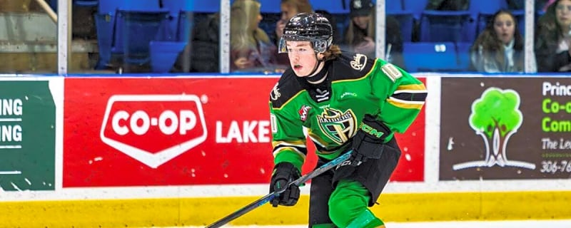
Gunnarwolfe Fontaine News / Inside The Rink / June 12
ECHL: Gunnarwolfe Fontaine Heads Overseas
Cincinnati Cyclones forward Gunnarwolfe Fontaine is heading overseas to Italy to play with HC Pustertal in the EIHL. In his first full season in the ECHL, Fontaine had 21 goals and 24 assists for 45 points in 71 games.
Nashville Predators News / The Hockey Writers / June 9

Top 10 Nashville Predators Prospects: Pre-2026 Draft Edition
The Nashville Predators are at a crossroads this season. They’re stuck between being too good to compete for the first overall pick and too poorly built to compete for the Stanley Cup.
Chris MacFarland News / NHL on ClutchPoints / June 8

Predators rumors: Will new president Chris MacFarland immediately retool Nashville’s roster?
The Nashville Predators are entering a new era under president and general manager Chris MacFarland, who joined the franchise after helping build the Colorado Avalanche team that won the Stanley Cup in 2022.
Nashville Predators News / Pro Hockey Rumors / June 8

Free Agent Focus: Nashville Predators
Free agency is just over a month away, and teams are looking ahead to when it opens. Even with the UFA crop being thinned out in recent months, there will be some quality veterans set to hit the open market in July, while many teams also have key restricted free agents to re-sign.
Chris MacFarland News / Daily Faceoff / June 7

Expect a retool to begin MacFarland’s tenure in Nashville
The Nashville Predators are in a new era under president and general manager Chris MacFarland, and while they won’t be entering a full rebuild, there are
Rob Blake News / NHL Trade Talk / June 5

Predators With Another Huge Hire, Bring in Rob Blake
Just hours after hiring Chris MacFarland to be the GM and President of Hockey Operations, the Nashville Predators have announced they have hired Rob Blake as the Executive Vice President of Hockey Operations.
Rob Blake News / Daily Faceoff / June 5

Predators hire Rob Blake as executive VP of hockey operations
A former NHL general manager is taking on a different role with a new team. On Friday, new Nashville Predators GM Chris MacFarland announced that the team has hired Rob Blake as the team’s new executive vice president of hockey operations.
Chris MacFarland News / NHL on ClutchPoints / June 4

Next move Predators must make after Chris MacFarland hiring
The Nashville Predators hired Chris MacFarland as their new general manager, bringing him in from the Colorado Avalanche. Barry Trotz has been moved into an advisory role as Nashville looks to rebuild its roster after a dreadful season.
Chris MacFarland News / Ball Exclusives / June 2
Predators hire Chris MacFarland as general manager
The Nashville Predators have named Chris MacFarland as the president of hockey operations and general manager. MacFarland was formerly the general manager of the Colorado Avalanche, where he spent 11 years with the organization.


Roman Josi News / Daily Faceoff / May 31

Predators’ Roman Josi named MVP of 2026 IIHF World Championship
Switzerland’s Roman Josi has been named MVP of the 2026 IIHF Men’s World Championship after leading his country to a silver medal. The 35-year-old has taken home second place four times at the World Championship, with the veteran losing 1-0 to Finland on Sunday in the gold medal game.
NHL News / Daily Faceoff / May 31
Top 10 ‘big guy’ prospects for the 2026 NHL Draft
Yesterday, we took a look at 10 of the better “small guy” prospects in the 2026 NHL Draft. Today, we’re going the opposite direction, looking at the true big dawgs of the draft class.
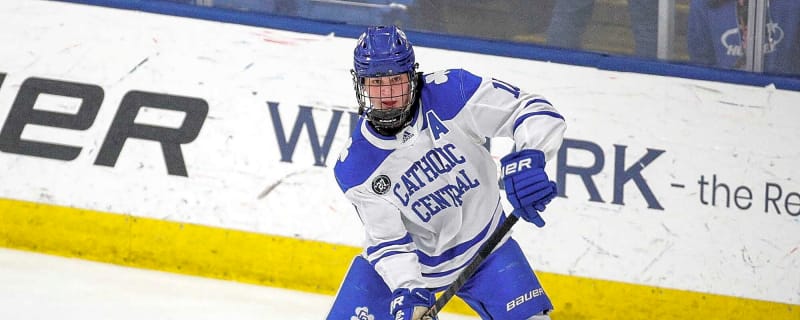
Felix Nilsson News / Pro Hockey Rumors / May 29

Predators Sign Felix Nilsson To Entry-Level Contract
According to a team announcement, the Nashville Predators have signed forward Felix Nilsson to a three-year, entry-level contract. The Predators didn’t disclose the financial terms of the deal, but it will carry through the 2028-29 season.
NHL News / NHL on ClutchPoints / May 25
Insider gives shaky update on Predators pursuit of Avalanche GM
The Nashville Predators’ search for a new general manager continues to stretch on, with insider Elliotte Friedman suggesting the club may be waiting for permission to speak with a top candidate, according to comments made on Monday’s edition of 32 Thoughts podcast.
Nashville Predators News / Pro Hockey Rumors / May 25

Predators May Seek Permission To Interview Chris McFarland For GM Vacancy
According to Elliotte Friedman on the 32 Thoughts podcast, the Nashville Predators are being patient in their general manager search and could be waiting to ask to converse with a top-tier candidate.
Nashville Predators News / Daily Faceoff / May 22
Rebuilding is the only option for Cup contention for the Predators
An organizational reset could be in store for the Nashville Predators. After this season, in which they finished tied for fifth in the Central Division with 86 points and missed the playoffs for a second straight year for the first time since 2014, the Predators may have to change course to find ultimate success.
Isak Walther News / Inside The Rink / May 21
ECHL: Isak Walther Signs With Sport in Finland’s Liiga
The Atlanta Gladiators will have another major hole to fill heading into the 2026-27 season as forward Isak Walther has signed overseas with Sport in Finland’s Liiga.
NHL News / NHL Rumors / May 20
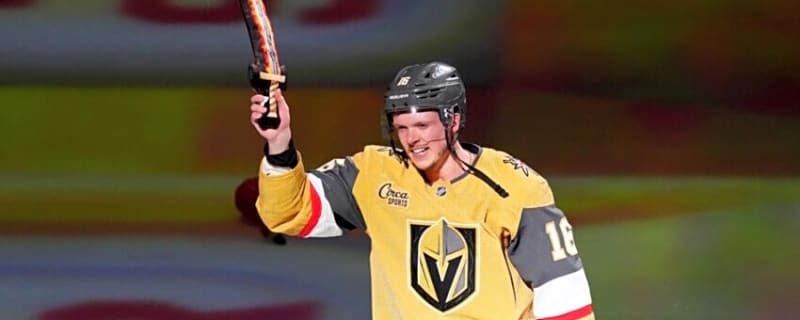
Vegas Golden Knights Have Cap Issues to Resolve to Sign Multiple Players
It is never easy to talk about teams that are still in the Stanley Cup Playoffs, but it is part of the business. As we have seen, teams like the Edmonton Oilers and Florida Panthers are going on long playoff runs and have to deal with their free agents days before July 1st.
Nashville Predators News / The Hockey Writers / May 15
3 Players the Predators Should Target With the 10th Pick in the 2026 NHL Draft
This season, the Nashville Predators were expected to be competing for the first-overall pick in the 2026 NHL Draft. With an aging core and after a disastrous 2024-25 campaign, it seemed that the Predators would be starting a rebuild.
Nashville Predators News / NHL on ClutchPoints / May 14

2 early Predators trade targets after missing 2026 Stanley Cup Playoffs
For a second consecutive year, the Nashville Predators came up short in their pursuit of a Stanley Cup Playoff berth, finishing the campaign with a 38-34-10 record.
Nashville Predators News / The Hockey Writers / April 21
The Predators Had the Most Pointless Season in the NHL
The Nashville Predators (38-34-10) looked like they were going to start a rebuild after the 2024-25 season. Their prospect pool was starting to take form, with Matthew Wood, Joakim Kemell, and Brady Martin looking NHL-ready.
Nashville Predators News / EasySportz / April 14

The Nashville Predators Almost Backed Into the Playoffs
NASHVILLE, Tenn. — It almost happened. Not with a surge, not with a statement — but with a stumble that somehow still had a chance to be enough. The Nashville Predators came within reach of backing into the Stanley Cup Playoffs, lingering in the race deep into the final week despite a stretch run that did little to inspire confidence.
Steven Stamkos News / NHL Trade Talk / March 24

Steven Stamkos Is Back to Scoring Like the Old Days
At 36, you might figure Steven Stamkos is starting to slow down. But anyone who’s been paying attention to the Preds lately knows that’s not true at all.
Breaking News
Trending News


Customize Your Newsletter
 +
+
Get the latest news and rumors, customized to your favorite sports and teams. Emailed daily. Always free!

MY ACCOUNT
SUBSCRIBE
ADVERTISE
JOBS
FAQ
PRIVACY POLICY COOKIE POLICY CONTACT US
ABOUT YARDBARKER TERMS OF SERVICE


PRIVACY POLICY COOKIE POLICY CONTACT US
ABOUT YARDBARKER TERMS OF SERVICE
Copyright 2026 YB Media, LLC. All rights reserved.
By using this site, you agree to our Terms of Service and Privacy Policy.
This site is for entertainment purposes only.
There is no gambling offered on this site.
Gambling Problem? Call 1-800-Gambler.

By using this site, you agree to our Terms of Service and Privacy Policy.
This site is for entertainment purposes only.
There is no gambling offered on this site.
Gambling Problem? Call 1-800-Gambler.